Source: FX
“Atlanta is about two cousins navigating their way in the Atlanta rap scene in an effort to improve their lives and the lives of their families.” — Wiki
As a graphic designer, my brain automatically tries to discern the context of every design. Watching the first episode of Atlanta, the logo was the first thing that popped out to me. I paused the show to examine it but didn’t grasp its significance till I reached the end of the episode. That’s when I realized it was a perfect representation for the series. Atlanta is a multifaceted series that juxtaposes humor with serious issues, and the makers of the series do a superb job of infusing the essence of it into the logo.

So what do the characteristics of this logo tell us about the show?
- Characteristics: The logo is composed entirely of a Logotype, with the word Atlanta rendered in a serif typeface named Cabernet JF. The first A is rendered with a swash( the extending part of the stroke). The last A is also a swash character but mirrored horizontally to give the logo a symmetrical balance. The characters between the swashes are regular characters.

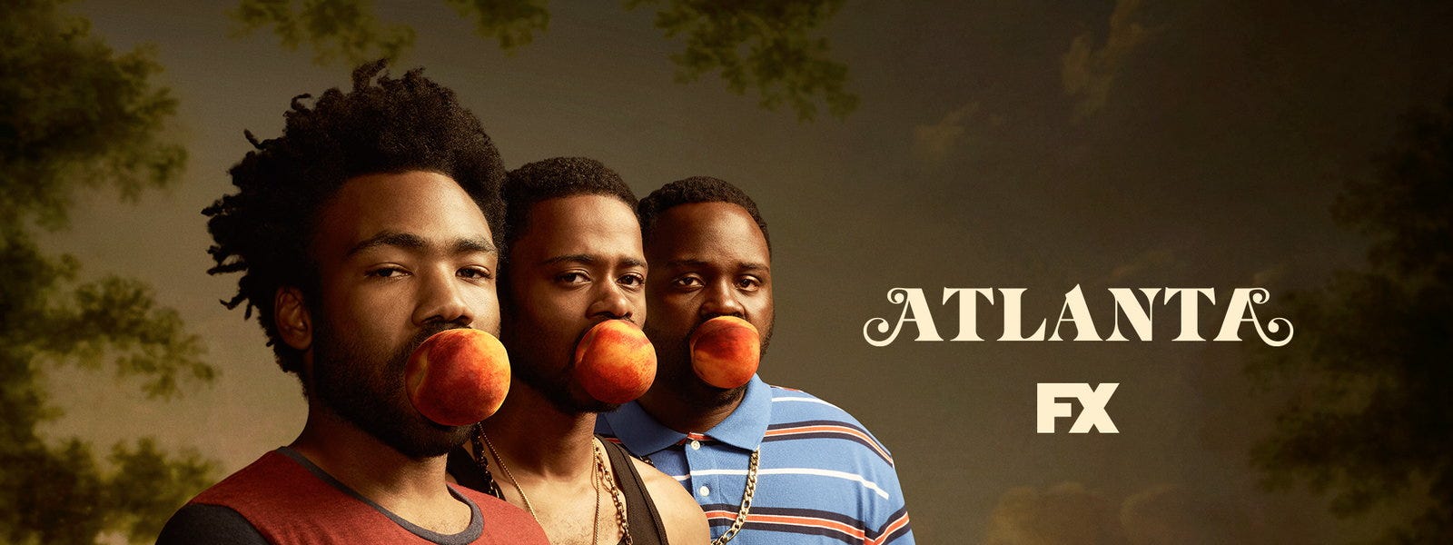
- Significance: So what’s the significance behind the As’ swash, which seems to break the seriousness of the other characters? With those swash characters, there’s a sense of flamboyance on the outside. It’s no coincidence it has a finial(the rounded part at the end of the stroke) that looks just like the peach fruit on the character’s mouth (in the hero image) — which look just like a clown’s red nose. That roundness is also inspired by The Son of Man a 1964 painting by the Belgian surrealist painter René Magritte, who said this about the painting,

“At least it hides the face partly well, so you have the apparent face, the apple, hiding the visible but hidden, the face of the person. It’s something that happens constantly. Everything we see hides another thing, we always want to see what is hidden by what we see. There is an interest in that which is hidden and which the visible does not show us. This interest can take the form of a quite intense feeling, a sort of conflict, one might say, between the visible that is hidden and the visible that is present.”
Watching Atlanta, you can see how this describes the surreal humor in the show — There’s always something hidden behind it. While the swash characters at the beginning and end have that whimsical, carefree and comedic feel, the ones tucked between them have a sturdy serious feel. It’s a well-blended contrast that indicates tucked between this comedy is the drama. The logo characters also have strokes that go from thick to thin depicting how easy it is for things in the series to transition and unsettle one, in order to send a less than overt message.
Side-note: Why a peach fruit in the image? The fruit in that image is a peach because Atlanta, Georgia has 75 streets that have the word “Peach tree” in them. This is why it’s regarded as the land of “Peach Tree” everything.
Ratings of the Logo’s Application
One of the most interesting aspects of the logo is how it’s integrated into the beginning scenes of most episodes. Somewhere around the first 5 minutes, there’s a change of scene, music starts playing and a scene with the logo infused is shown. As a designer, I enjoy looking out for these treasure hunt scenes. Below are all the scenes in Atlanta that show the logo.
I’ve arranged them in ascending order of how well the logos are presented and applied. The rating goes from Aite, to oh, cool, to I see what you did there, to fye!🔥🔥🔥
Presentation Level: Aite


Note: First episodes of each season have it displayed explicitly (There’s the exception of Episode 6 Season 2 which has it displayed that way). The backgrounds, while different, are thematically similar as they all show an aerial view of Atlanta.
Presentation Level: Oh, cool


Note: Logo painted on different mediums. The logo changes colors depending on the accent color or background color of the frame.
Presentation Level: I see what you did there

Note:
Logo mark rendered on a beer coaster: This features only the first character of logo, which shows how recognizable the logo is with just the mark representing it.

Note:
Logo rendered as a wallpaper, tucked in the corner of the frame with a bokeh effect blurring it out.
Note:
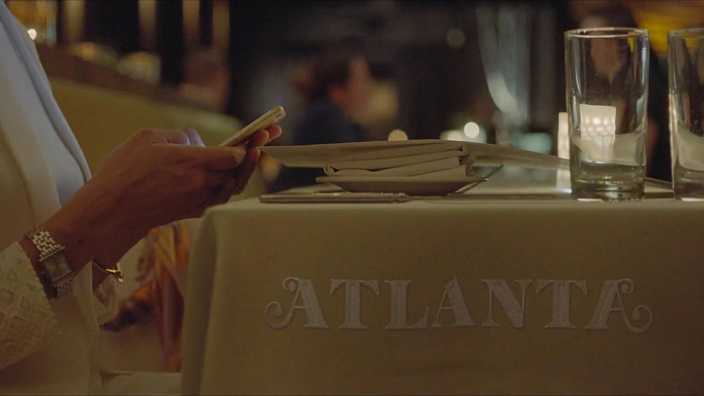
Logo embroided on the restaurant’s table cloth.

Note:
Logo embroided on a table cloth: This features triangular geometric patterns on top of the Atlanta logo. They most likely are a geometric representation of A for Atlanta.

Note:
Logo rendered on a basketball court.

Note:
Logo rendered on a moving bus: This rendition sports two hues of blue with a modified swash in the first A character.
Presentation Level: Fye! 🔥🔥🔥

Note:
Logo rendered as champagne spills: Now this really pushed the versatility of the logo. You can see they skipped past the serifs on some of the characters, however because of the logos sturdy composition, you can still clearly see Atlanta.

Note:
Logo rendered as a lower-back tattoo: Augmenting the logo is more swish characters beside the A characters. The prominent addition is more swish symbols held together by an outlined love symbol.

Note:
Logo rendered on a revolver: What I like about this is how the miniature display of the logo doesn’t impair its legibility. You’ve got to look for it in this frame, but once you see it, you do.
Note:
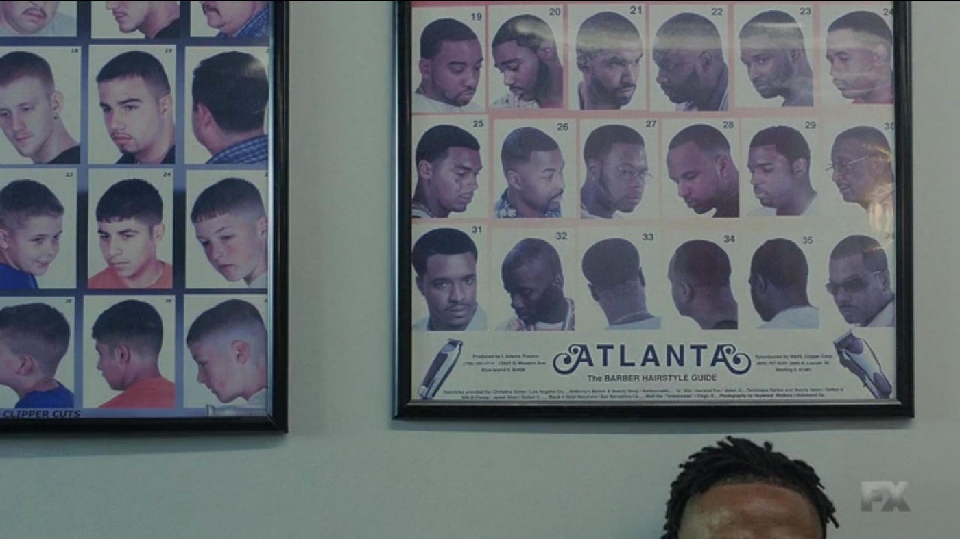
Logo rendered on a hairstyle poster: As someone who grew up gazing at these posters in barbershops, admiring the diversity of hairstyles — I couldn’t dare try, this was an incredibly relatable medium to put the logo. For this logo rendition, apart from the first and the last A’s, the rest of the characters are rendered in uppercase sans serif. They have been adequately tracked(spaced well between all the characters) and this gives the logo a different vibe. I’ll leave the significance of this for readers to determine.
So why is this the perfect logo for it again?
The Atlanta logo is able to translate so well across all these mediums because it fulfills the requirements for a great logo. It’s simple, it’s distinct, and most importantly it’s versatile. These characteristics allow it to achieve these ranges of applications. It stands as an identifiable identity irrespective of its aspect ratio, color, form, or background and it also clearly communicates what the series is about — all these come together to make it a perfect logo.
Anything similar to this?
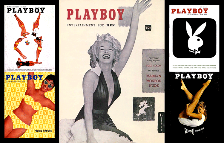
Yup, what Atlanta has done with its logo is quite reminiscent of what Art Paul, the art director, and designer of Playboy magazine, did with the Playboy bunny logo. He would find smart ways of hiding the logo on the magazine cover. He’d hide them so well, readers would write to the magazine to inform them the logo was missing from the covers. While the bunny logo was rendered in abstract ways, Atlanta’s a lot less subtle.
Will Atlanta’s logo be regarded as iconic as the Playboy’s bunny?
— I don’t know, but with an Emmy and a Golden Globe award in tow, I’ve got a good feeling the series will go down as iconic.
P.S
I couldn’t spot the logo in Season 1 Episodes 7 & 10, Season 2 Episodes 10 & 11. I don’t think it’s there but still can’t shake away the feeling it is. Spot it? Please let me know in the comments.


