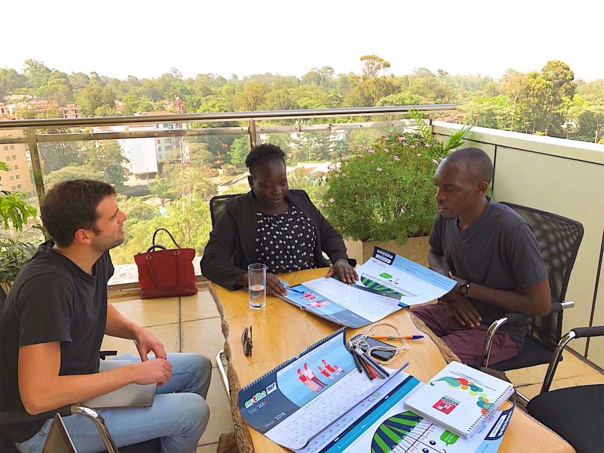
Center for Advanced Hindsight

M-tiba Calendar

In the last quarter of 2017, we collaborated with The Center for Advanced Hindsight, a behavioral science research group led by Dan Ariely at Duke University, an Ivy League-caliber institution, to design a 2018 savings calendar used in Kenya.

The calendar was created to help low-income women remember to make timely payments for their subsidized National Hospital Insurance Fund (NHIF) health coverage.

The Center focuses on making people happier, healthier, and wealthier through behavioral science—a mission that closely aligns with our own focus on creating products that bring people joy. Both behavioral science and design are centered on shaping human thought, behavior, and decision-making. Given this natural synergy, we were excited to contribute to the project.

You can get a deeper sense of the project through the illustrations featured in the calendar, which were co-created by the Center’s Lab artist, Matt Trower, and our team.

Telling the story of the program proved essential. By framing the importance of the “I-Push” insurance program as a personal narrative—how it helped a mother save her daughter’s life—we made the message more relatable and emotionally impactful, giving it a much better chance of resonating with the women it aimed to serve.

We used a complementary pastel color palette to create vivid, yet calm and balanced illustrations. To make the design more inviting, we anthropomorphized the umbrella by giving it soft, upward-looking eyes and a curved handle that together form a friendly, smiling face. This gentle visual cue subtly encourages the women to engage with the calendar and feel at ease while using it. By fostering this sense of comfort, we increased the likelihood that they would consistently fill in the calendar—an essential step in the savings process.

We chose a muted background color to ensure that the most important elements—the illustrations and the calendar—stood out prominently. To create contrast and visual harmony, we used tints of complementary colors, green and red, drawn from the mTiba brand. These complementary colors, when placed side by side, create maximum contrast, giving the design a clear, dynamic, and engaging look.

It was also essential that the calendar felt modern and clean, while subtly conveying a sense of urgency and seriousness. Text visibility was a key consideration, so we selected a low-contrast geometric sans-serif typeface. This choice balanced the need for readability with the desired tone, making it easier for the women to interact with the calendar consistently.