NCDC Covid-19 Infographics
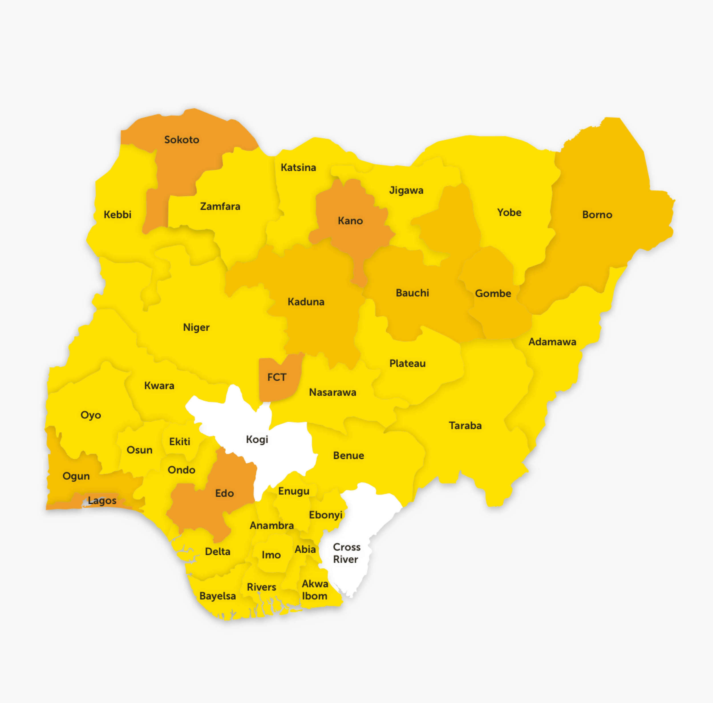
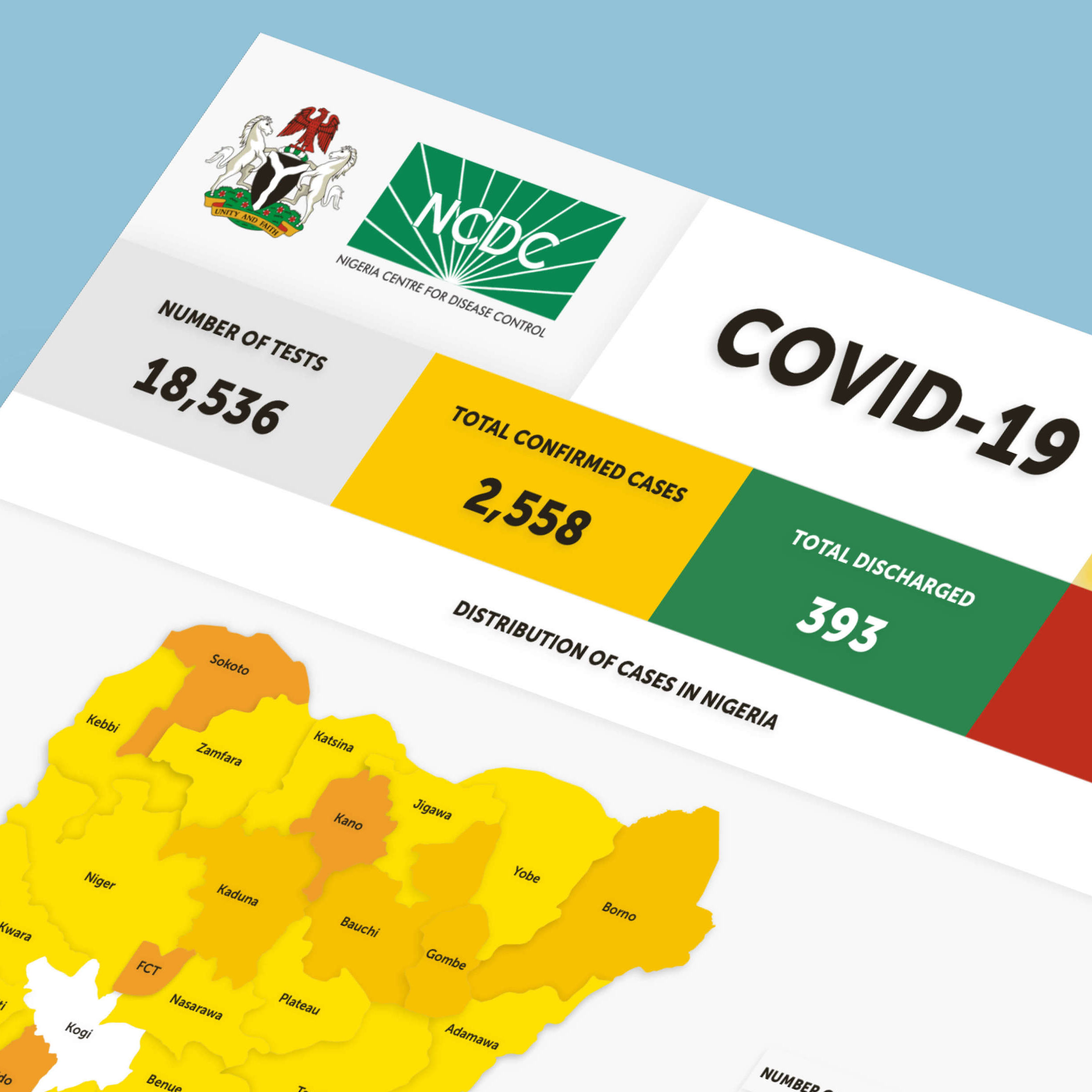
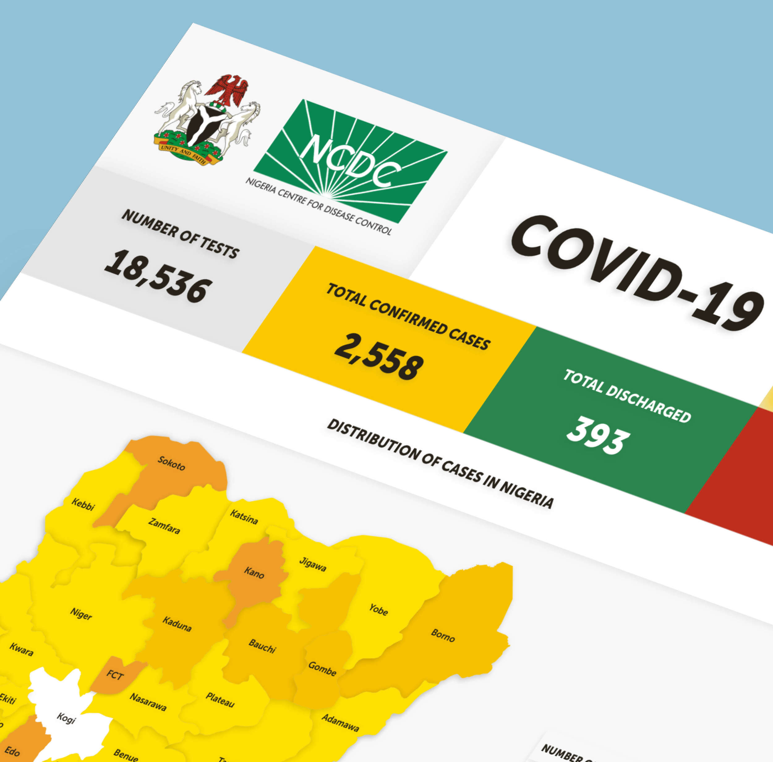
We redesigned the NCDC infographic that presents key COVID-19 data to millions of Nigerians. The original version had several visual inconsistencies that made it difficult for the public to easily understand, so we set out to address these issues and improve clarity.


Next, we moved on to designing the infographics, focusing on creating visuals that are clear, easy to digest, and visually appealing  .
.
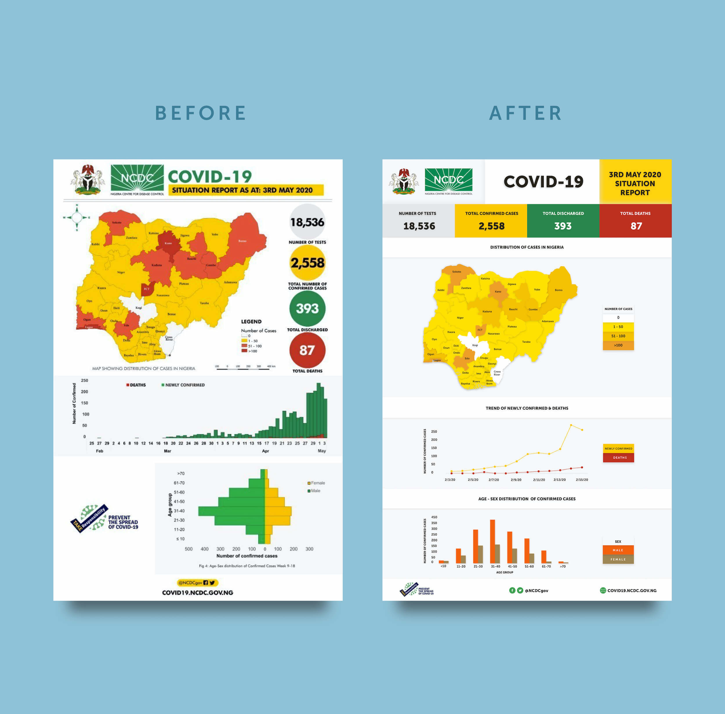
To achieve this goal, we made several key updates, including:
1. Highlighting the most important figures for quick reference
2. Giving each graph its own dedicated space to improve clarity
3. Adding clear, descriptive titles to each graph
4. Standardizing the legends for consistency
5. Applying colors thoughtfully to enhance readability
6. Updating the graphs and standardizing their y-axes to make them easier to understand
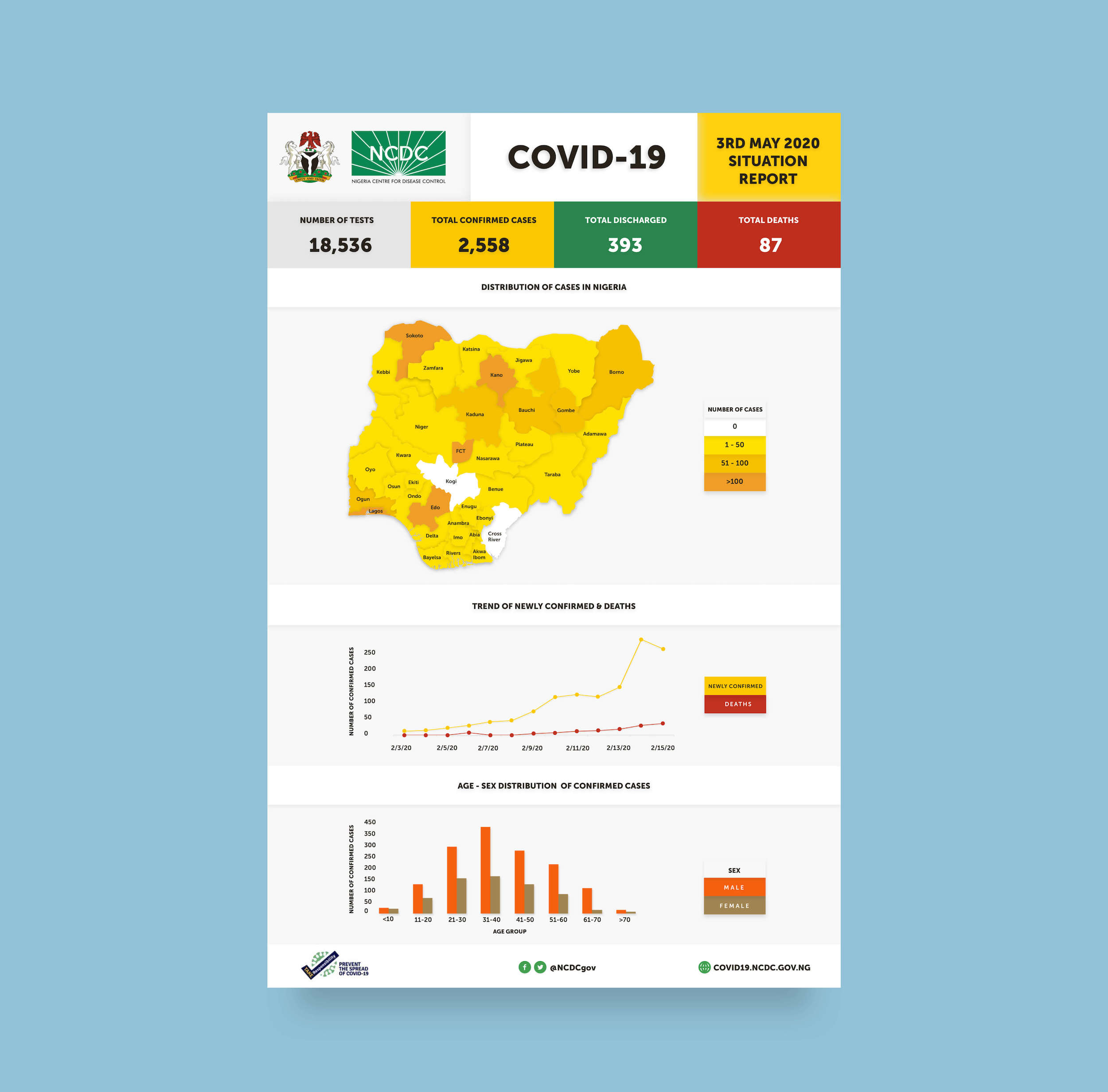
As with everything we design, every element in our infographics is crafted with intention. Just as we carefully select colors to enhance understanding, we were equally deliberate in our use of shadows and textures to add depth, guide focus, and create a more engaging visual experience.
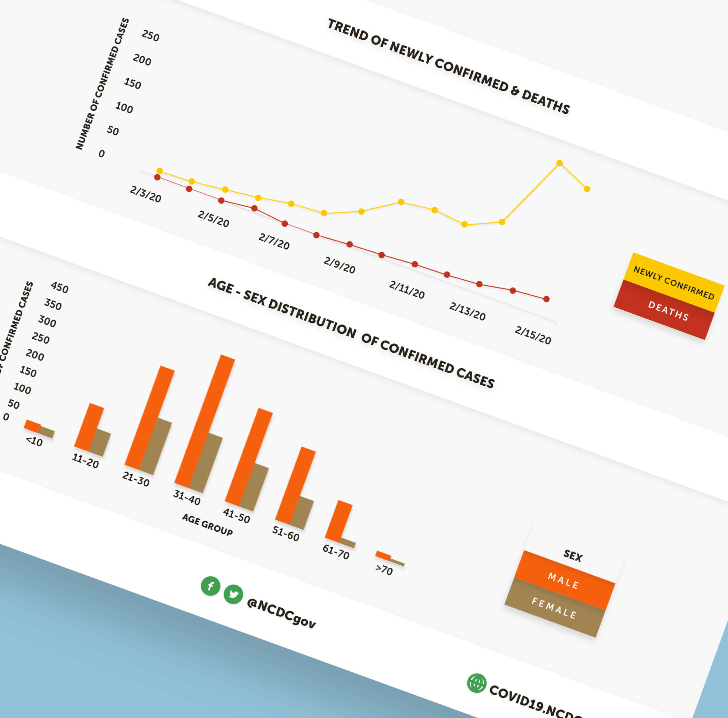
We use shadows to add depth and a richer sense of interaction to each element. This transforms them from being purely visual to feeling almost tactile. Tactility matters—it connects us to the instinctive curiosity of childhood, when we naturally explored the world through touch. This subtle invitation to ‘feel’ the elements sparks a sense of childlike joy and discovery. It also introduces a jigsaw-like quality that playfully encourages exploration. Also, by using shadows instead of black outlines to separate elements, we achieve a cleaner, more minimalist interface that feels both elegant and engaging. All of this aligns with our core design philosophy: creating for happiness.
A few days after we released the redesigned infographic, the NCDC adopted several of the improvements we had recommended.