Hygeia
Hygeia HMO is the largest and one of Nigeria’s most trusted health insurance companies. They serve a range of customers from individuals to small businesses, providing comprehensive health insurance packages. We teamed up with them to refresh their identity and their website. 👨🏾💻
Storytelling
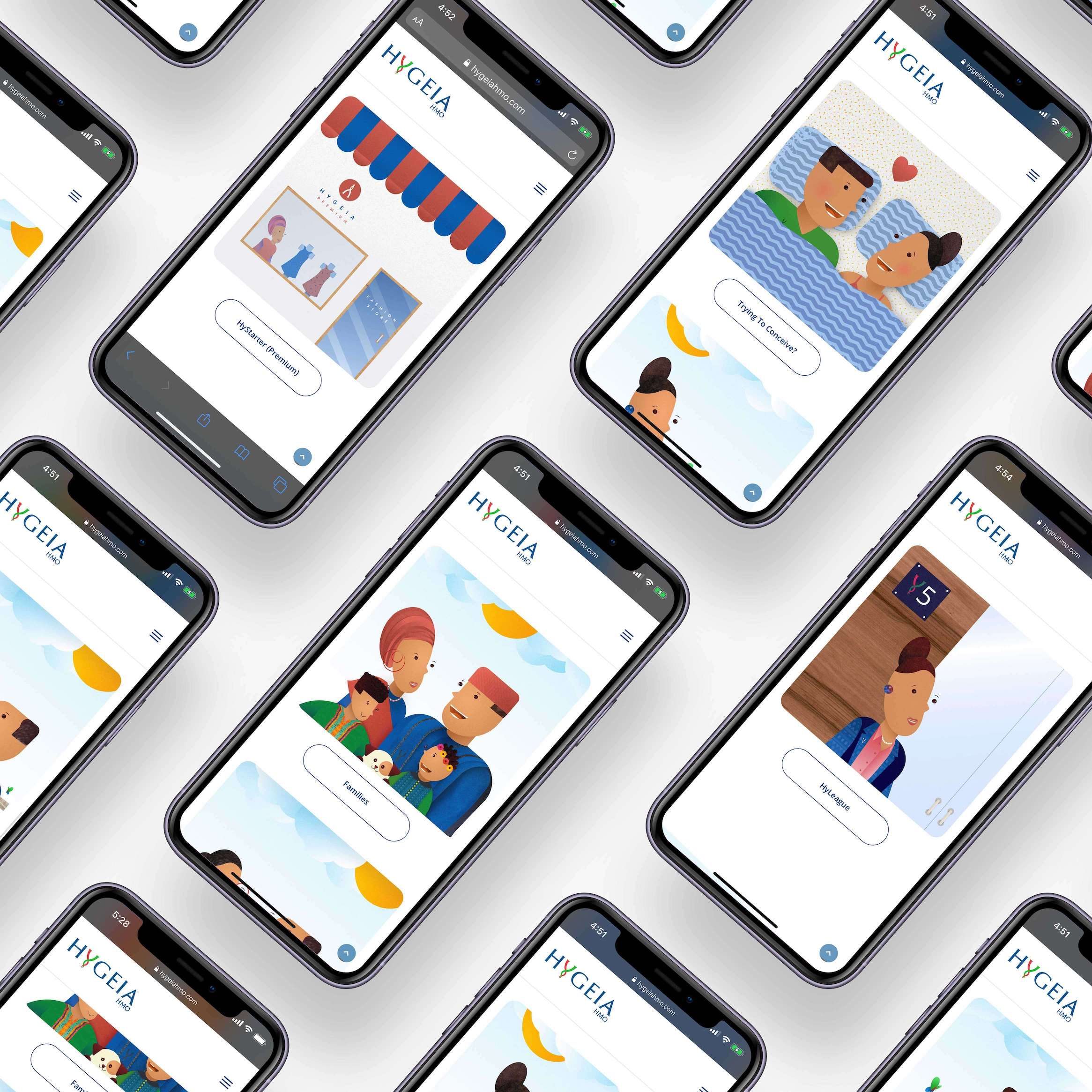
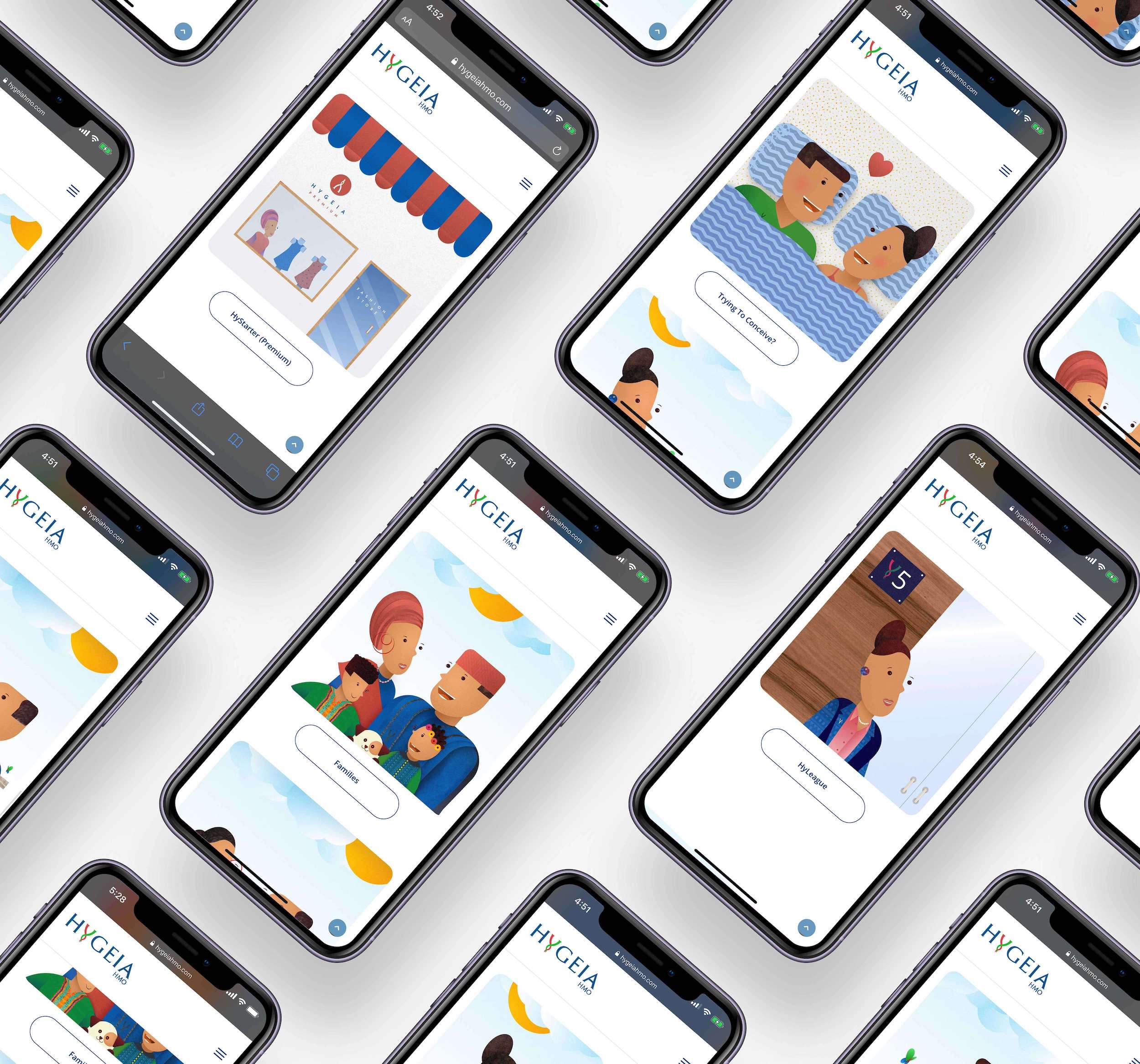
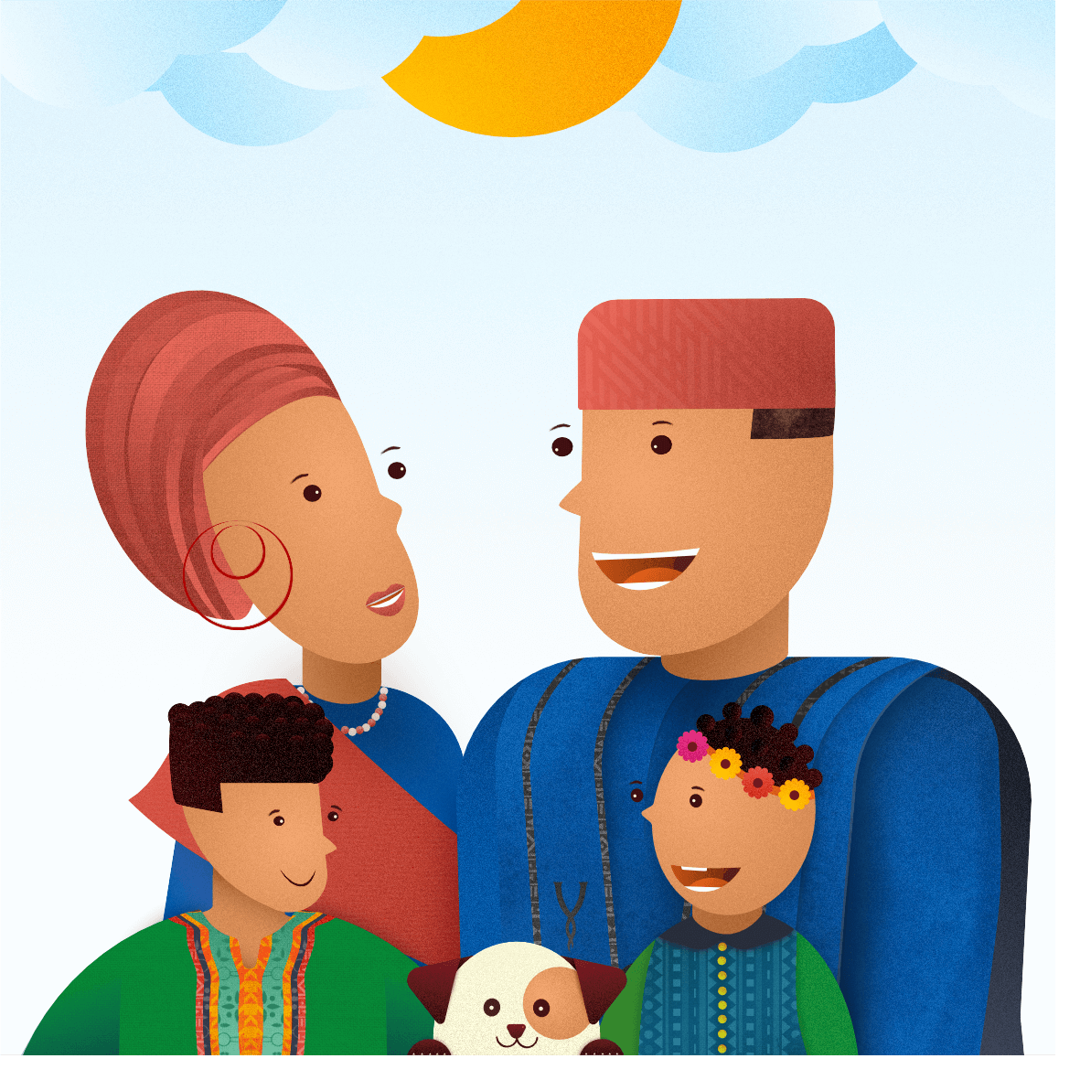
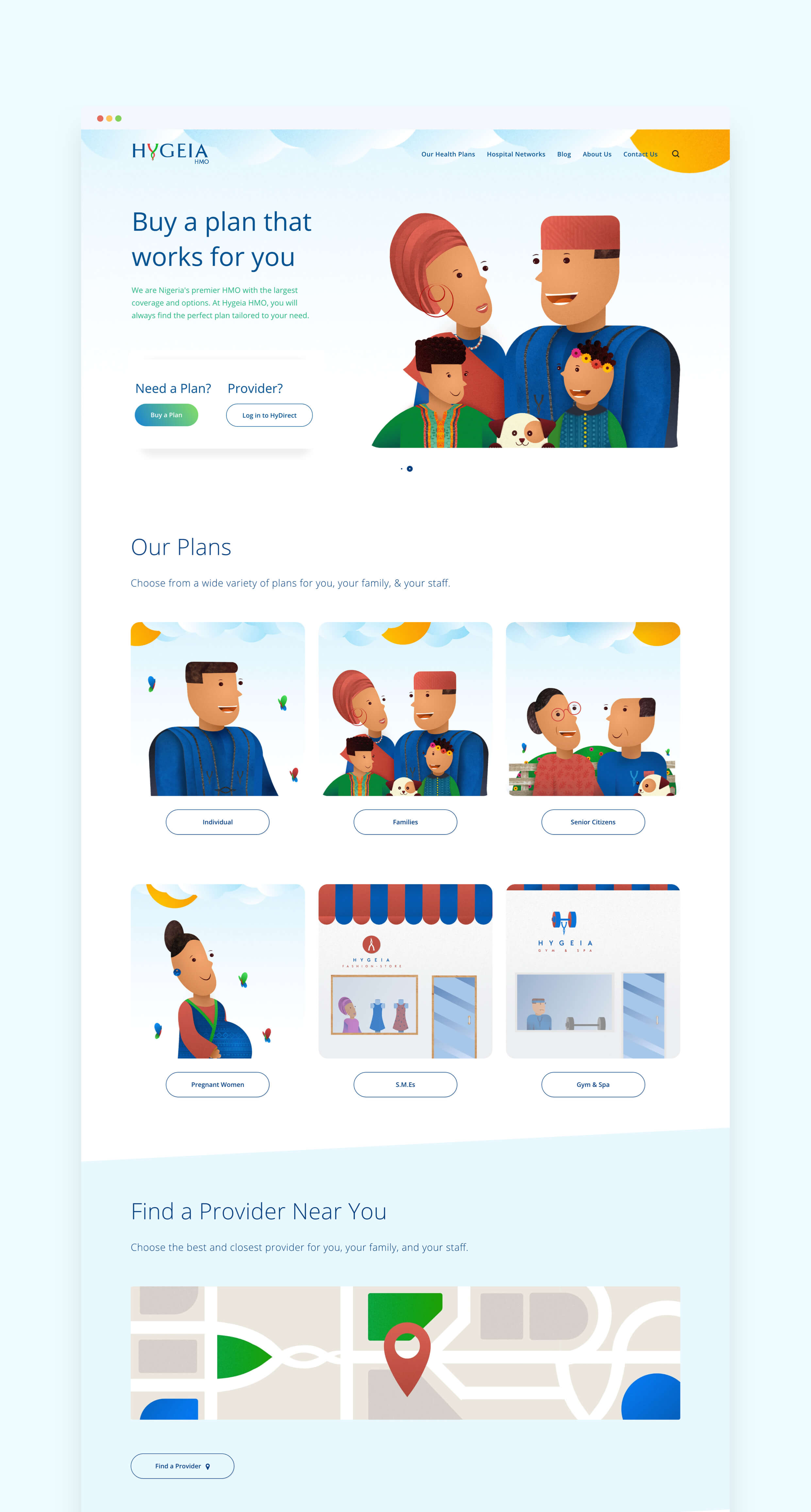
Storytelling was a crucial part of the strategy to improve the user journey. The end goal was to help users understand Hygeia’s plans and navigate their offerings easily. We created our illustrations around the story of a family.
The family starts off as a single man on a Personal Plan.
He meets his wife who is also on a Personal Plan.

They attempt to start a family together while using the Trying to Conceive Plan.

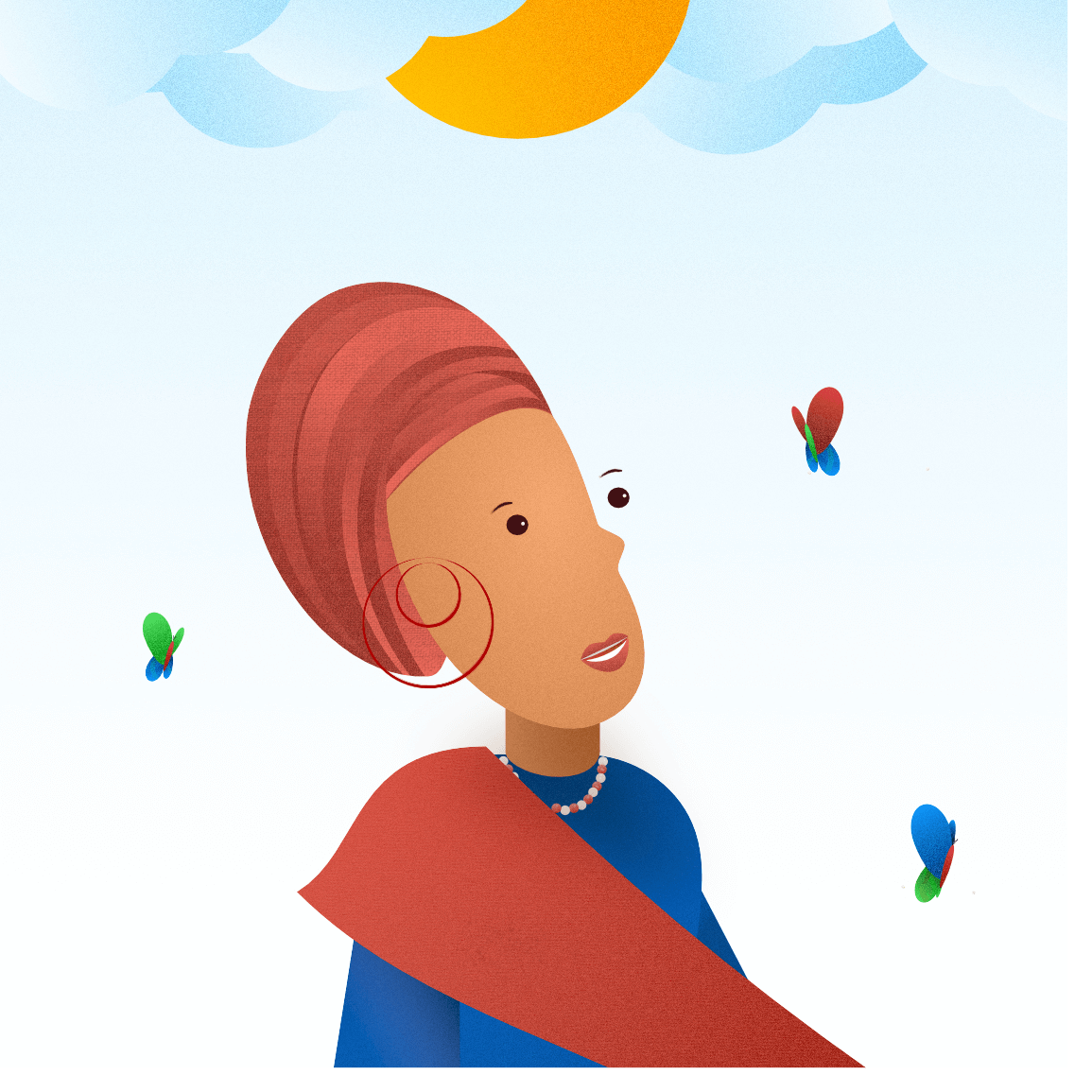
They’re successful and she gets pregnant. Now she’s on the Pregnant Woman Plan.
Before long they’ve got a full family going and are on the Family Plan.
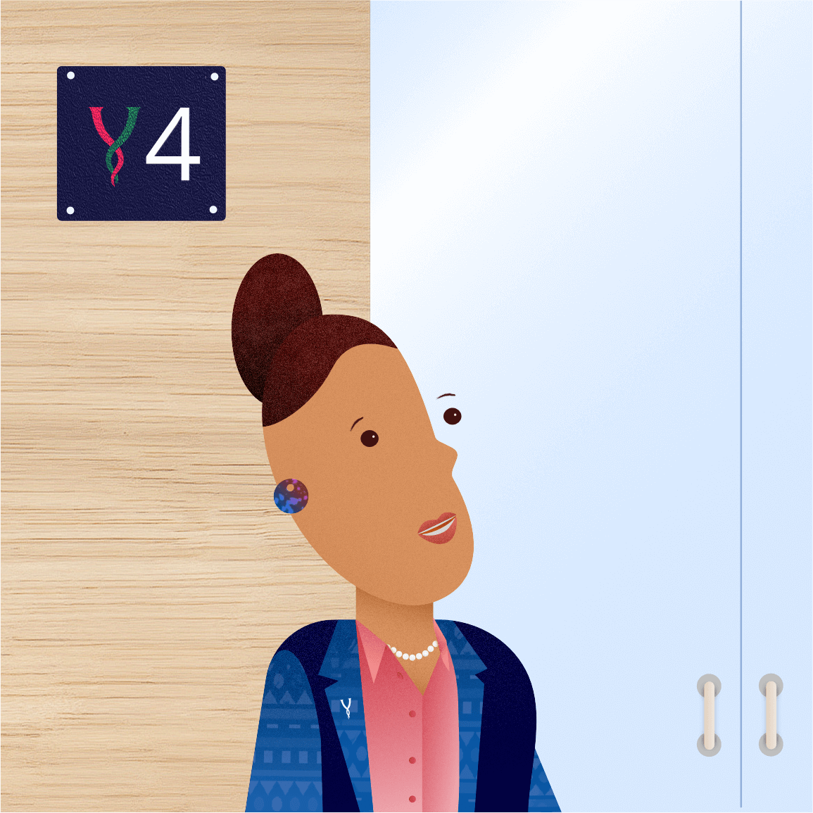
She works for a corporation with hundreds of staff who are on Corporate Plans.
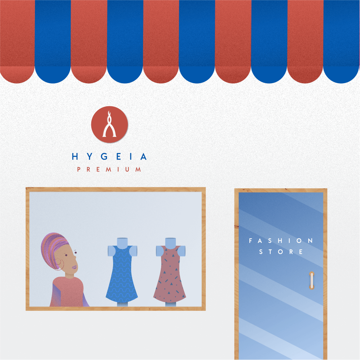
Also, she has a fashion store as a side-business, which is covered by the SME Plan.
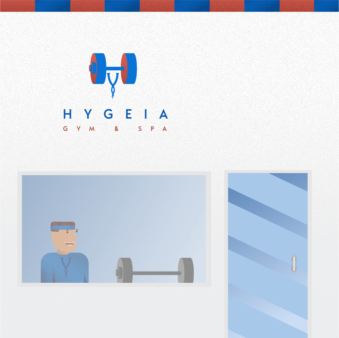
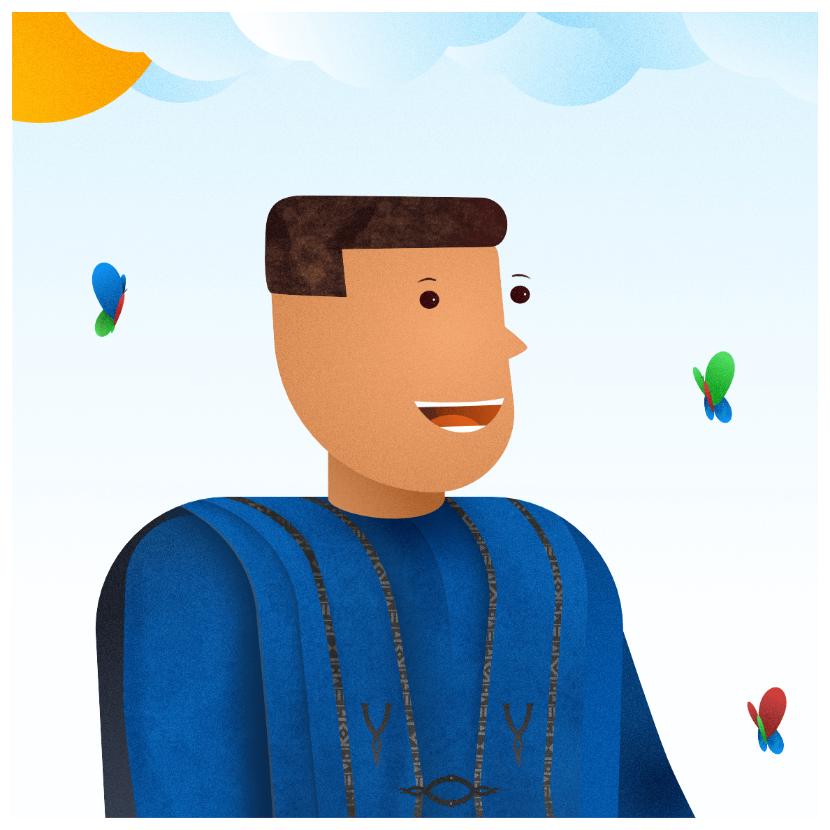
The man is able to go to the gym on the weekends since he has a Gym & Spa Plan.
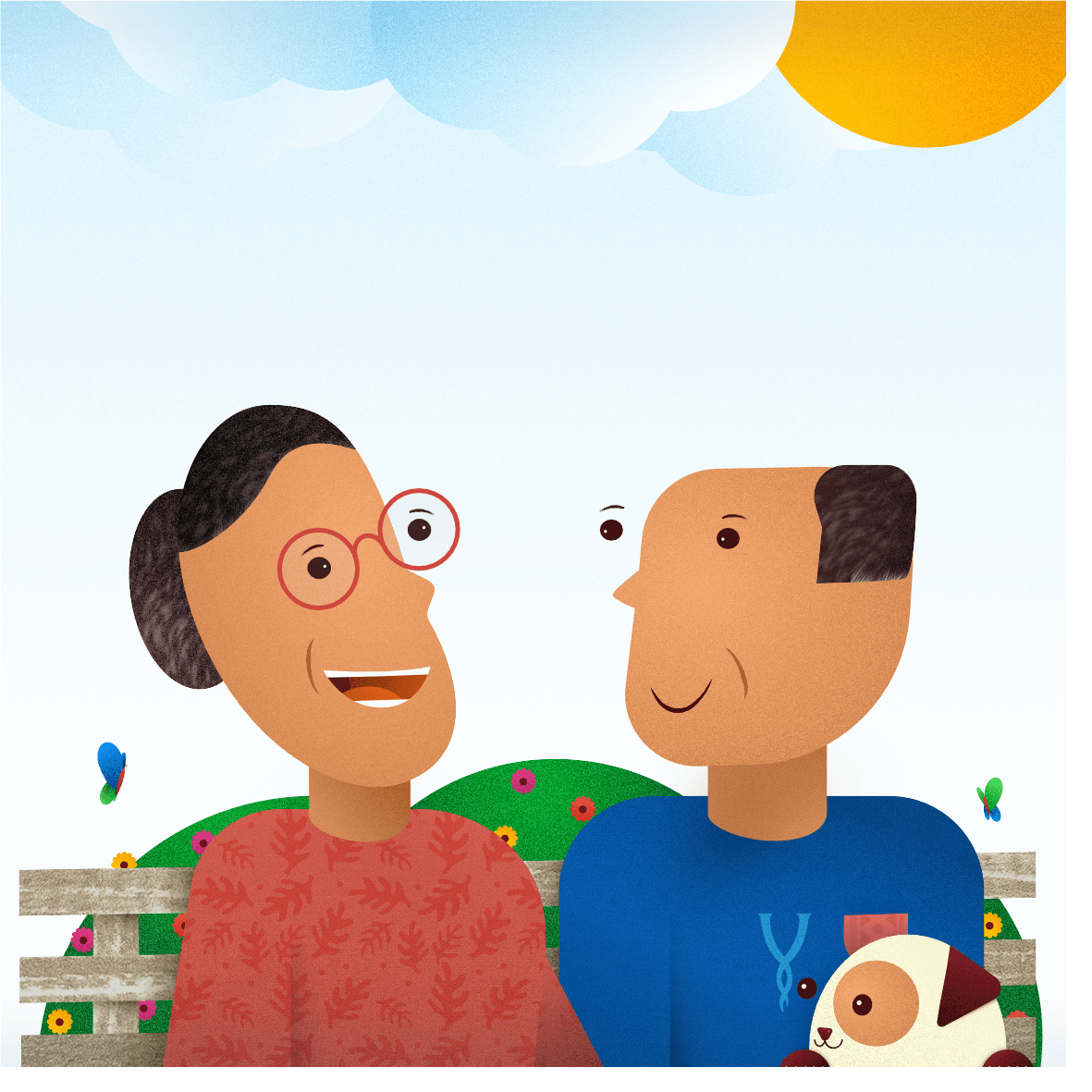
They eventually retire as they get older and live a life of bliss, while covered by the Senior Citizens Plan.
This story achieves the intended effect of demonstrating the diversity and range of Hygeia’s plans, which helped us drive the brand message that “with Hygeia, you’ll always find a perfect plan tailored to your needs – through every stage of life”.
Inspiration for Illustrations
We believe that one of the best ways to create something new is to start by drawing inspiration from what already exists. Therefore our process of creating the illustrations began with us drawing inspiration from the work of others. This act requires us to see and express gratitude for the beauty in others’ works, which helps evolve our creativity.

The eyes of the characters were inspired by those of @extrafabulous_comics’ characters, with a whimsical look that evoked a vibe of lightness and fun.
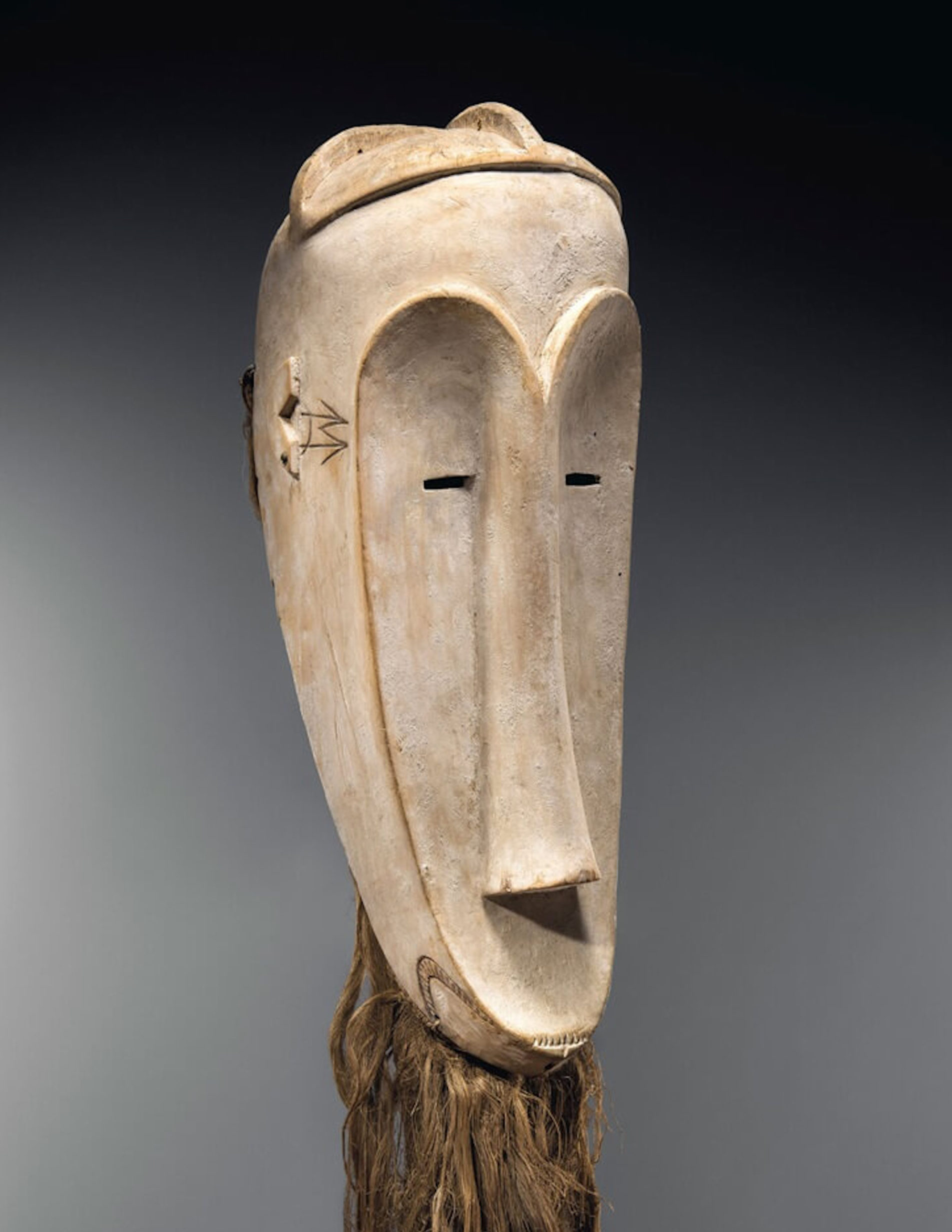
The geometric design of the faces was inspired by African face masks, specifically the Ngil masks worn by the Fang people of Gabon.

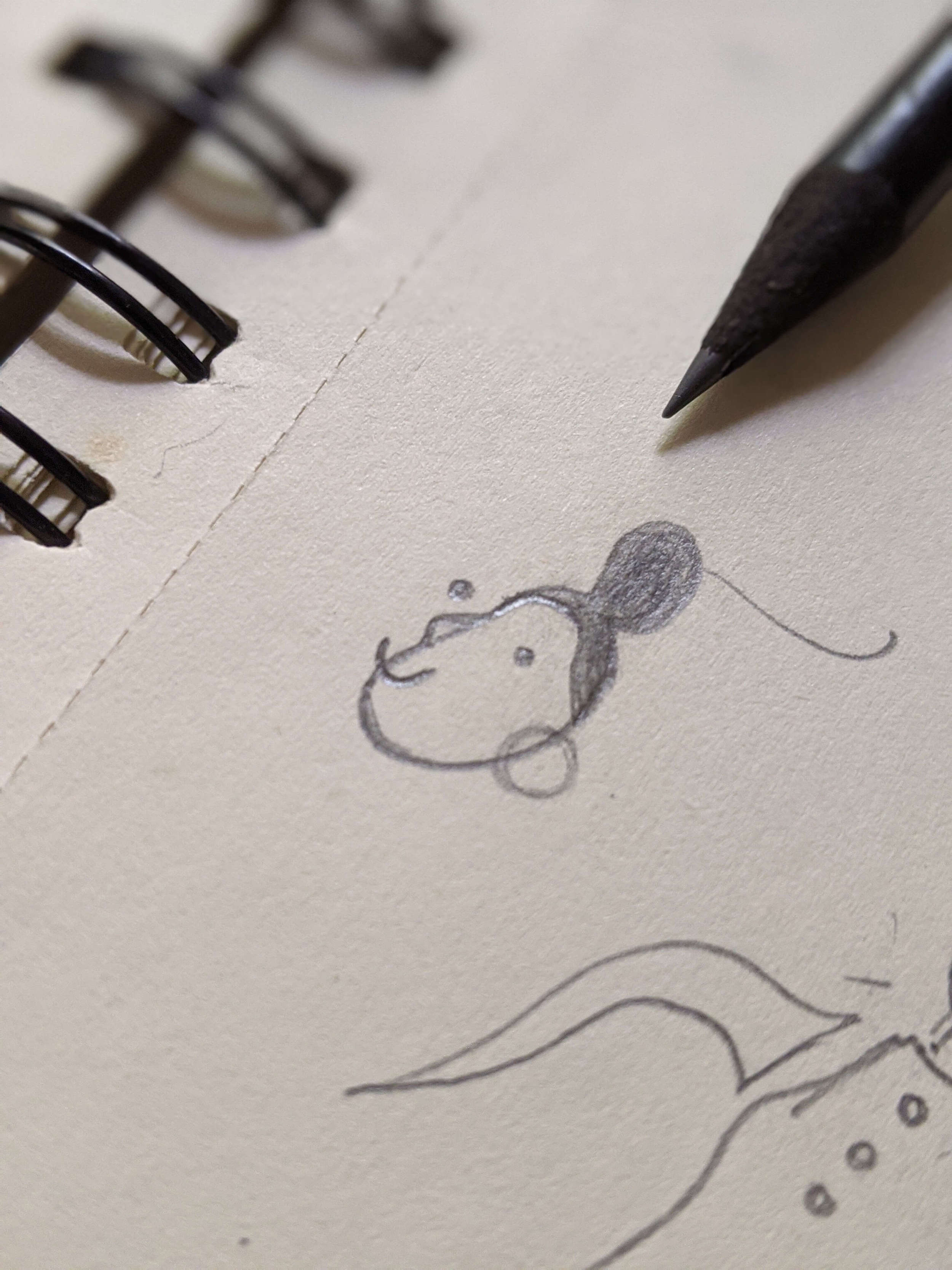
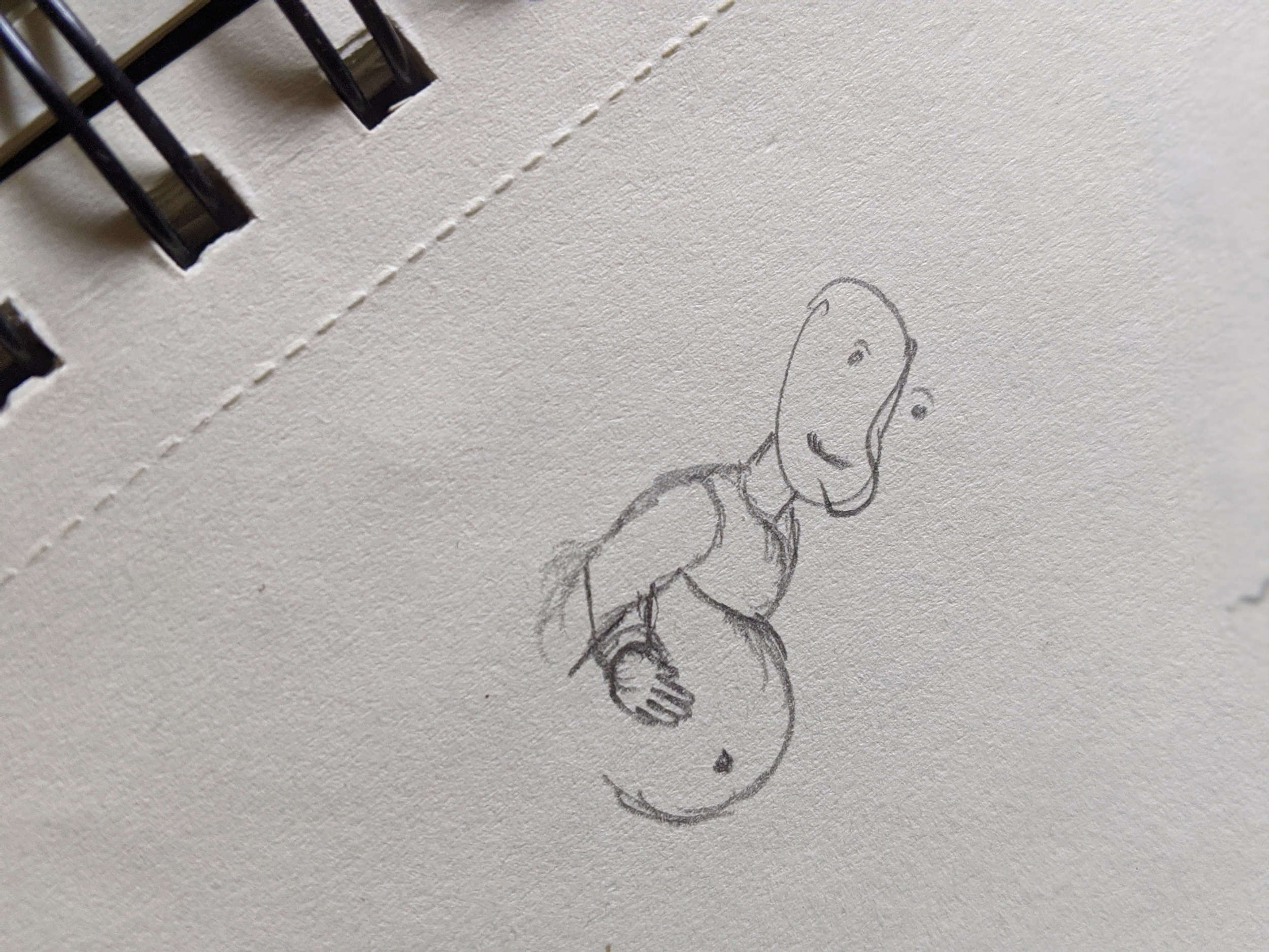
After our research, we sketched possible looks to immediately get a visual sense of what the illustrations would look like.

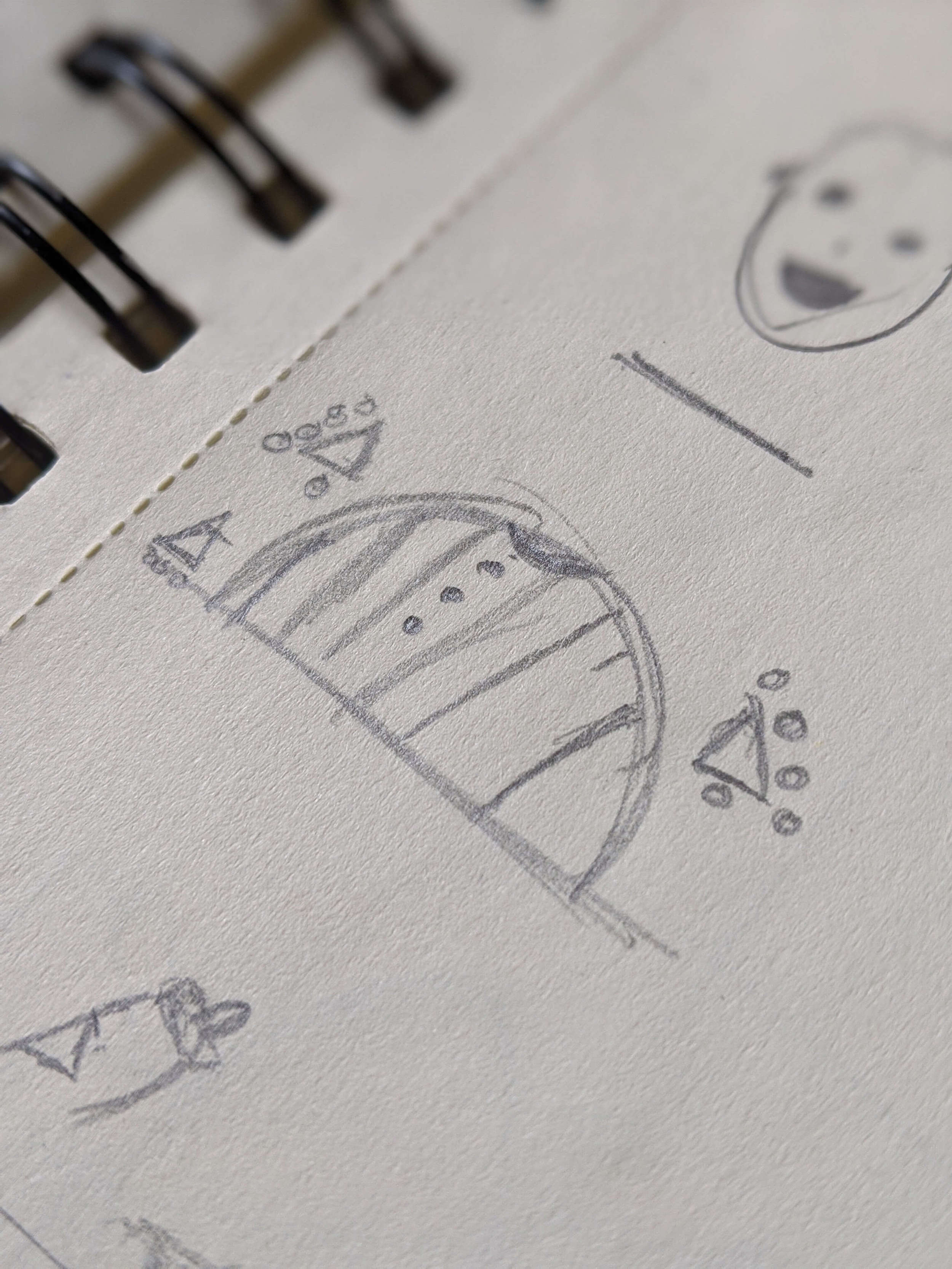

By drawing inspiration from multiple sources and sketching ideas early on, we were able to rapidly arrive at a unique foundation for the illustrations.
Brand Integration
At Akanka, we believe in the importance of pushing the energy of the client’s brand identity into everything surrounding the brand⚡️. Customers should be able to look at anything created for and by a company and feel the vibe of the company’s brand. For Hygeia, we both subtly and overtly pushed the energy of their brand into the illustrations, so that customers are consistently reminded of it.
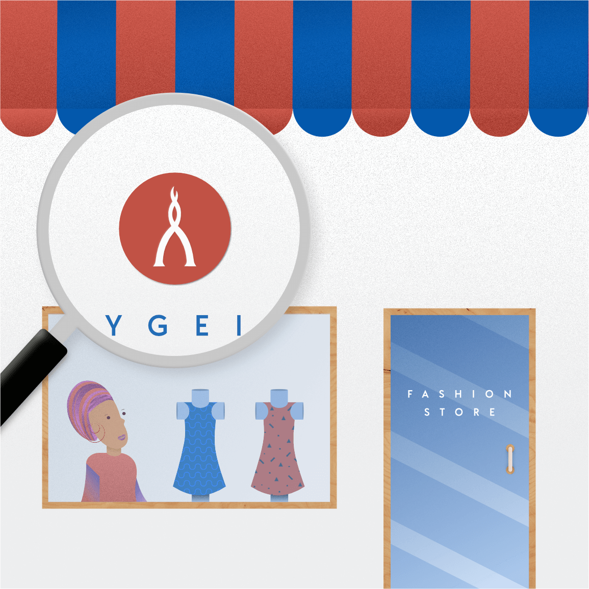
By inverting the Hygeia logo, we turned it into a new logo for the woman’s fashion store, so it resembles the outline of a dress.
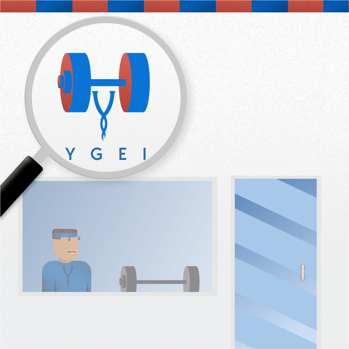
For the Gym and Spa plan, we included a gym weight to the top of the Hygeia logo, so the gym’s logo looks like the outline of a person carrying a weight.
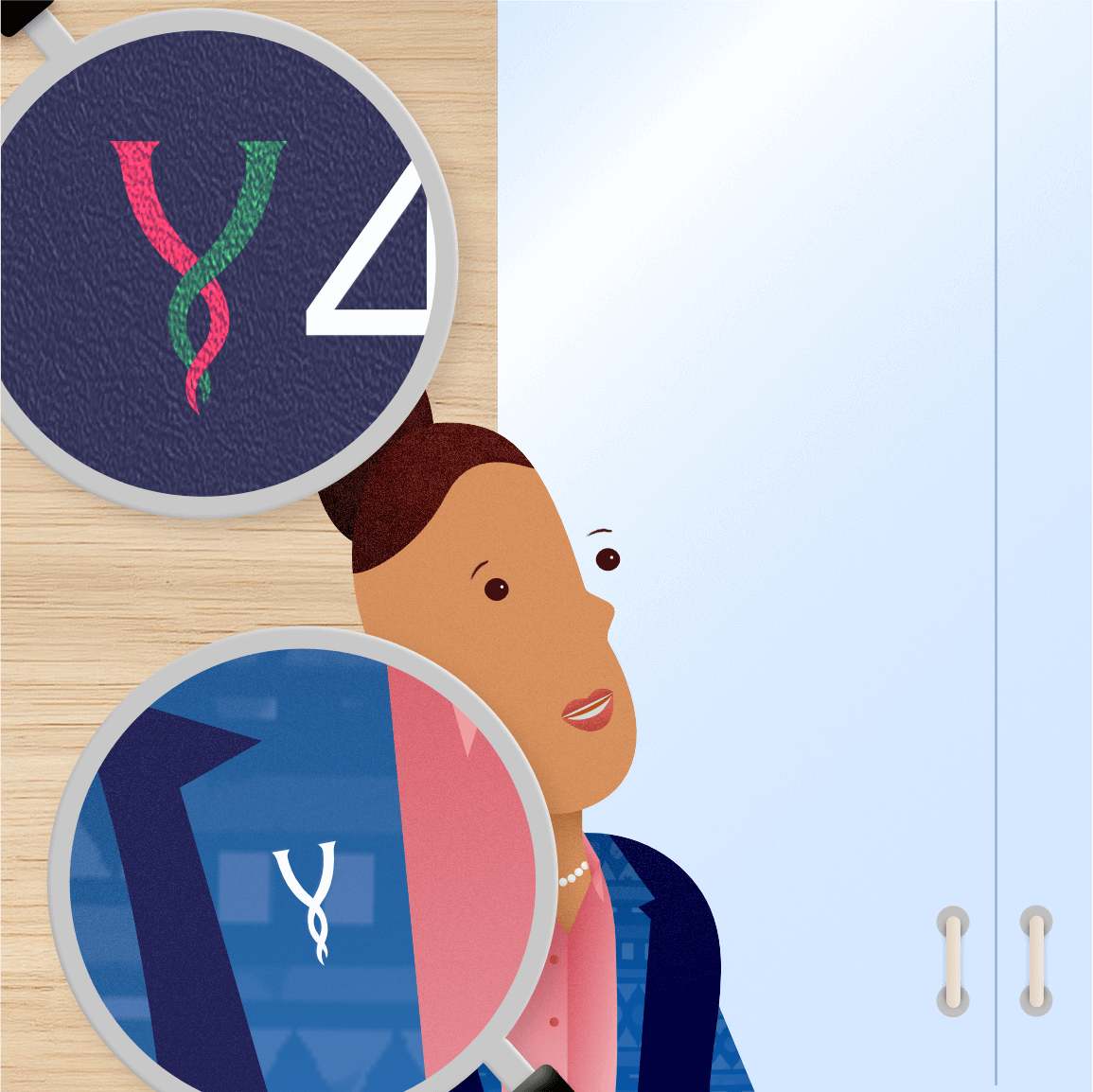
For the corporate plans, we used the logo as a pin on the woman’s shirt. You can also see the logo on the office floor sign.

We also included the logo on the man’s t-shirt.

We also included the logo on the man’s agbada (the pattern design and the agbada clasp).
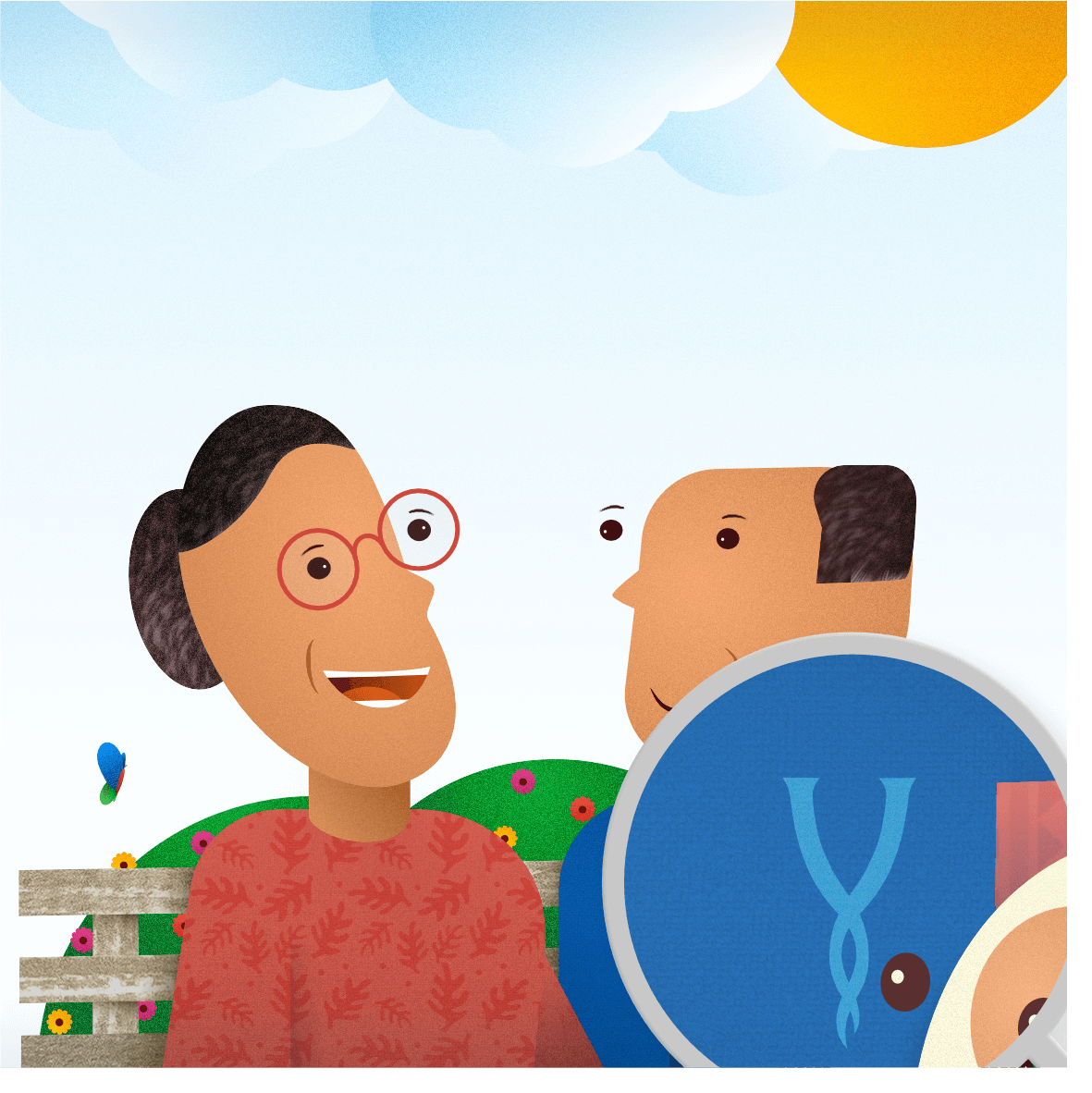
We also included the logo on the t-shirt of the older man.
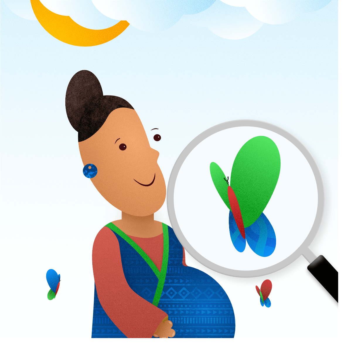
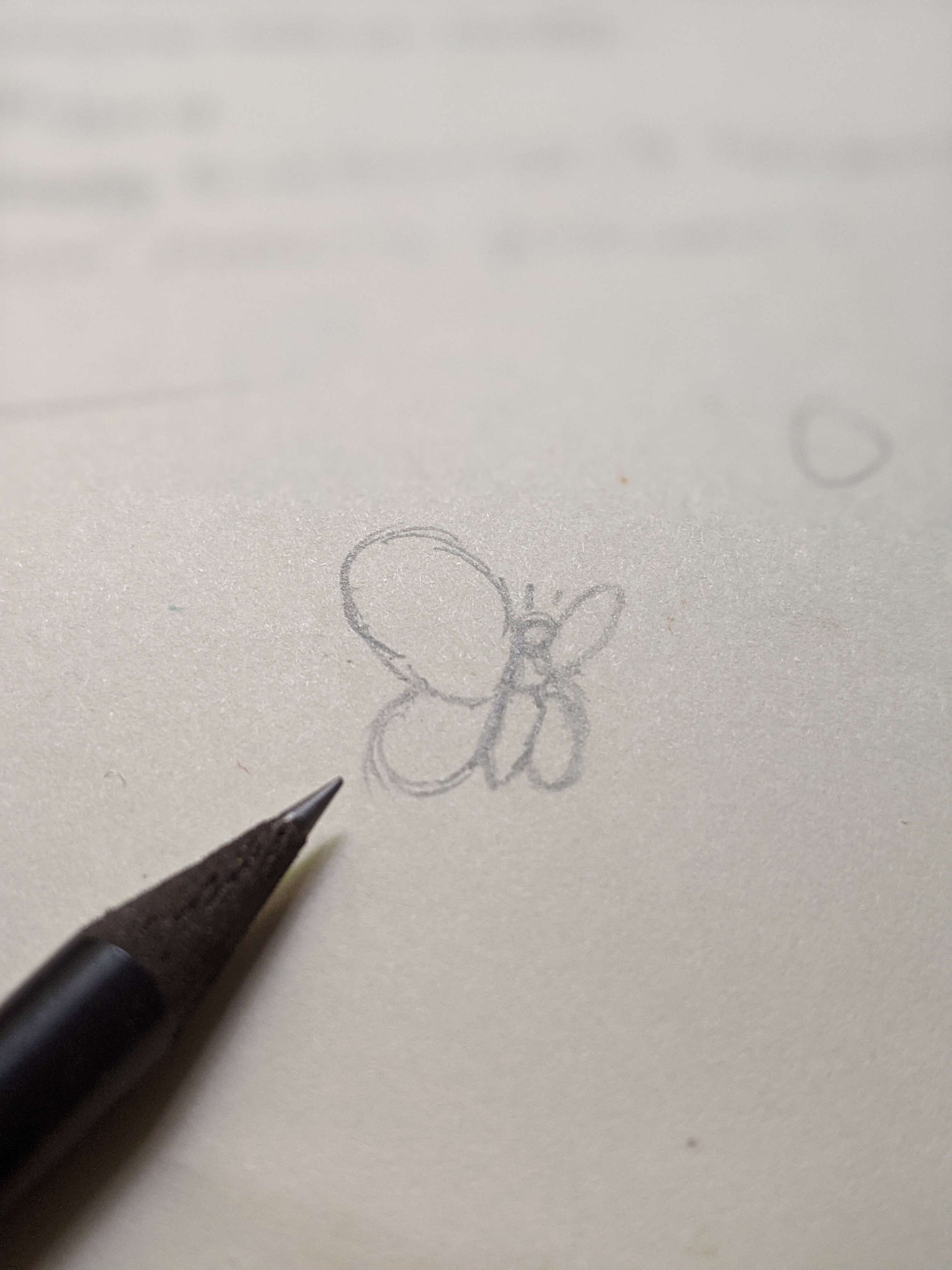
If you zoom into the picture of the butterfly, you’ll notice we used the logo’s “Y” as the butterfly’s antenna, and incorporated the Y into the patterns on the butterfly’s wings. You can also see the green Y outline on the pregnant woman’s robe.
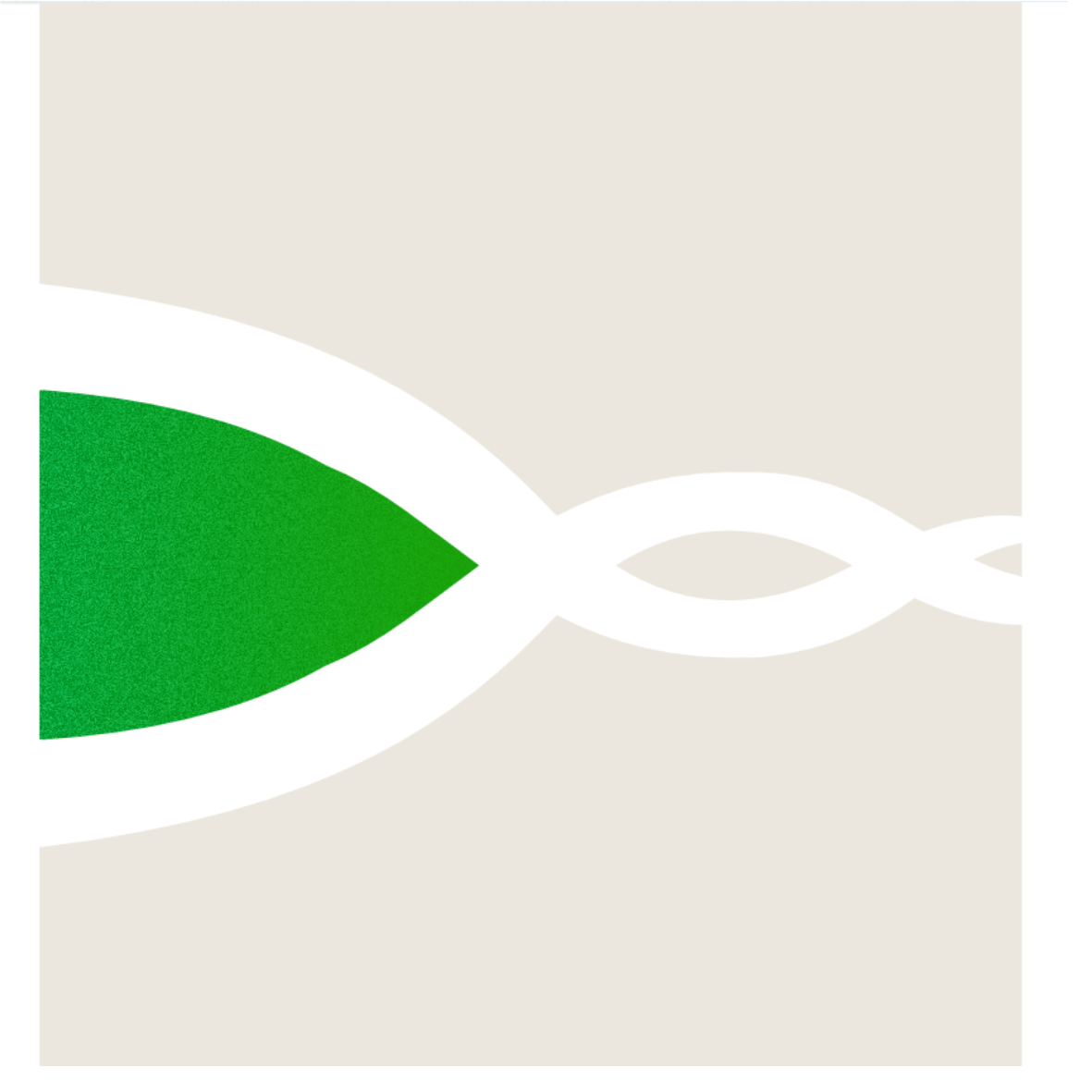
We turned the Hygeia logo into the outline of streets on the illustration for providers, alluding to Hygeia as the path towards choosing the best provider.
Additionally, across every image, we used the updated brand colors of red, green, and blue. These all come together to create a cohesive brand energy that customers feel as they browse through the plans on the site.
Designing Happiness
When creating, designers have to start from a place of intention. At Akanka, we derive our intentions from our mission of designing happiness. For Hygeia, we were intentional about designing happiness in multiple ways.
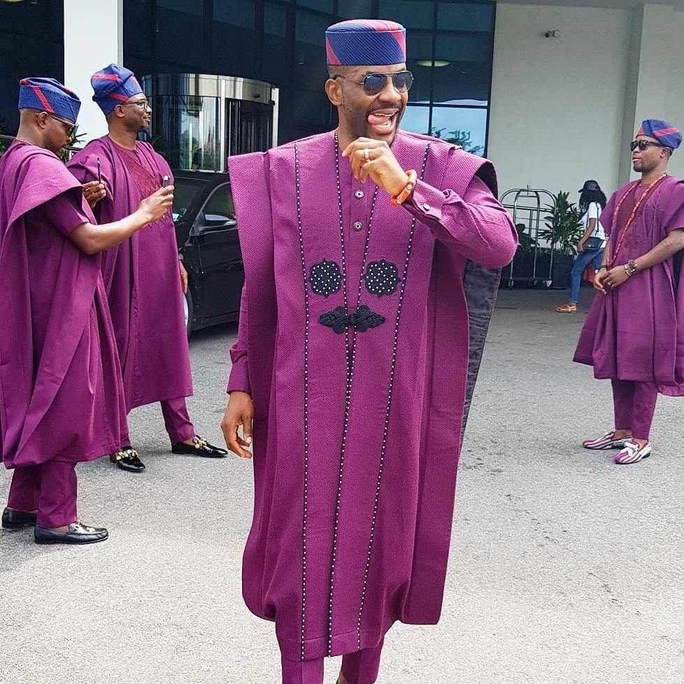
First, as an African brand, we were deliberate about clothing our characters in African apparels, as it’s important that visitors can see characters they relate to. As an Easter egg, we illustrated the man’s agbada to match the style of Ebuka’s famous agbada, which was designed by @ugomonye.official.

Second, we gave the characters smiling expressions. This conveys the happy feelings of the characters and mirrors what we want the visitors to feel.
Third, as biophilic designers aware of the importance of designing nature into our environments, we incorporated blue skies, sunlight, butterflies, and plants into the illustrations. We also included a dog because…who doesn’t love dogs? 😍
As another Easter egg, we designed the sun to change its position across the illustrations as a symbolism of the passage of time. ☀️
These all come together to create a feeling of happiness that visitors can vibe with.
Round Up
To round up our flashback on Hygeia, let’s talk about how adding stories to the user journey also improved the site’s functionality. By using stories and focusing closely on the site’s responsiveness across all devices, we were able to map out a clear journey that’s scalable. Whether you’re coming to the site from a desktop, iPad or a mobile phone, you get to enjoy a journey that has been designed to take you from discovery to purchasing a plan that’s right for you.