

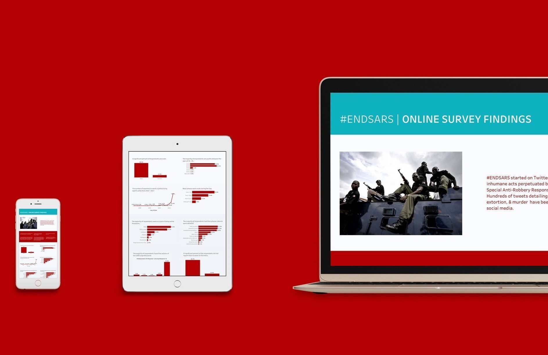
Lessons from the #ENDSARS Viz
Designing the visualization is usually the final and crucial step when working with data meant for public consumption. Cleaning, processing, and analyzing lead up to the moment where insight must inform or spur action. Given the importance of this step, how do you (as a designer, data analyst, team lead, or founder pitching his product) design for an audience that might have difficulty understanding and interpreting the data?
Using the visualization we made with data got from the #ENDSARS survey, we’ll walk through 16 design lessons we distilled from the process. We’ve segmented these lessons into two sections — the content and the user interface. Also, the full visualization can be found here.
Content
1. The first question when working with data is to ask what the point of your actions should be. Should it be to enlighten or to spur action? This helps provide clarity to the individual who might have access to numerous datasets but will have to focus on the most important.
2. Look through your data and decide if a central narrative exists. The next step when you’ve figured out a narrative exists is to ask “so what?”. Your answer helps you figure out if you’ve made the right choice. However, flexibility might be key in other contexts. Sometimes it might be up to readers to decide what pattern they see.
3. Layout the context. You might be tempted to immediately delve into the graphs when creating your visualization, but hold off it. Instead, start by laying out the context of your work. The context sets the foundation for the information visualized and acts as a mental map for your readers as they go through the visualizations.
4. Use images when appropriate. Humans are drawn to images — especially images of other humans. In this case, an image of the police reduces the sense of distance and abstractness a reader might feel towards the insight delivered by the visualization.


5. Lay out the emotional narrative through stories, in this case, stories from respondents. Stories personalise your results and increase emotional investment in them. Those who suffer from the abuses of the SARS stop being mere statistics when the reader can empathize with their experience. An entry from the survey said, “Officer John Doe killed my mother.” No statistic can get more chilling and emotive than that sentence.


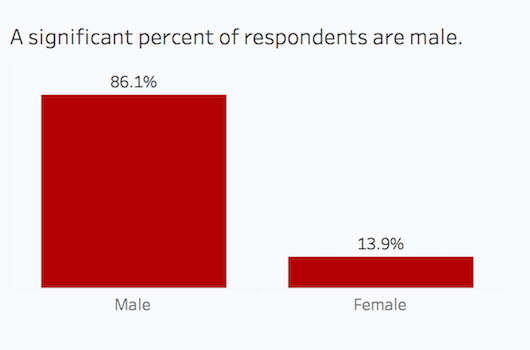
6. Ensure consistency of metric — whole numbers or percentages — depending on contexts. You do not want your users tediously switching between metrics. We decided on percentages in this visualization in order to get a sense of portion i.e. how much weight a response held compared to the total responses.

“Simplicity is about subtracting the obvious and adding the meaningful.” – John Maeda, The Laws of Simplicity
7. If you have few data points in your graph, get rid of the y-axis (vertical) label if possible and move the specific numbers to the top or within the bars.

8. Resist the temptation to use pie charts, as they make it difficult for readers to visually discern hierarchy in size or amount. Bar charts might be boring, but they are far more effective. Also, using different types of graphs does not make your visualization more interesting or enlightening. Sticking to one or two types of graphs (within functional considerations) leaves your readers feeling far less cognitively strained as they don’t have to struggle to interpret multiple graph types.
“Choosing graphic forms is largely dependent on the messages you wish to convey, or the insights you want to get.” – Alberto Cairo, The Truthful Art
9. Headers should state the main insight from the graph. Instead of dull descriptive texts, you should strive to ease readers into the graph with a concise statement of the graph’s top insight.


User Interface
1. Sketch your viz design on paper. Creating a rough sketch on paper helps you visualize where every element should go. Sketching with paper also frees you from the imaginative constraints that accompany using an electronic device.


2. Generously use whitespace i.e. the portion that is left blank. Don’t crowd out the visualization’s background with the size of the graphs, and ensure symmetry all through. Ensuring symmetry through the proper use of whitespace guides the reader’s attention to the graphs and allows them to experience a sense of flow as they go through the visualization.

3. Use color sparingly. One or two colors should suffice, as multiple colors distract the user from the content of the visualization. In this visualization, our Akanka Brand colors only go in the header and footer as a way of indicating the start and end of the visualization.

4. For the graphs, use a color that matches the context or narrative. The focus on the oppressive actions by the SARS meant a warmer color was more appropriate than a cooler color like blue or green.

5. When you decide on a color, be consistent with the use of that color across the visualization. Only veer from this consistency if functionally required to. For example, you can use 2 colors if contrast has to be emphasized. Alternatively, the same color in varying shades should suffice.
6. When segmenting your visualization, different shades of the same color can be used to create the effect of delineation. By using varying degrees of grey, we were able to consciously/subconsciously cue the reader to the different groupings without labeling these groups.


7. The way to make your visualization aesthetically pleasing and visually effortless for the readers to follow is to ensure font consistency in type and in size. Use one font type or at most two. Also, ensure that font sizes are uniform across graphs and reflect hierarchy in visualization.
8. Most importantly, make sure your viz is responsive by designing for every device type — mobile, tablet, and desktop.
“The key to any visual design is the presentation of a cohesive, structured, readable, and understandable composition.” — Alberto Cairo, The Truthful Art
Decide if the aim is to impress or to educate. If your aim is to educate, adopt the habit of asking “What can I do to make it easier for my readers to comprehend?” Employing this question and going through this list should give you the necessary framework to create visualizations that are minimalist, engaging, and effective.
As always, thanks to Mohini Ufeli for reviewing and editing.
