

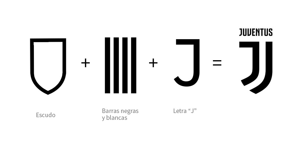
Redesigning brands can be tricky business — especially when they have strong followings. Ask Juventus — an Italian league football team — who recently revealed their new minimalist identity to a deluge of derision from social media. In spite of the vitriolic reaction to the logo from staunch Juventus fans, professional designers agree that the Juventus logo redesign is indeed brilliant and appropriate for a club seeking to break from the standard mould of a football team into a more marketable brand like Manchester United or Real Madrid. Redesigning a logo embedded with historical and emotional connections can be tricky for design agencies, especially considering how hard it could be to figure out what would please or infuriate sport fans.
Fortunately, most agencies or freelancers will have to deal more with redesigning for companies than for teams with passionate fans. However, even in the case of companies, some develop brands strong enough to evoke emotional reactions from their consumers. Nike and Apple are classic examples of such companies. In such cases where a designer is commissioned to rethink such dominant brands, agencies must be careful to fulfill the objective of bringing the brand forward while preserving elements that are seen as core to the design.
This involves an examination of the symbolic components that make up the current identity and a measured consideration of what the new brand aspires to be.
With this flexible approach, designers are able to allude to the history of the brand, thereby preserving its roots, while boldly stepping into the future. By considering the core themes of the brand, designers can create new elements that best represent these themes. And by analysing the meaning behind the old logo’s elements, designers can decide which elements make it into the new one.
This flexibility varies based on the brief. On some occasions, preserving the thematic direction of the old logo proves successful. When we worked with Stand to End Rape (STER) to redesign their visual identity, we incorporated elements from the old logo in a modern and deliberate manner that kept the new logo thematically similar, but functionally and aesthetically better.
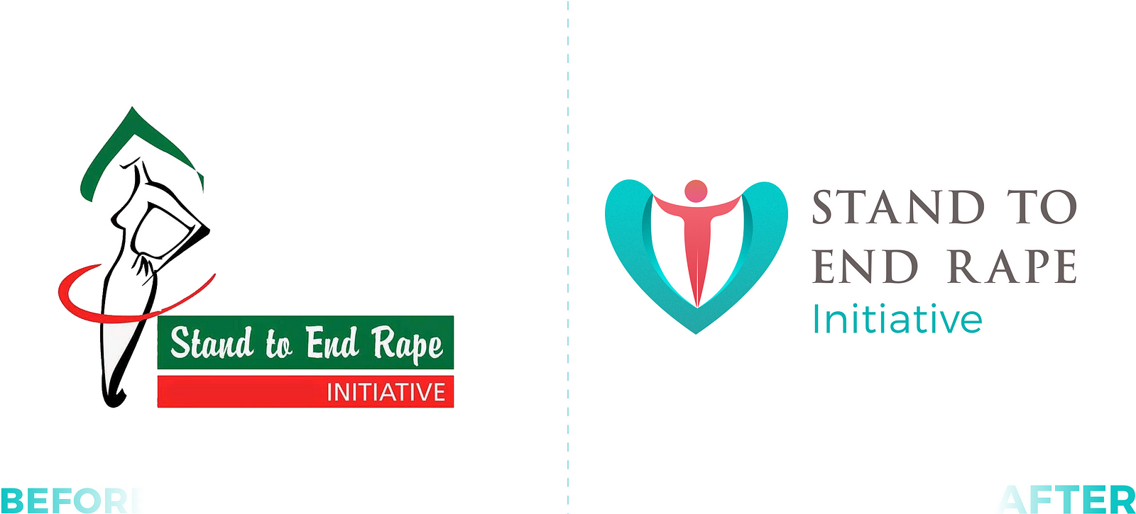
Every element in the former logo makes its way into the new logo in a clearer, more purposeful way. The abstract band around the figure in the old logo morphs into the arms of the new androgynous figure that account for both male and female humans. We inverted the abstract green, gave it a more peaceful tone of teal and modified it into a symbol of love that doubles as a shield. Also, we balanced emphasis between typeface and the logo type by evenly weighing their sizes. And by modifying the font type, we made it more legible for print and electronic display.
Observe how the logo mark functions as a monogram
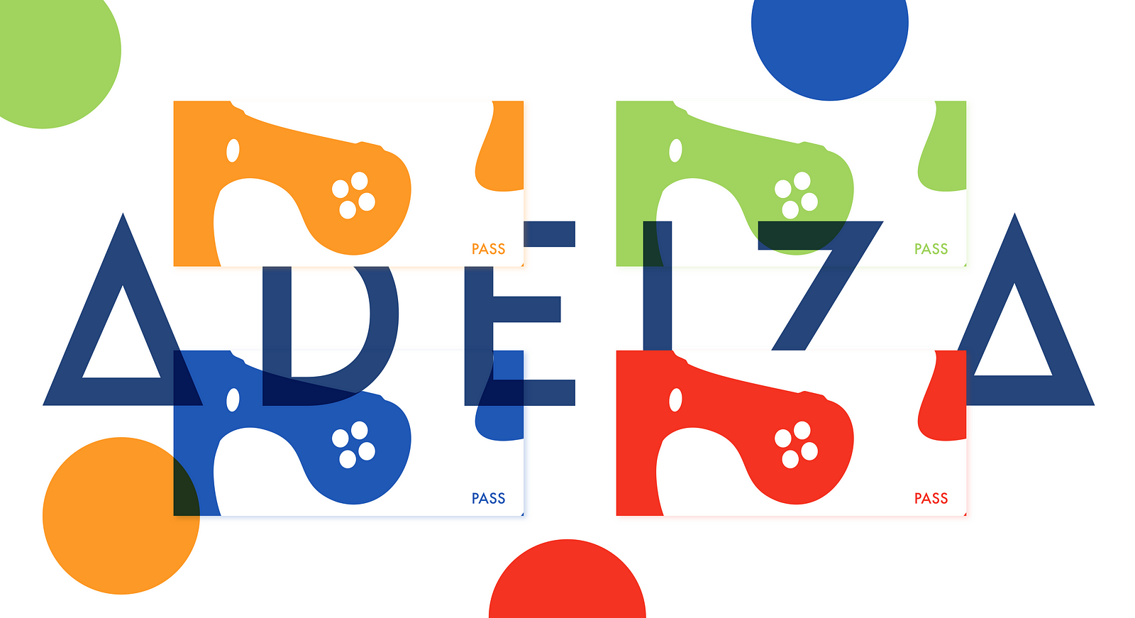
In contrast to the previous identity, here’s an instance where an old logo’s elements did not reflect the brand’s aspirations, and gave us room to completely overhaul the design. Adeiza Gaming is a gaming events company in Abuja. Their old logo had a retro look reminiscent of 1970–80’s arcade centres — a fitting nod to the idea of convergence of gamers. However, the founder of Adeiza Gaming saw their event as a unique collective experience incorporating the latest advancements in gaming — from high graphic football, racing and shooting games on PlayStation 4 consoles to the rarer Virtual Reality (VR) headsets.
Our job was to figure out how we could incorporate all these elements into a distinctive visual identity. Here’s the result.
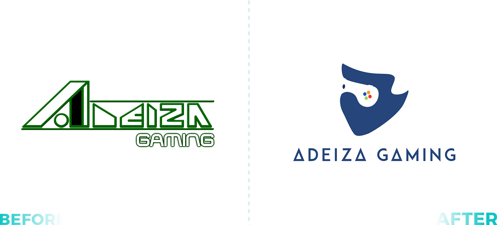
Their new logo features 5 colours, 4 of them vivid colours which are inspired by the Xbox game controller. The game pad, depicted through the use of negative space, doubles as VR goggles. The typeface isn’t left out as it features a modified Futura with the ‘A’ reflecting the triangle from a PlayStation game controller.
As shown, there’s no strict formula, instead this approach allows designers start from the current elements while including the brand’s aspirations. It really doesn’t get more flexible. So armed with the two steps included in this approach go thee into the world and make brief work of that brief. (Yes, pun intended. Puns make great designs, but that’s a topic for another day.)✌🏾