
Akanka Space (Kitchen)
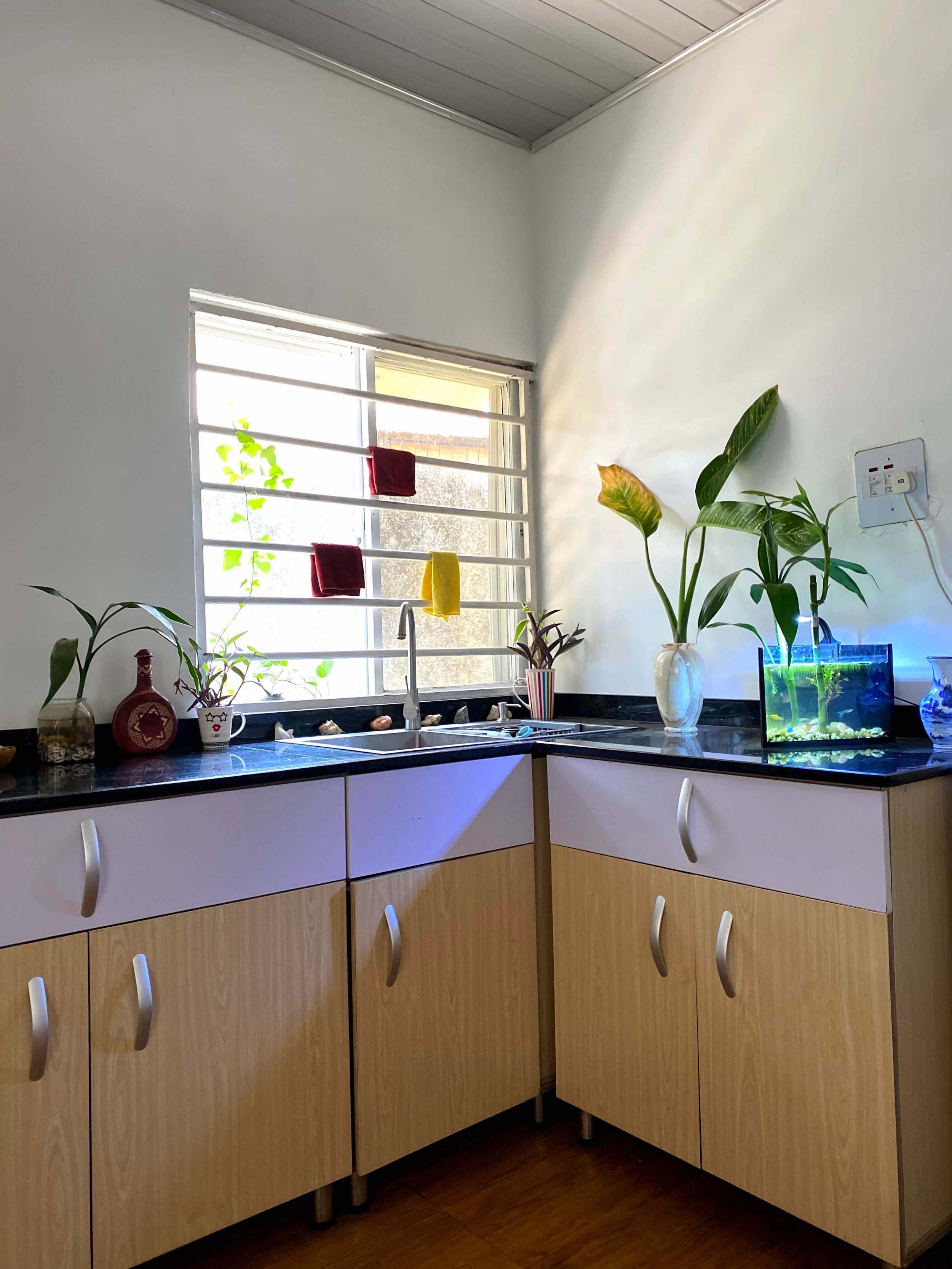
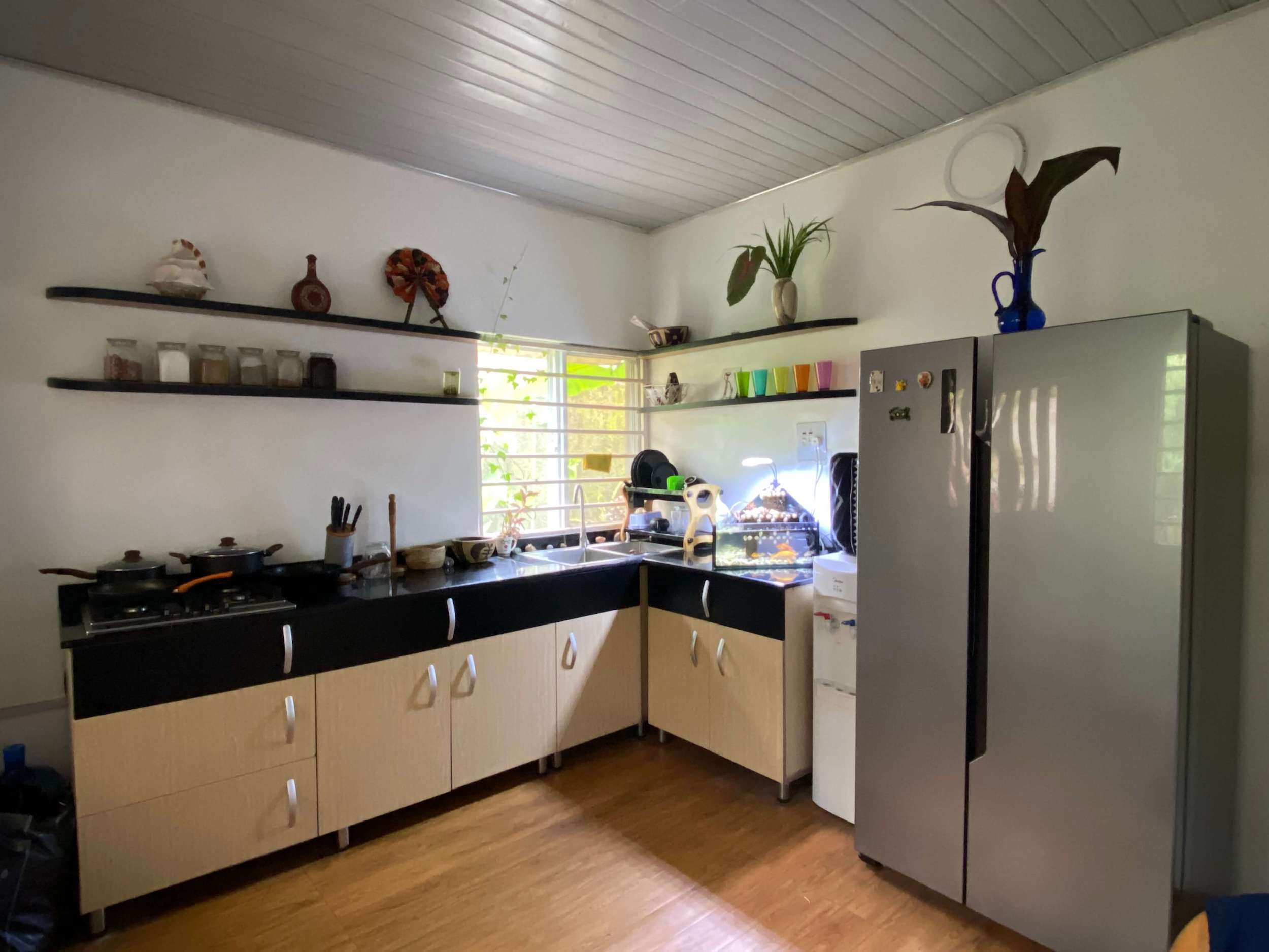
One of the first places to get right in a space is the kitchen. After all, everyone’s got to eat 🤤. We redesigned our Abuja Studio’s kitchen into a larger, warmer, greener, and more peaceful space that doubles as a dining room.
Our Design Process
Here’s our mental design process for anything we design, from brands & spaces to mindsets. We:
1. See it as what it is
2. Find reasons to be grateful for it
3. See it as what it can be
Designing the future requires gratitude in the present.
In the beginning…
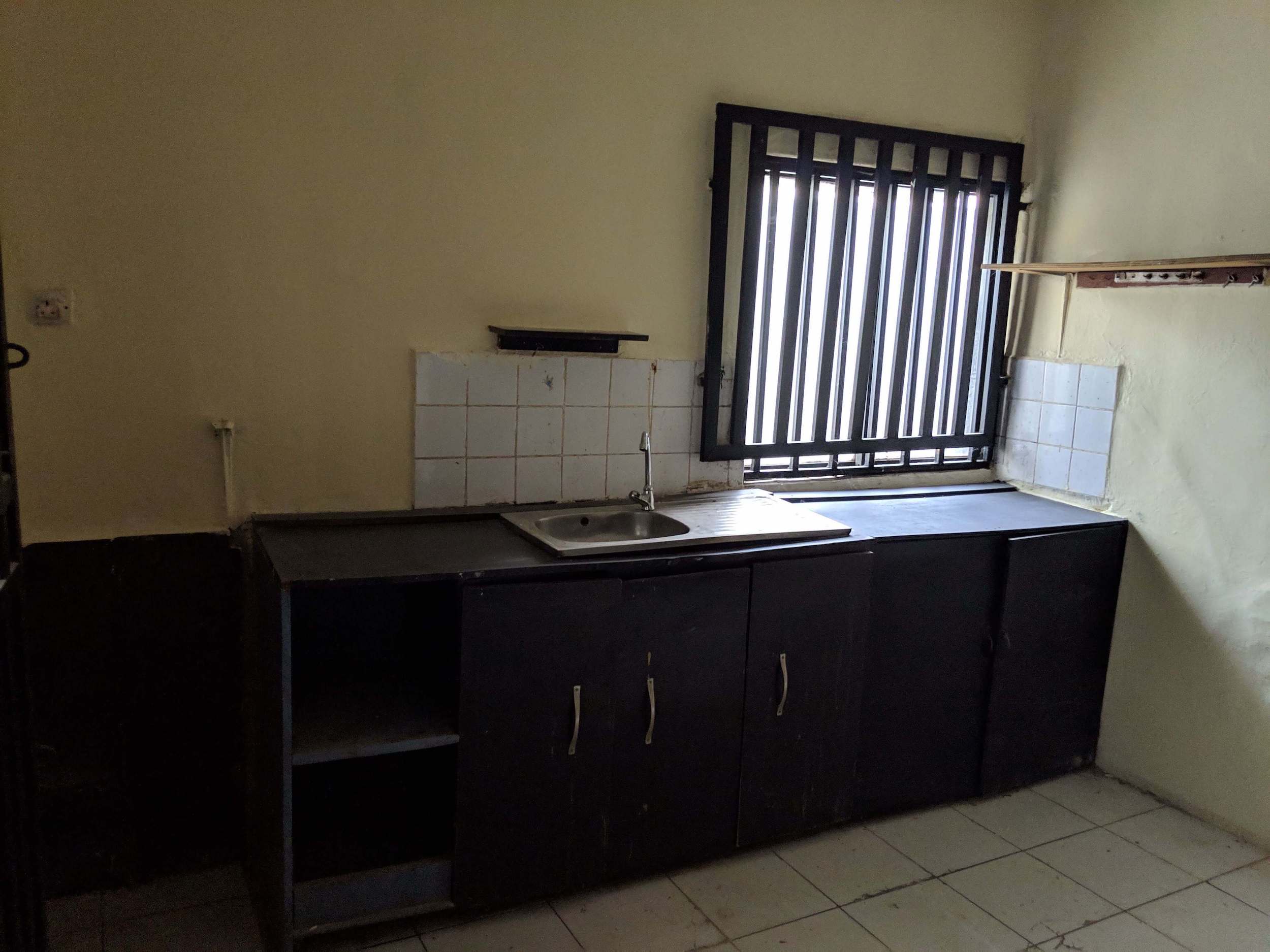
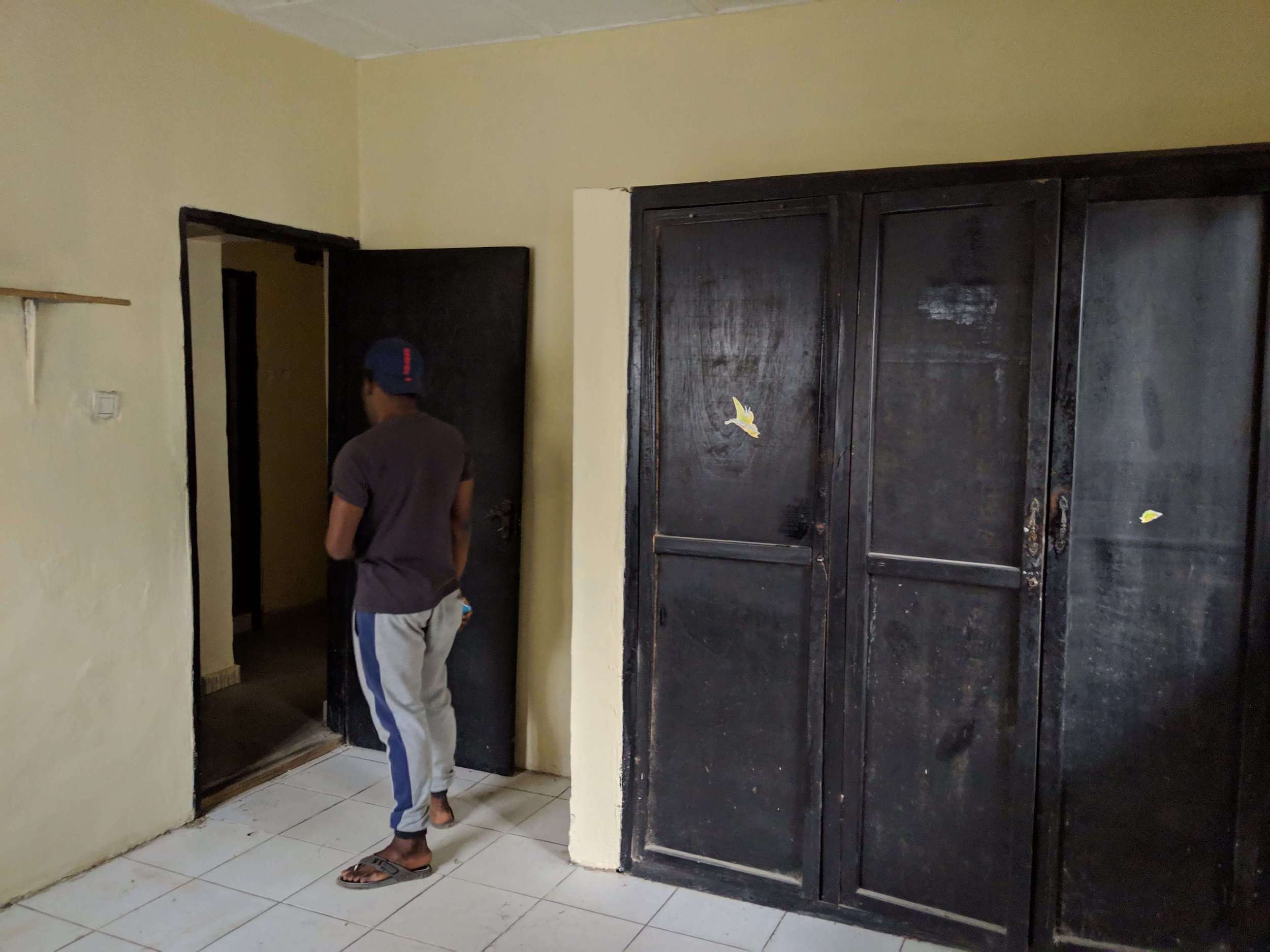
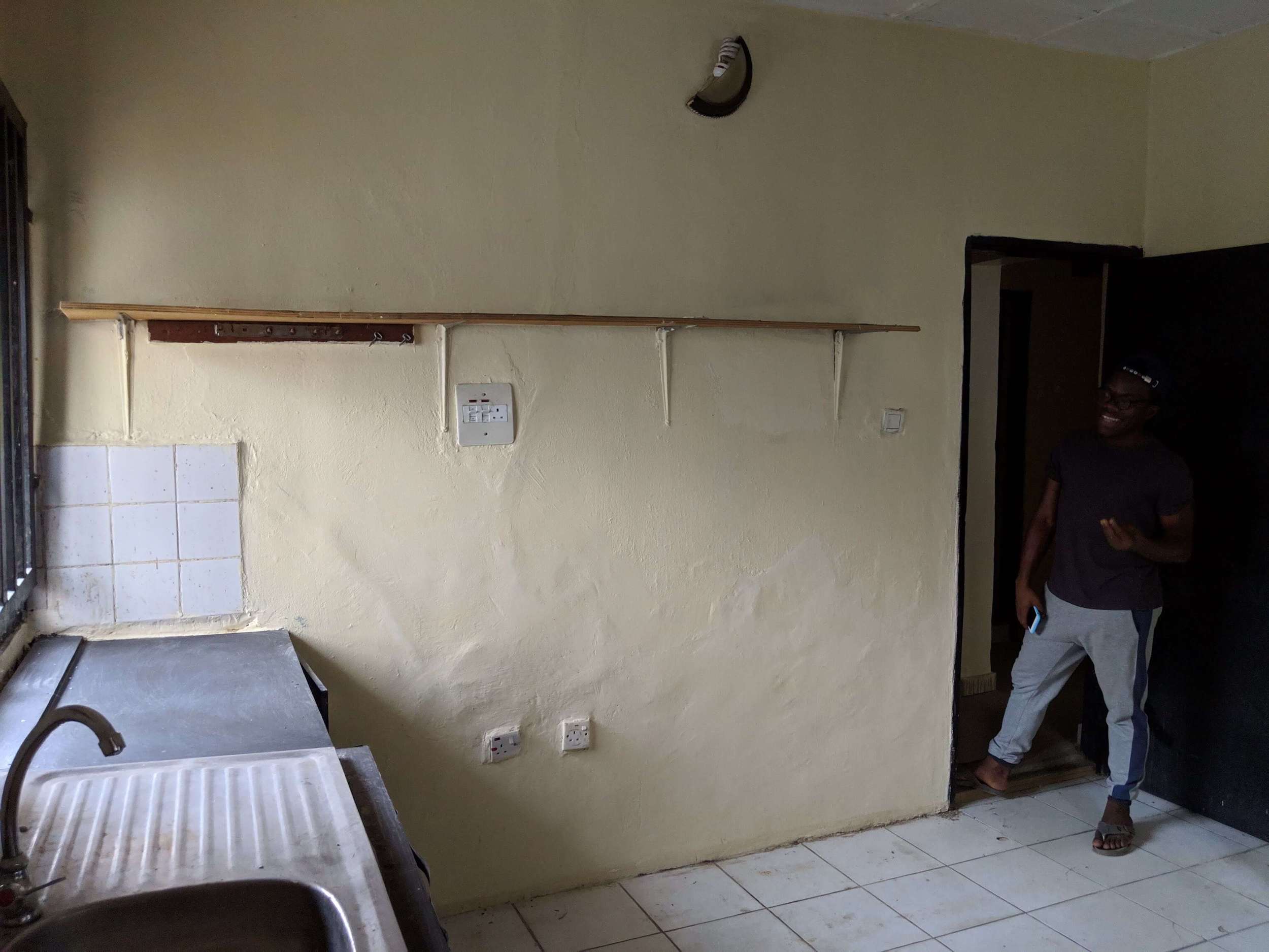
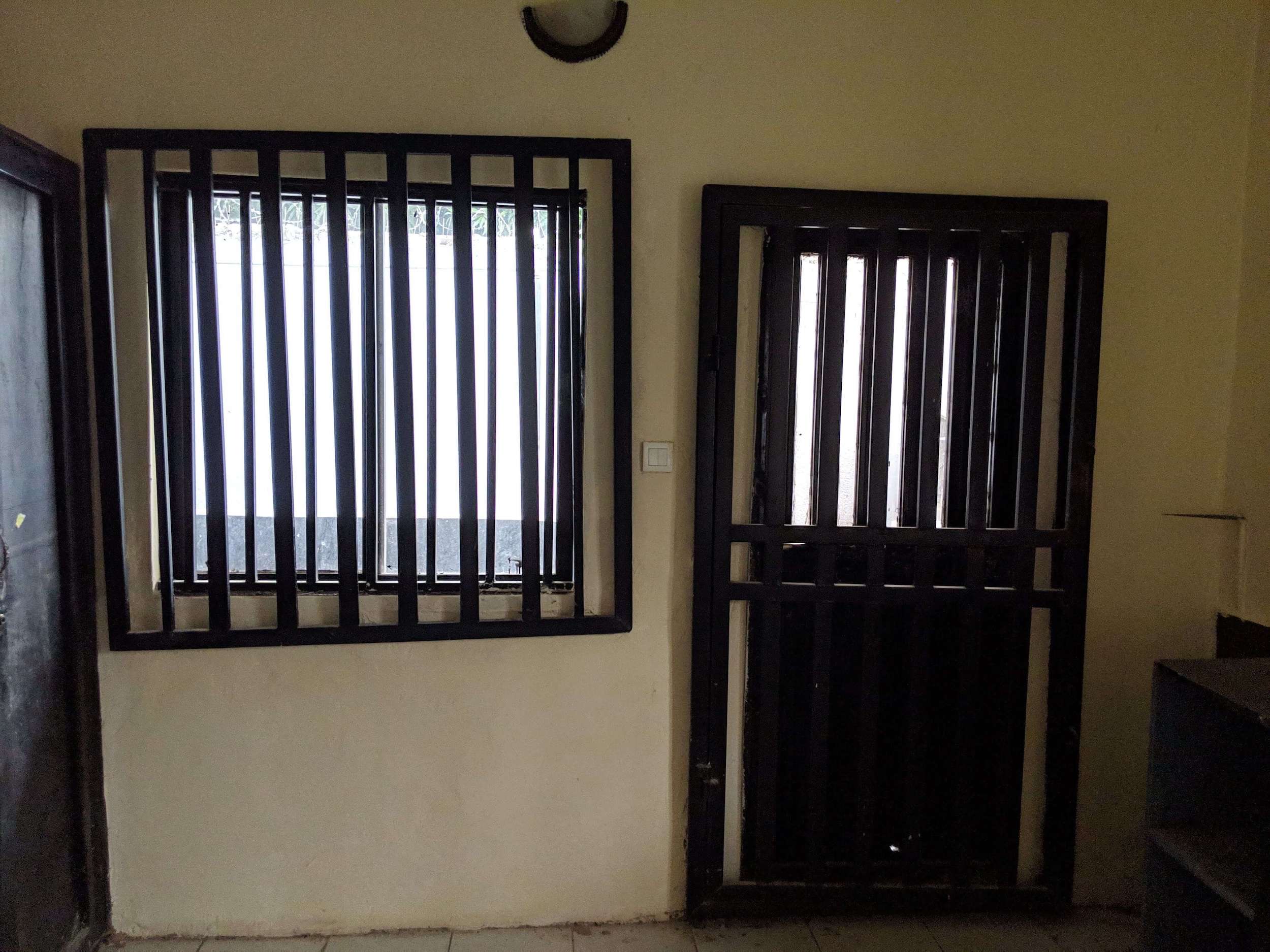
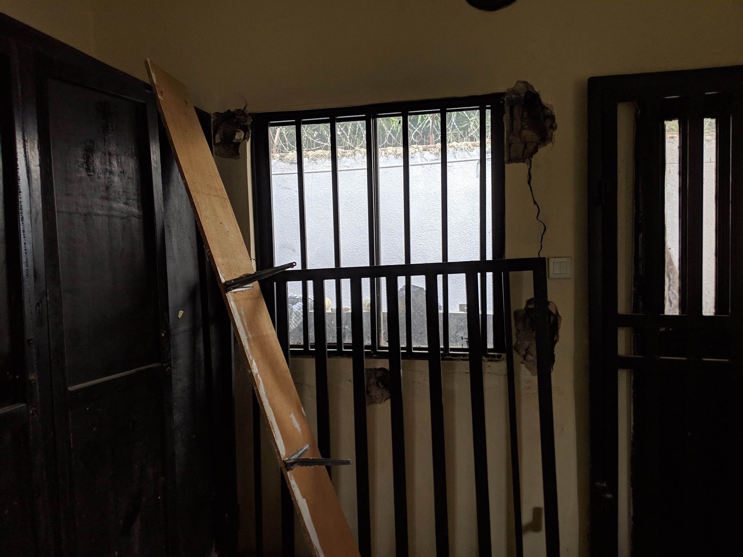
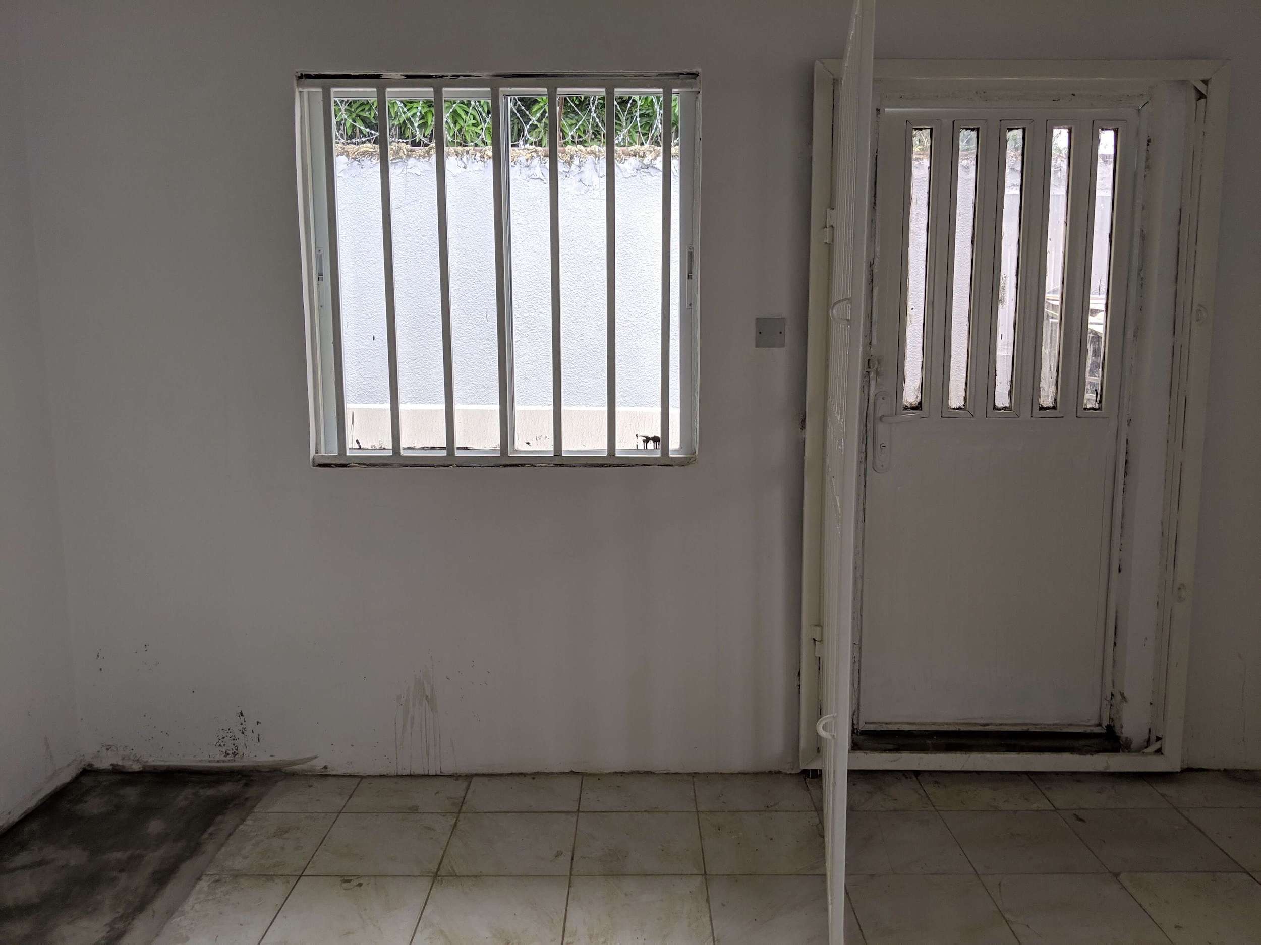
The first time we walked into the kitchen, we knew that redesigning it would require a lot of work. It featured double-thick burglar bars, crumbling cabinets & cupboards. 😭 However, we saw that it could make for a 🔥 multipurpose kitchen.
Decluttering
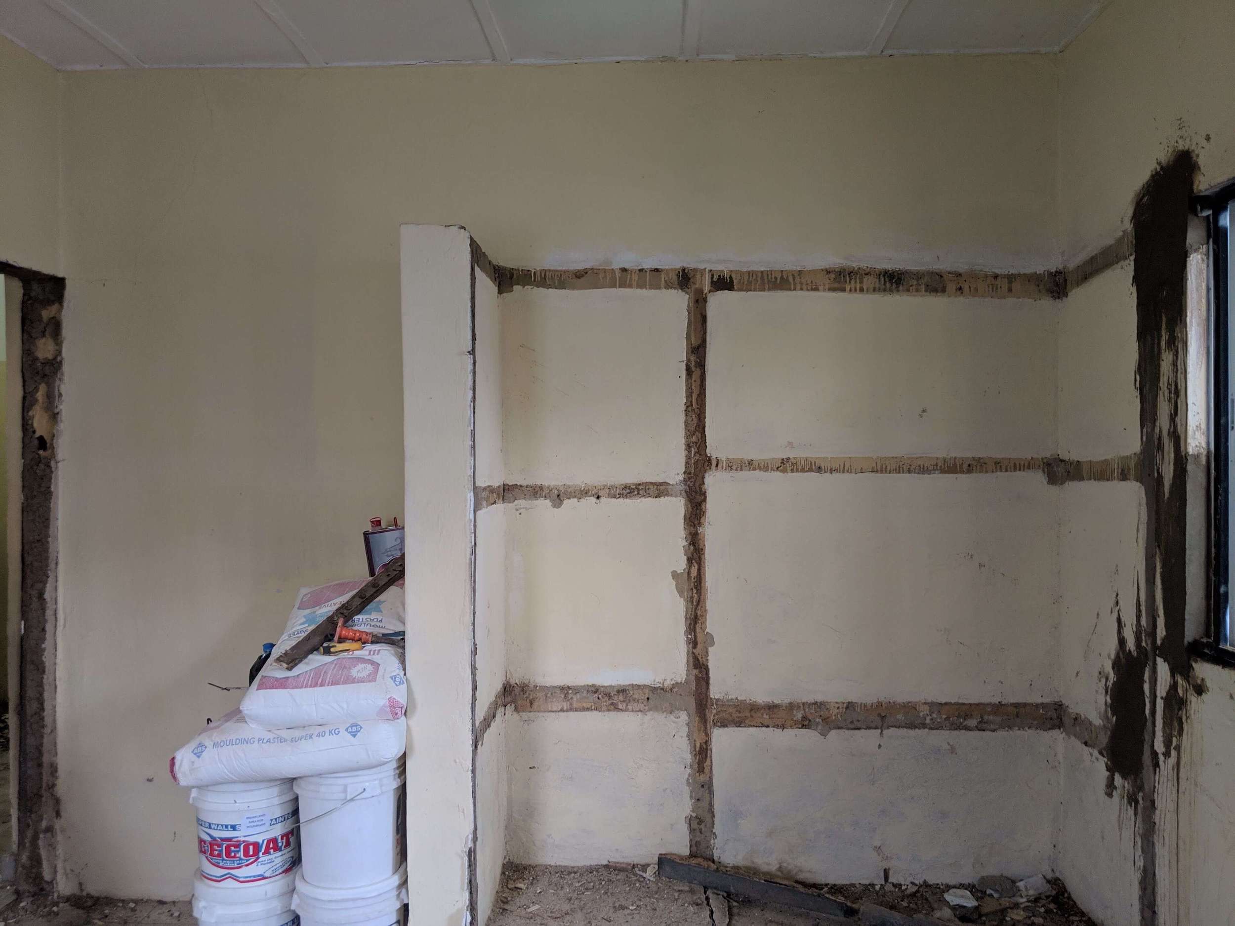
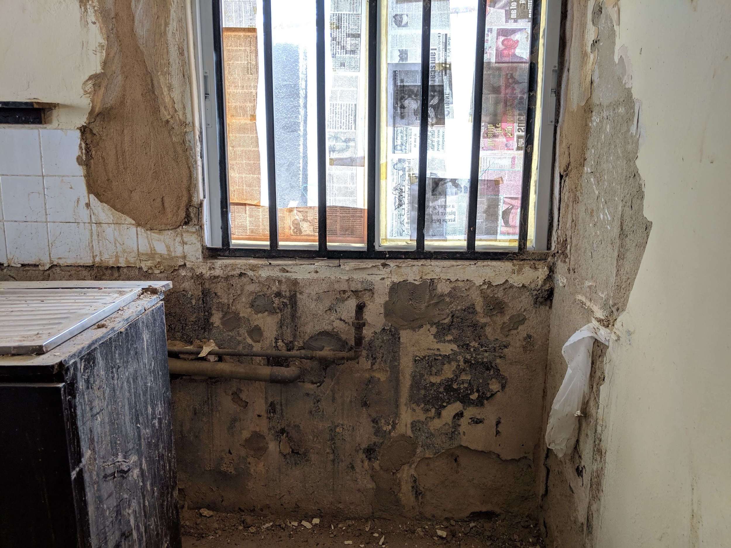
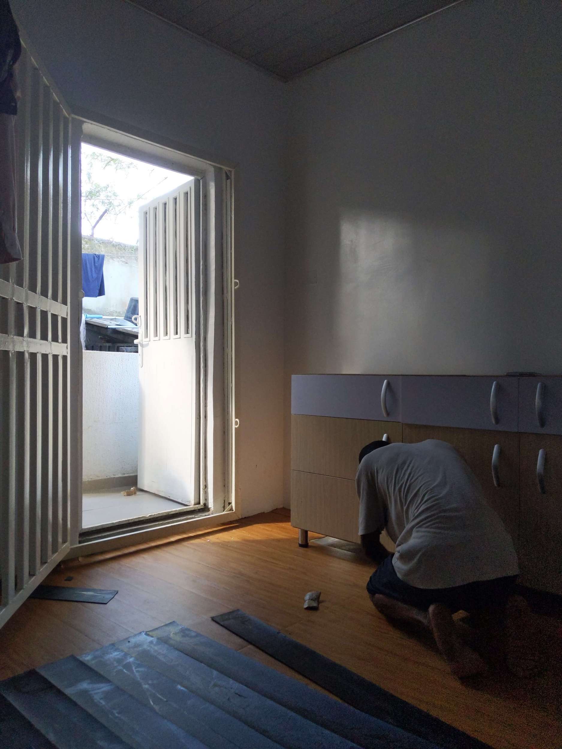
Our practical design process involves first removing the clutter and creating a blank canvas, which provides the cognitive space to be creative. In this case, the burglar bars, kitchen cabinet and cupboard had to go. So we took them all down.
White Space
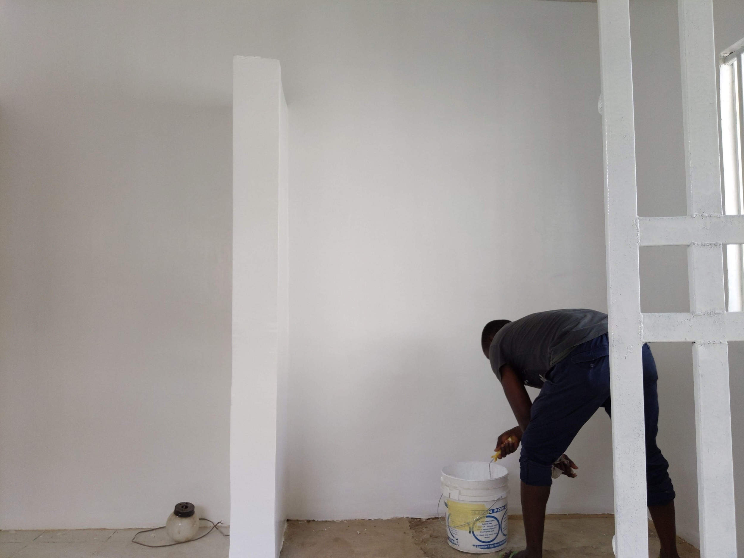
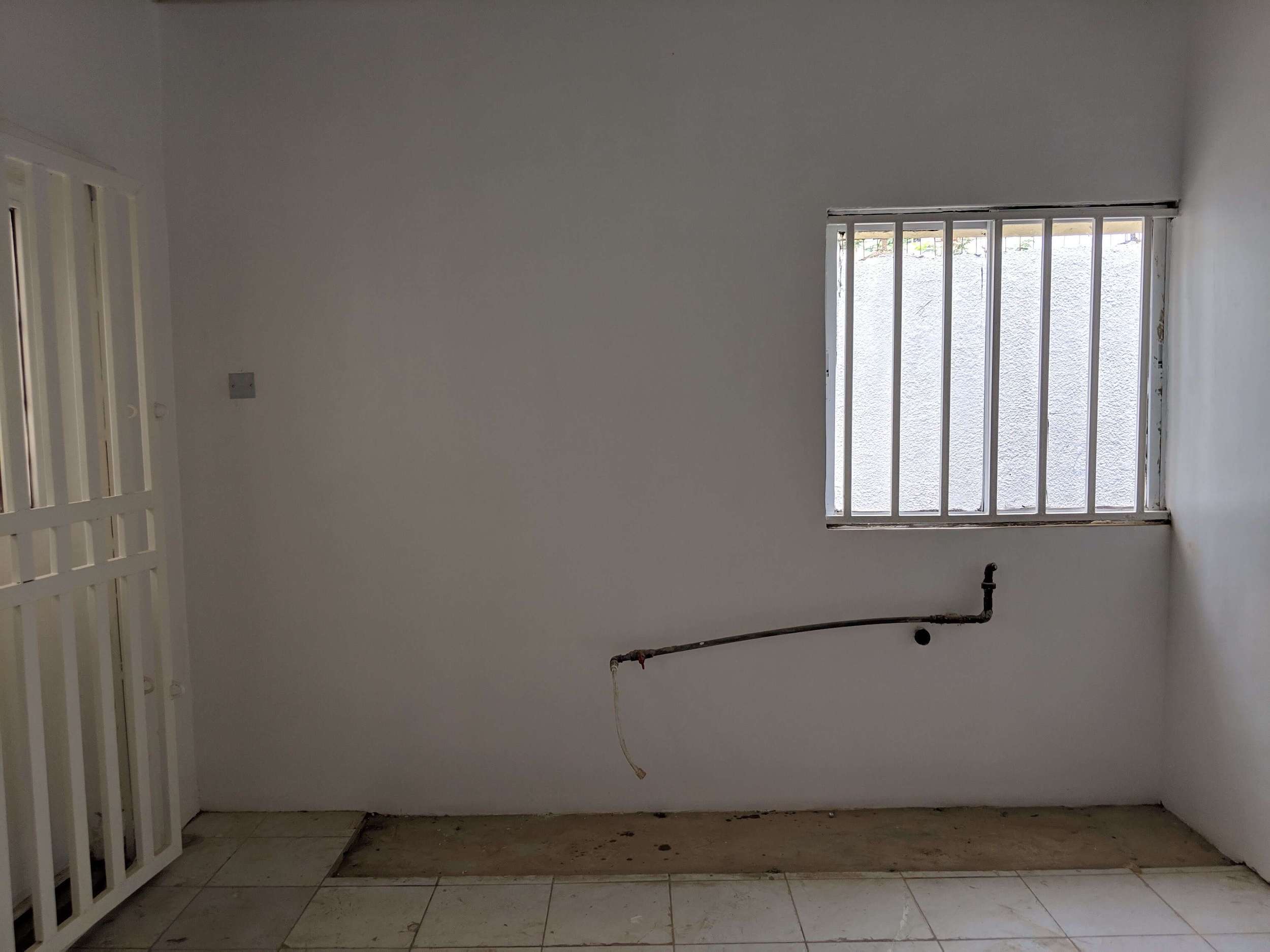
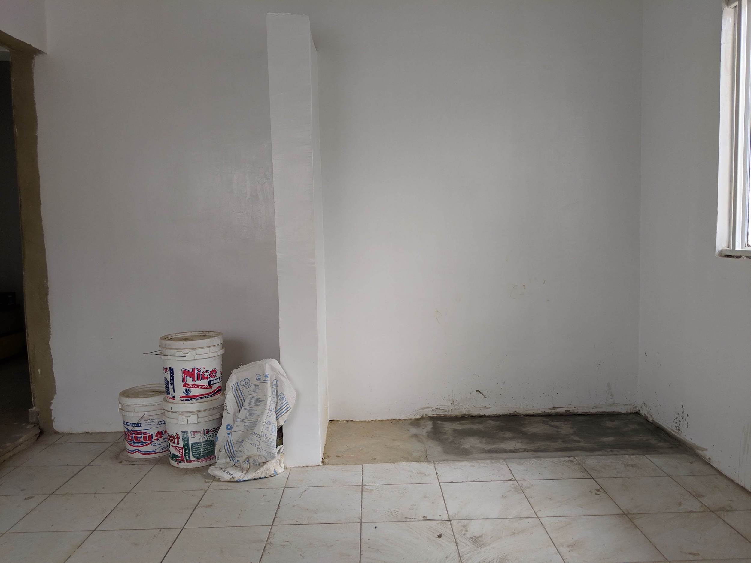
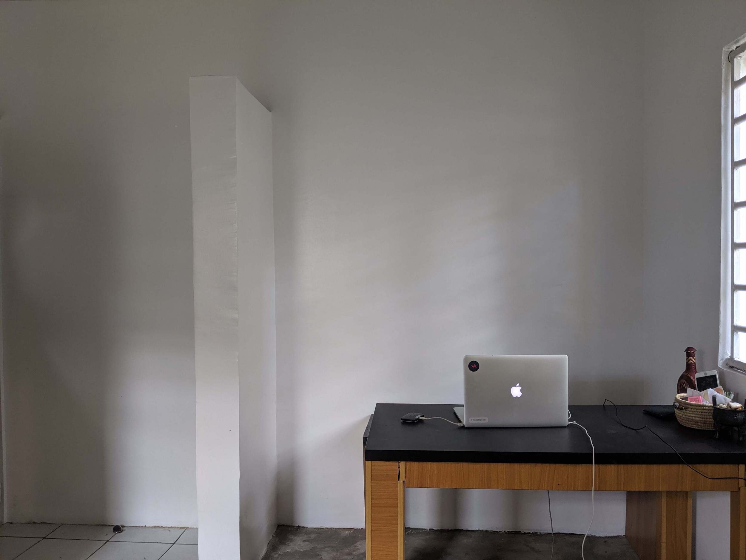
Next, we painted the entire space white to bring in more light. It would also allow the colours we planned to introduce, stand out.
Creating more space
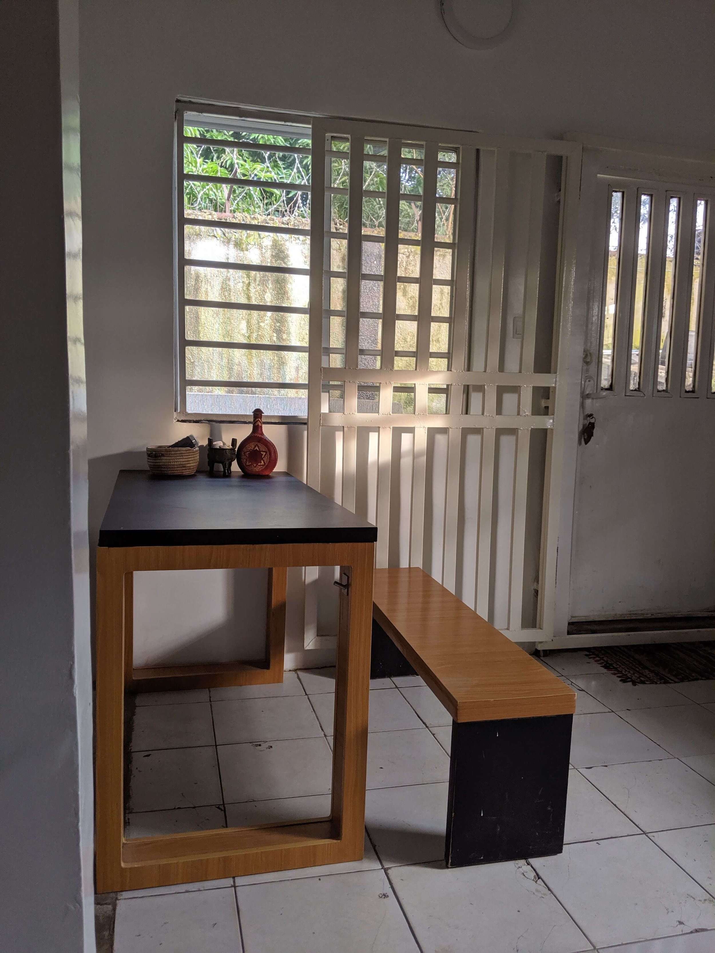
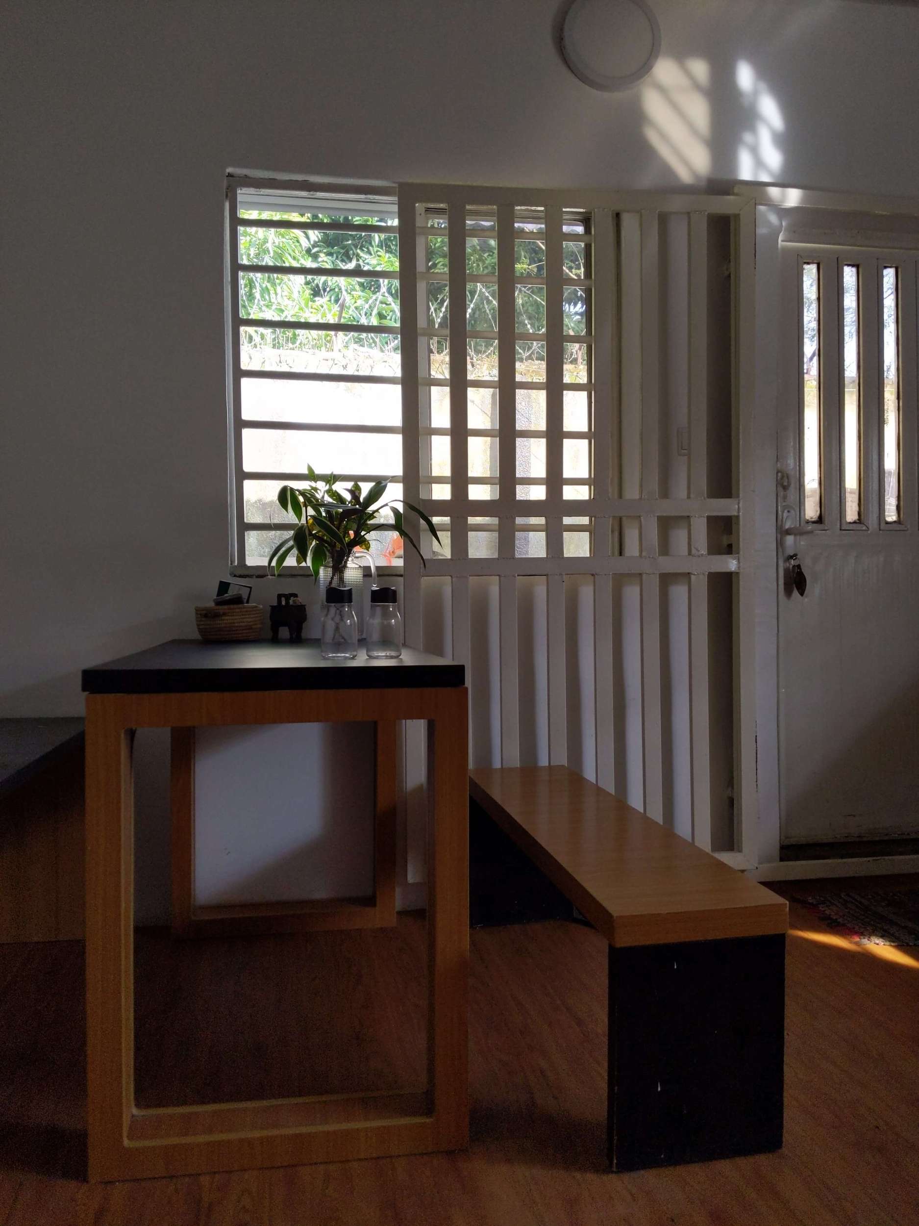
We turned the cupboard area into a sitting/dining area by bringing in some old temporary furniture. We’ll be designing new furniture in the future to fit the aesthetics of the new studio.
Designing friendlier bars
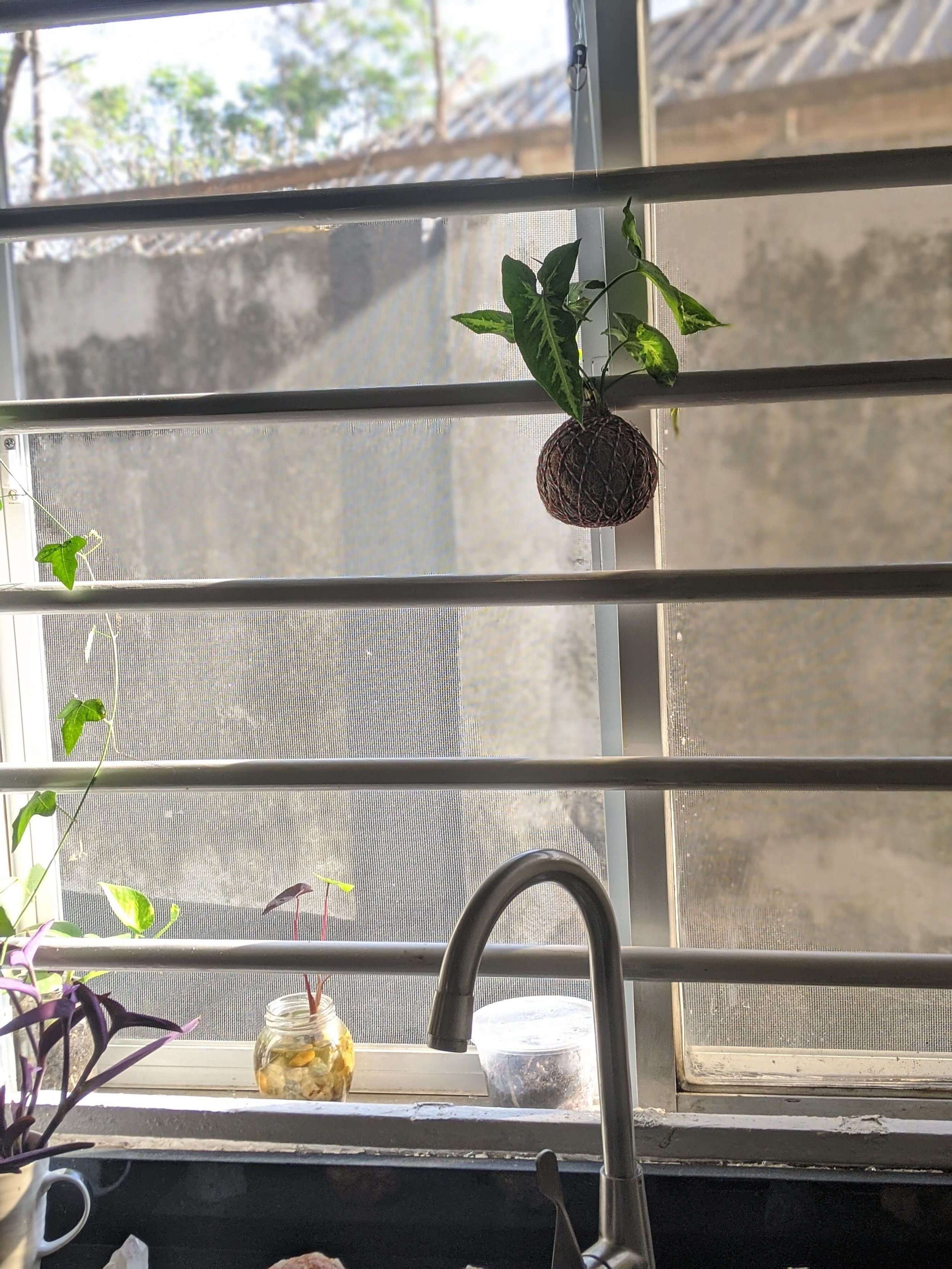
We designed our own burglar bars to be:
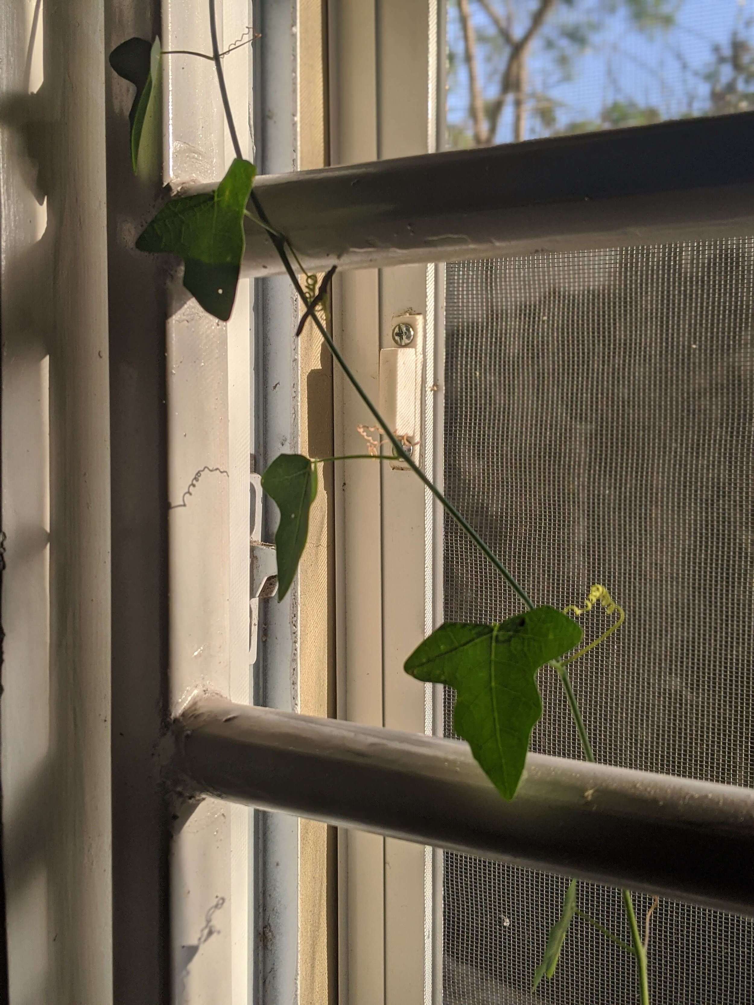
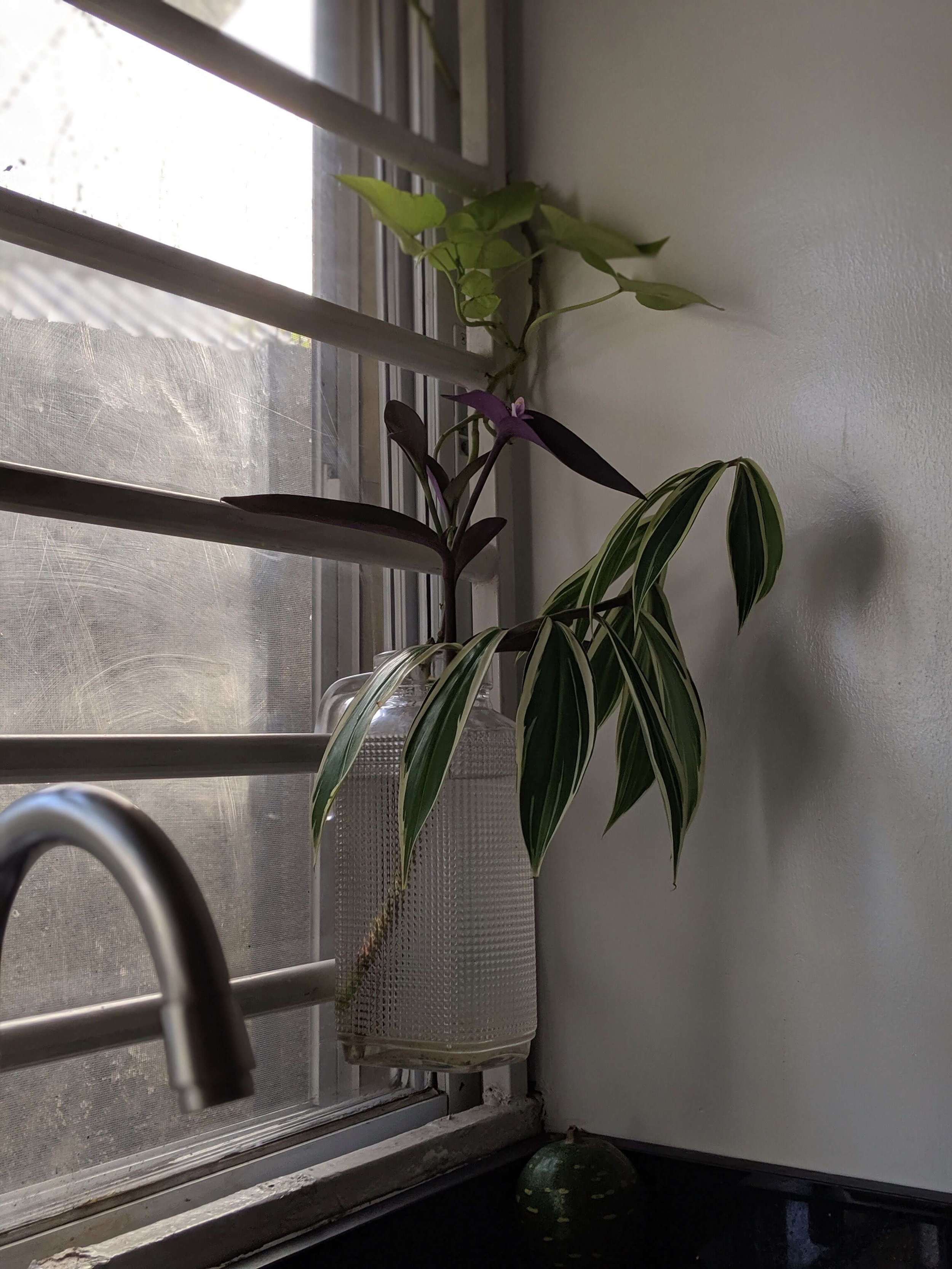
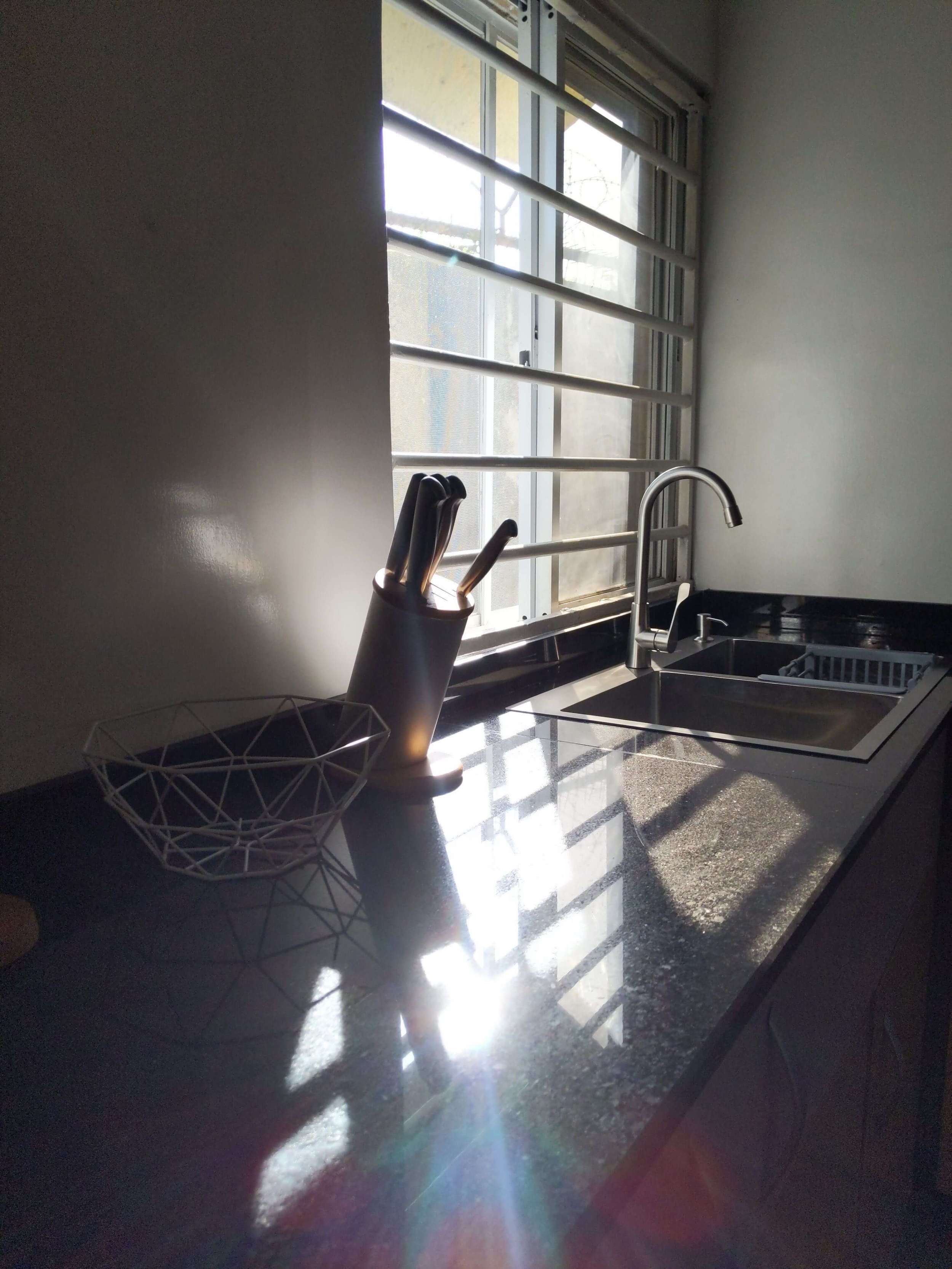
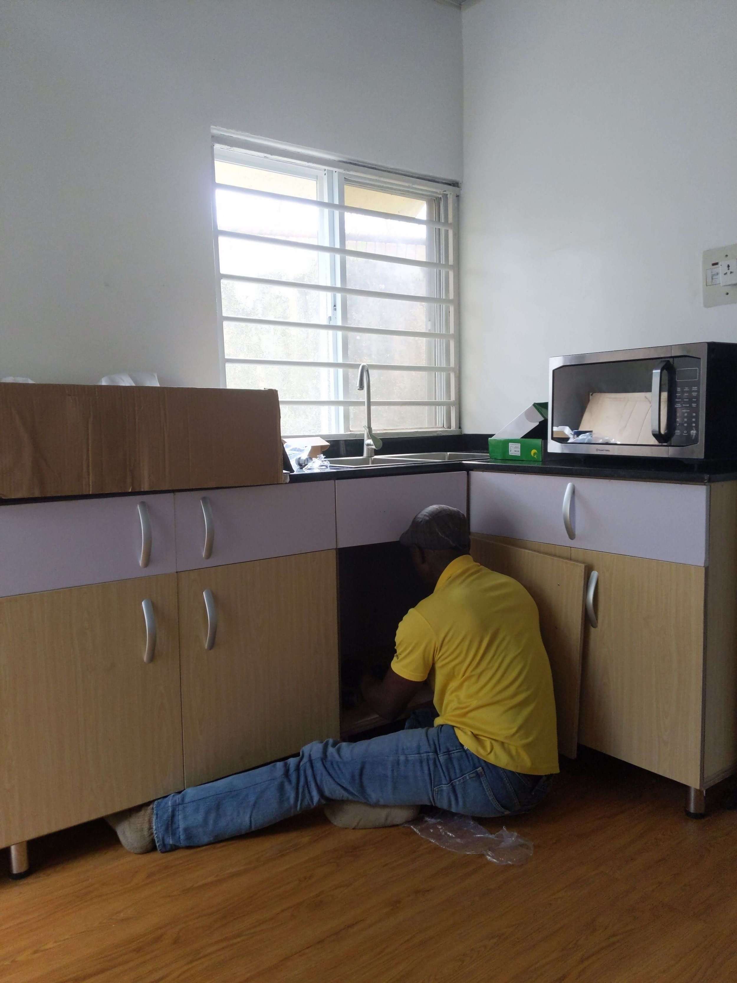
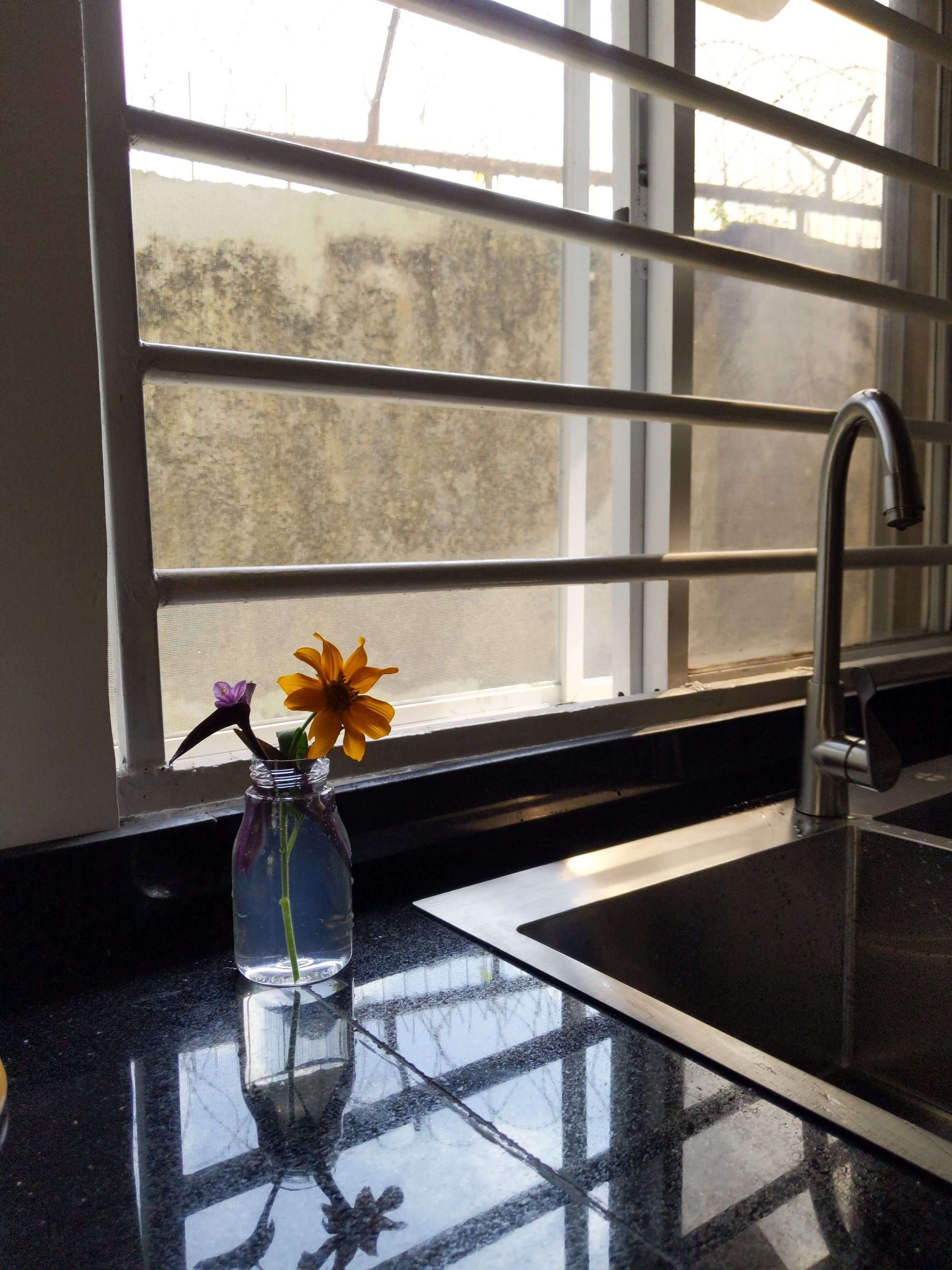
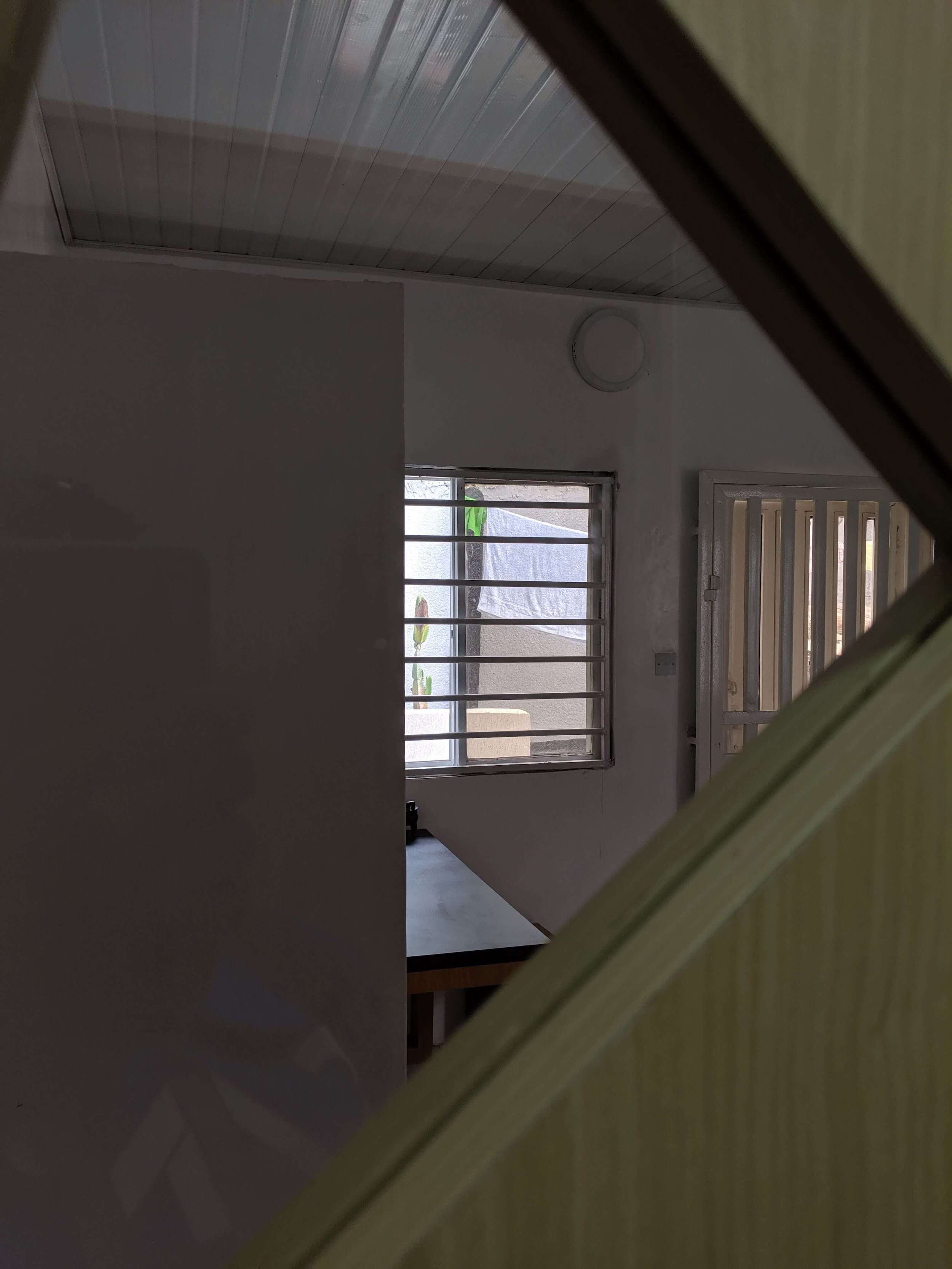
1. Horizontal: This allows us to completely eliminate the “prison vibe” of vertical bars. It also allows viewers look through without the bars breaking their line of sight. Lastly, it doubles as a plant & towel rack.
2. White: This reflects more light & helps the bars blend better with the surroundings.
3. Rounded: So it feels friendlier.
Designing the cabinets
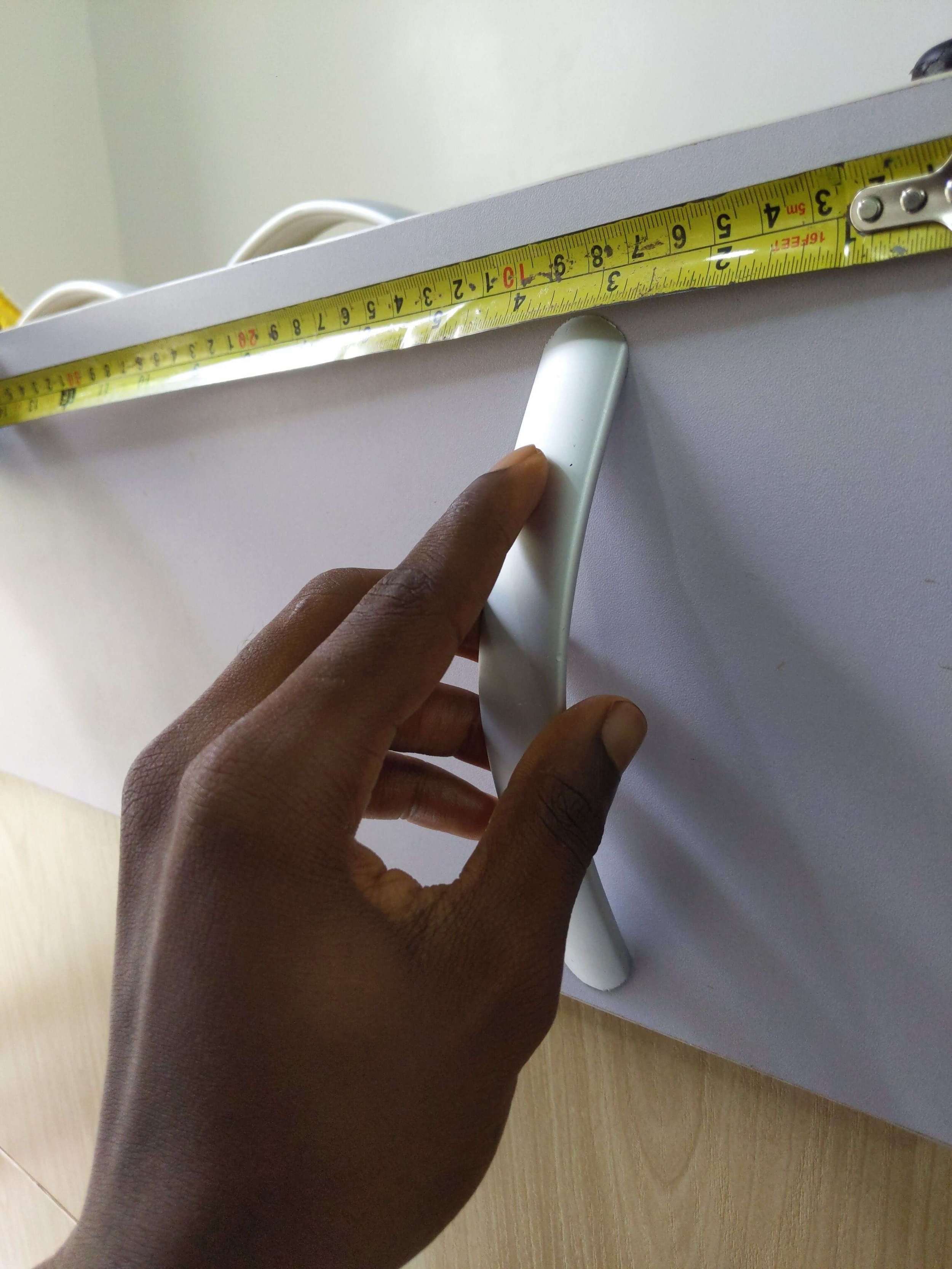
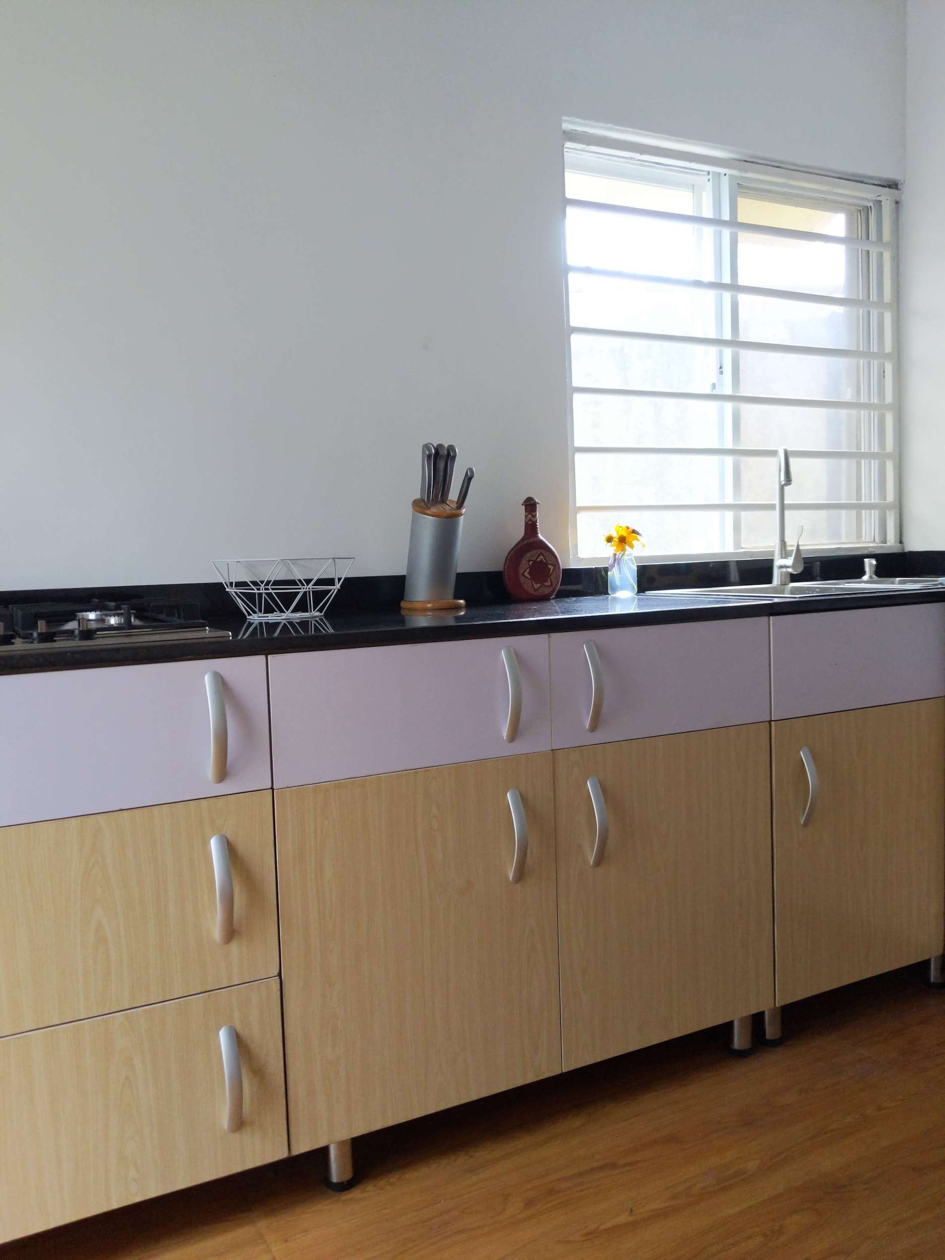
We also designed our cabinets to reflect our design inspirations. The black countertop is inspired by Japanese design, the contrast of the wood with the white is inspired by Nordic design, while the handles are inspired by African scarification. We design incrementally, so months later, we changed the white drawers to black to increase the level of visual cohesion and align the aesthetics with our signature #BlackonEverything style.

Designing the kitchen door
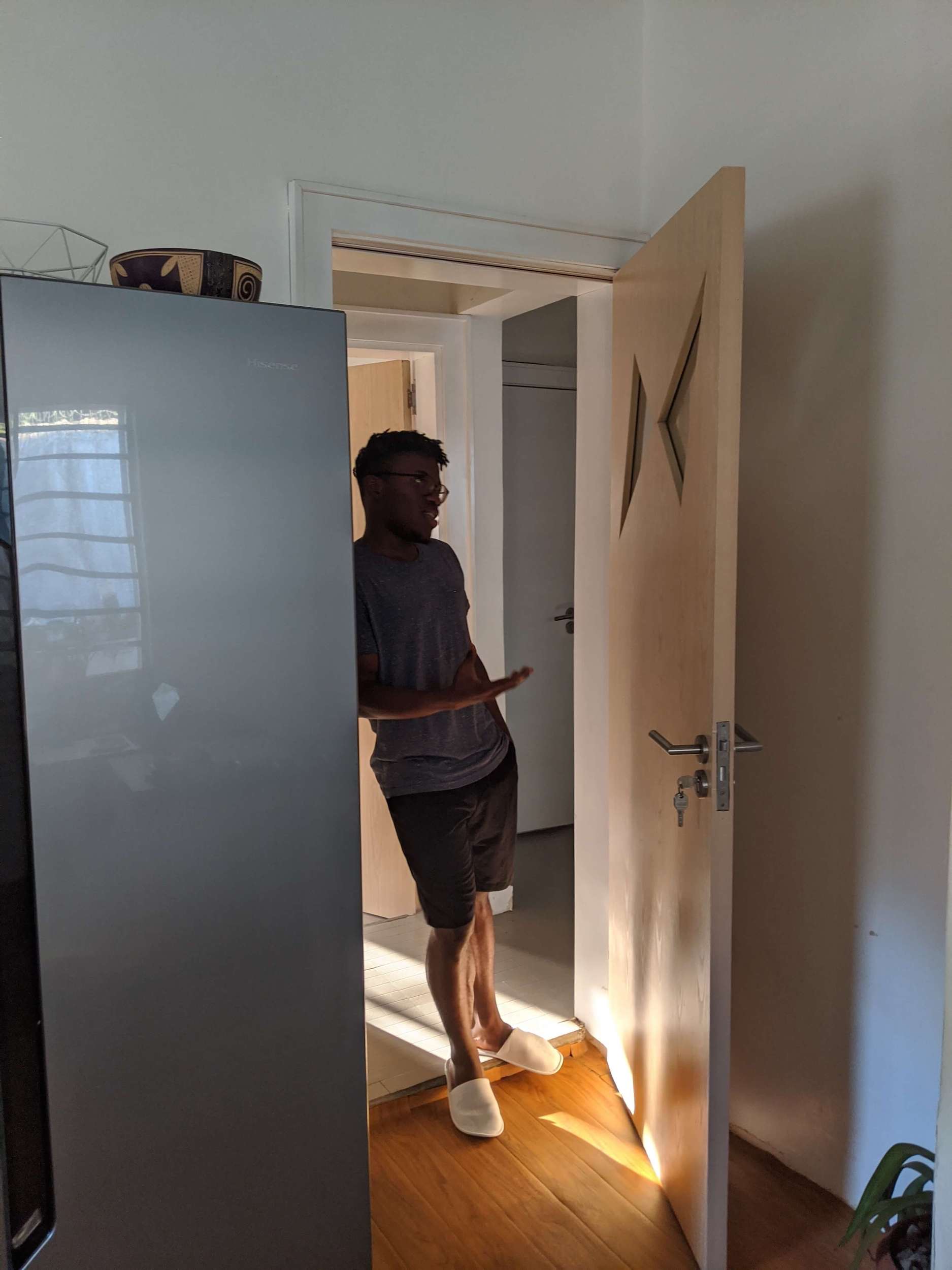
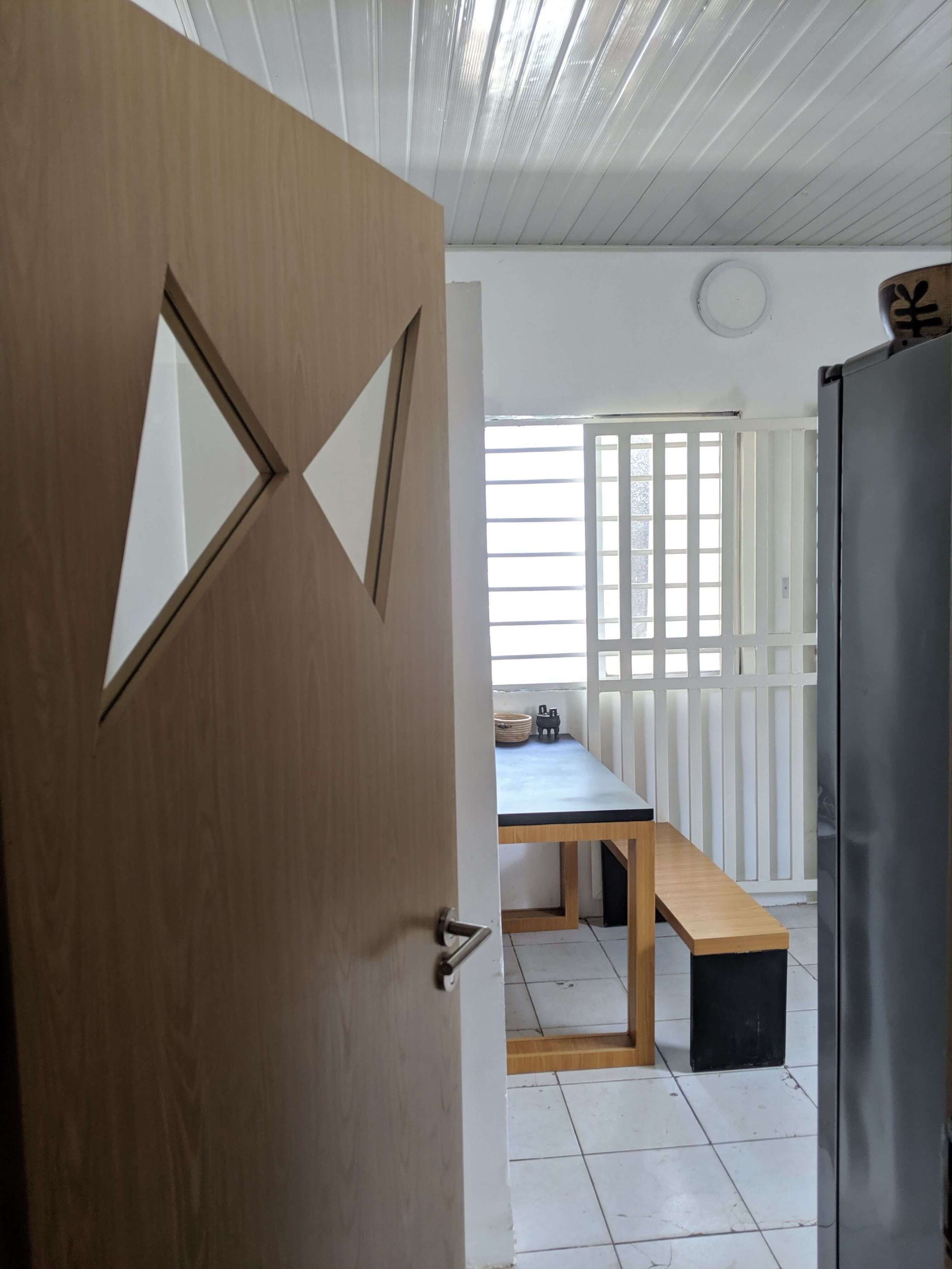
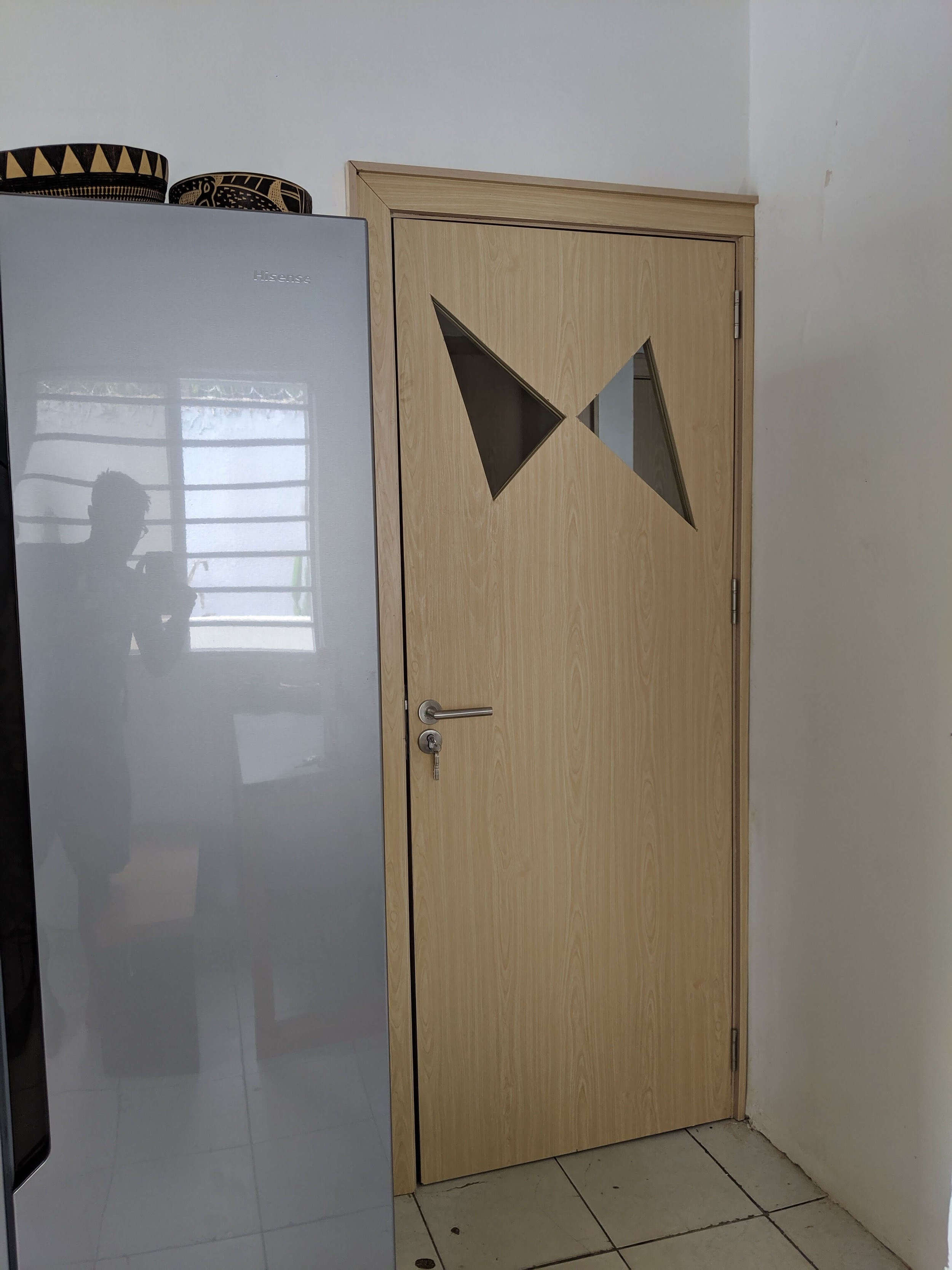
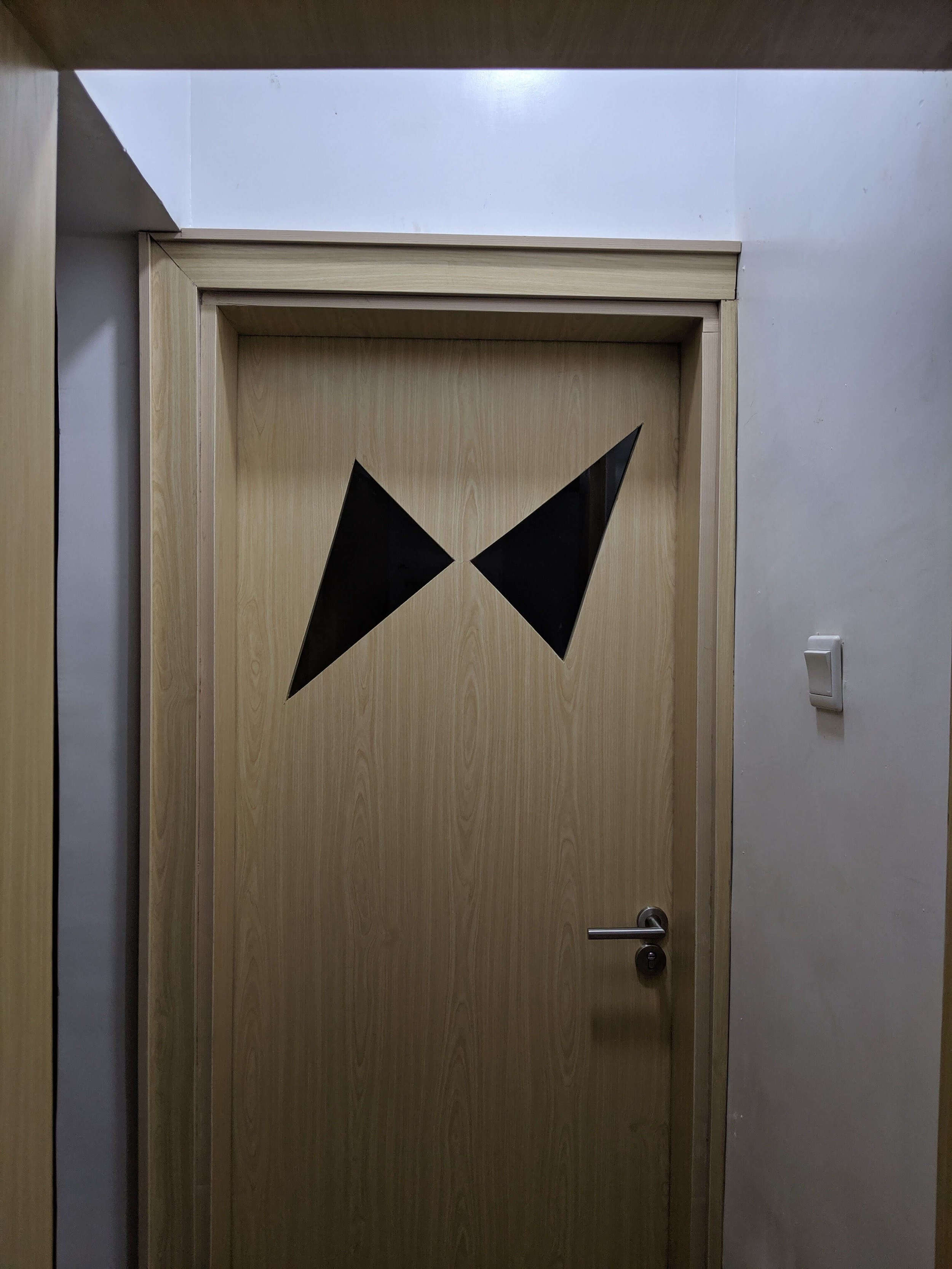
We wanted a kitchen door that would be see-through, so we designed one with the outline of our logo carved in as a glass window!
We’re writing a separate thread on the doors we’ve designed and the decisions that went into them. ✍🏾 Look out for it!
Designing the kitchen floor
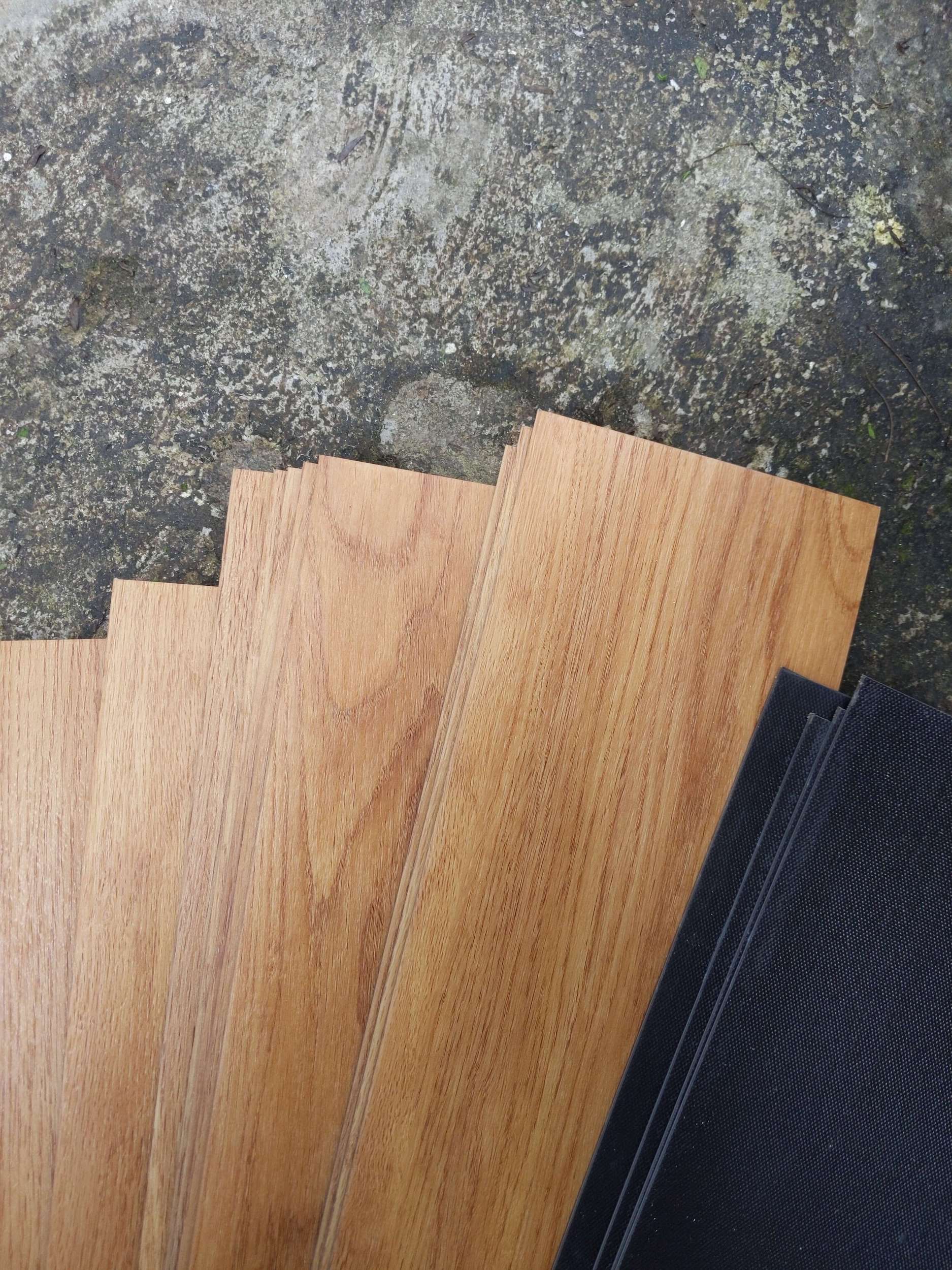
We chose warm wood laminate flooring to contrast against the light wood of the cabinets and the doors. This allows the kitchen to feel warmer, more exciting, and welcoming.
Conclusion
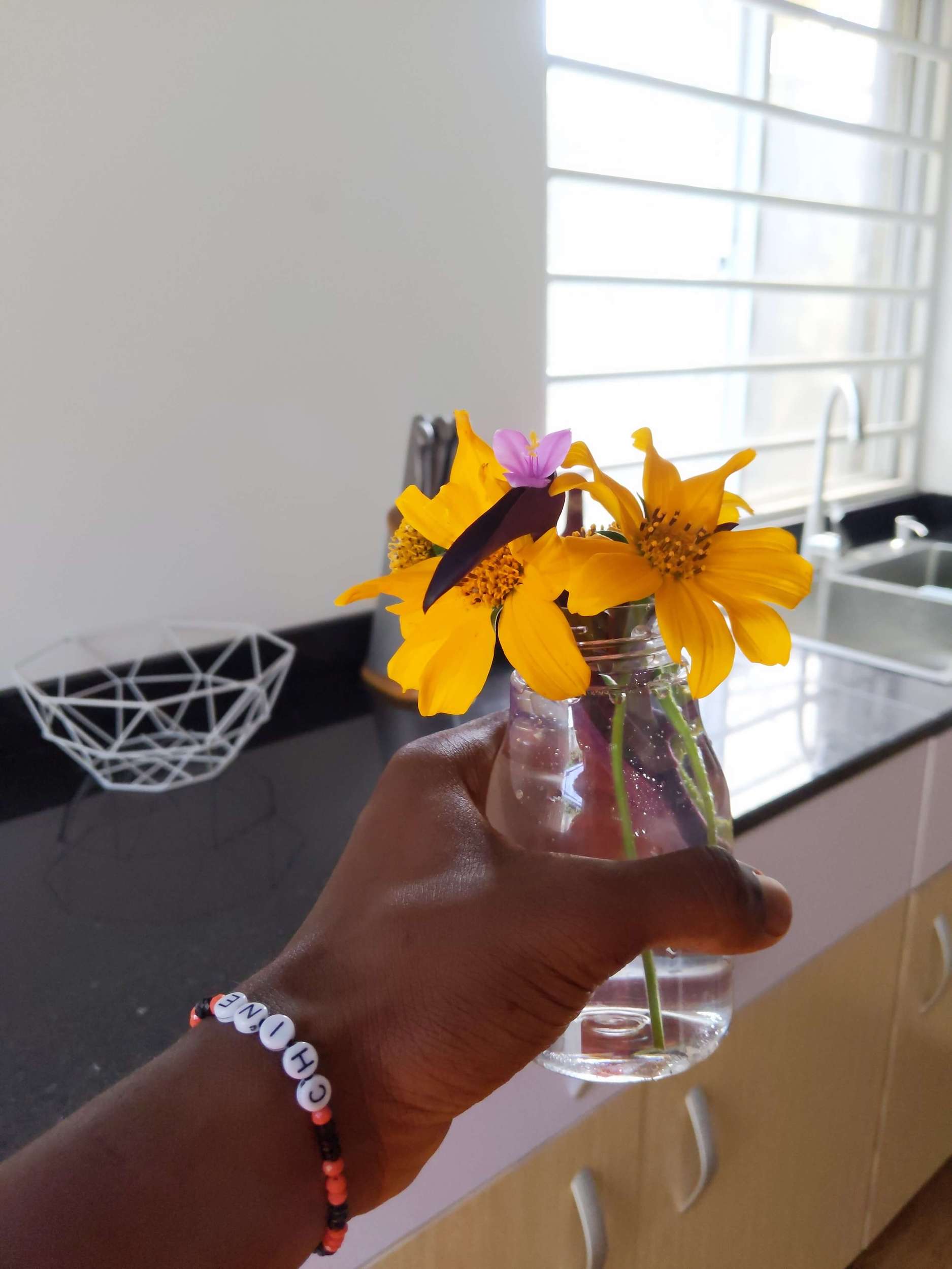
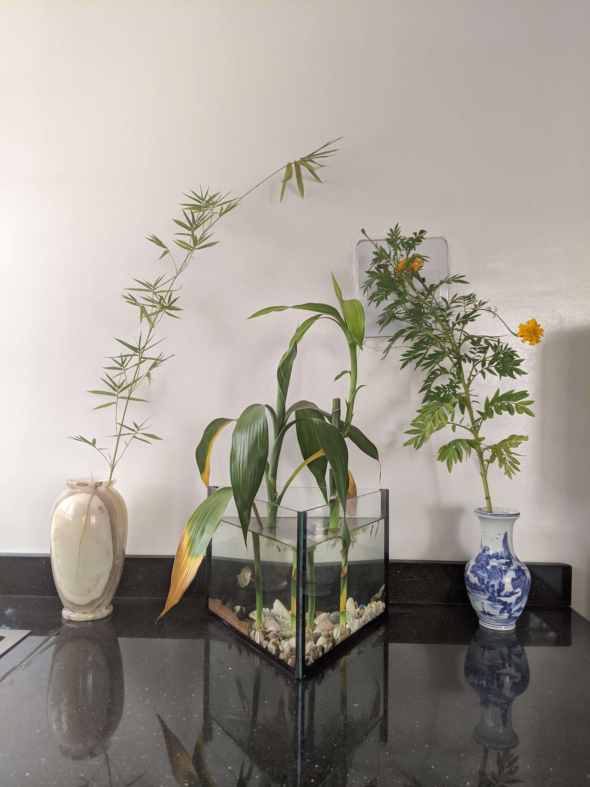
Fast forward from when we first walked into the kitchen. In the process of redesigning it, we’ve now created a number of original products: a new cabinet, a new style of door, and a range of aquatic flowerpots.
