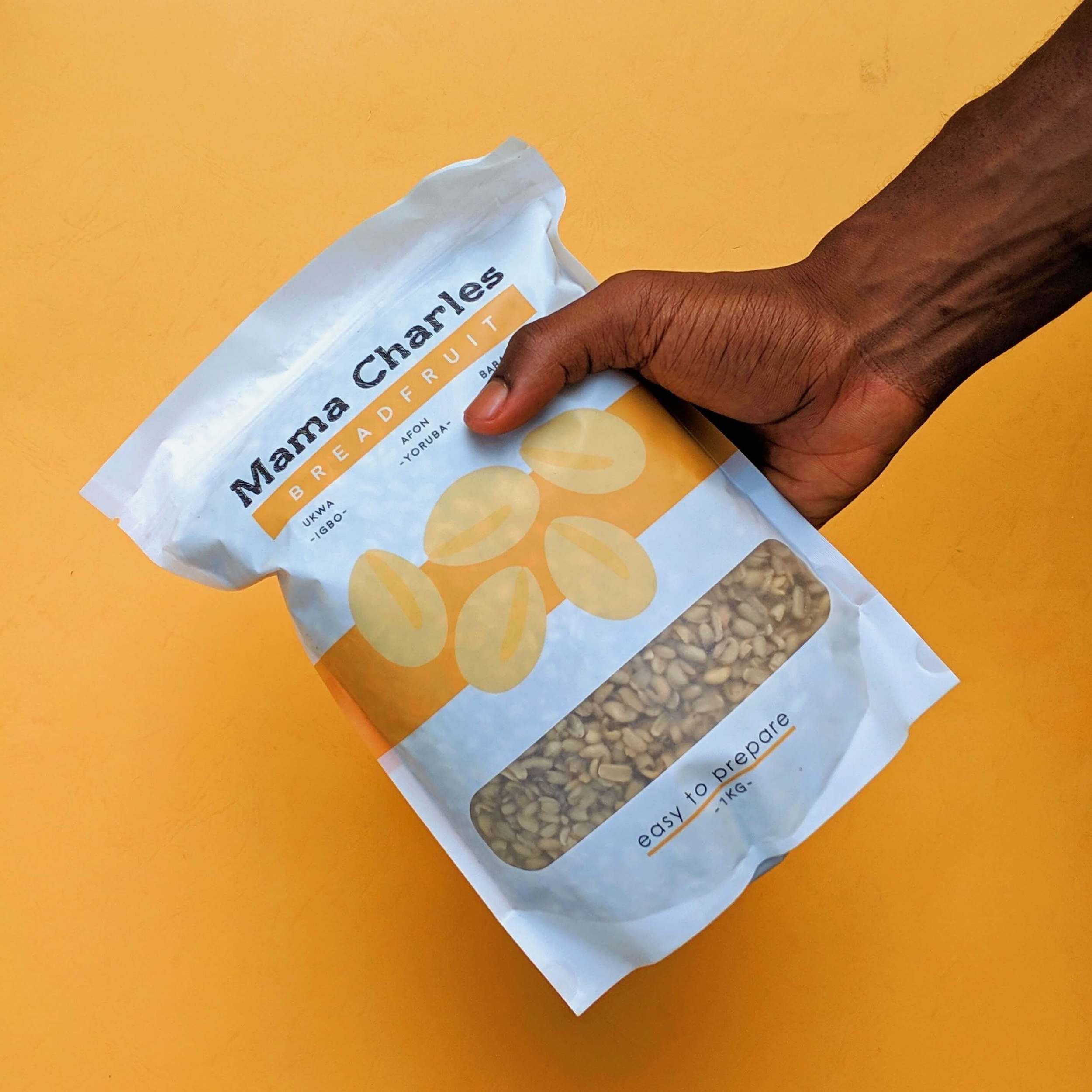
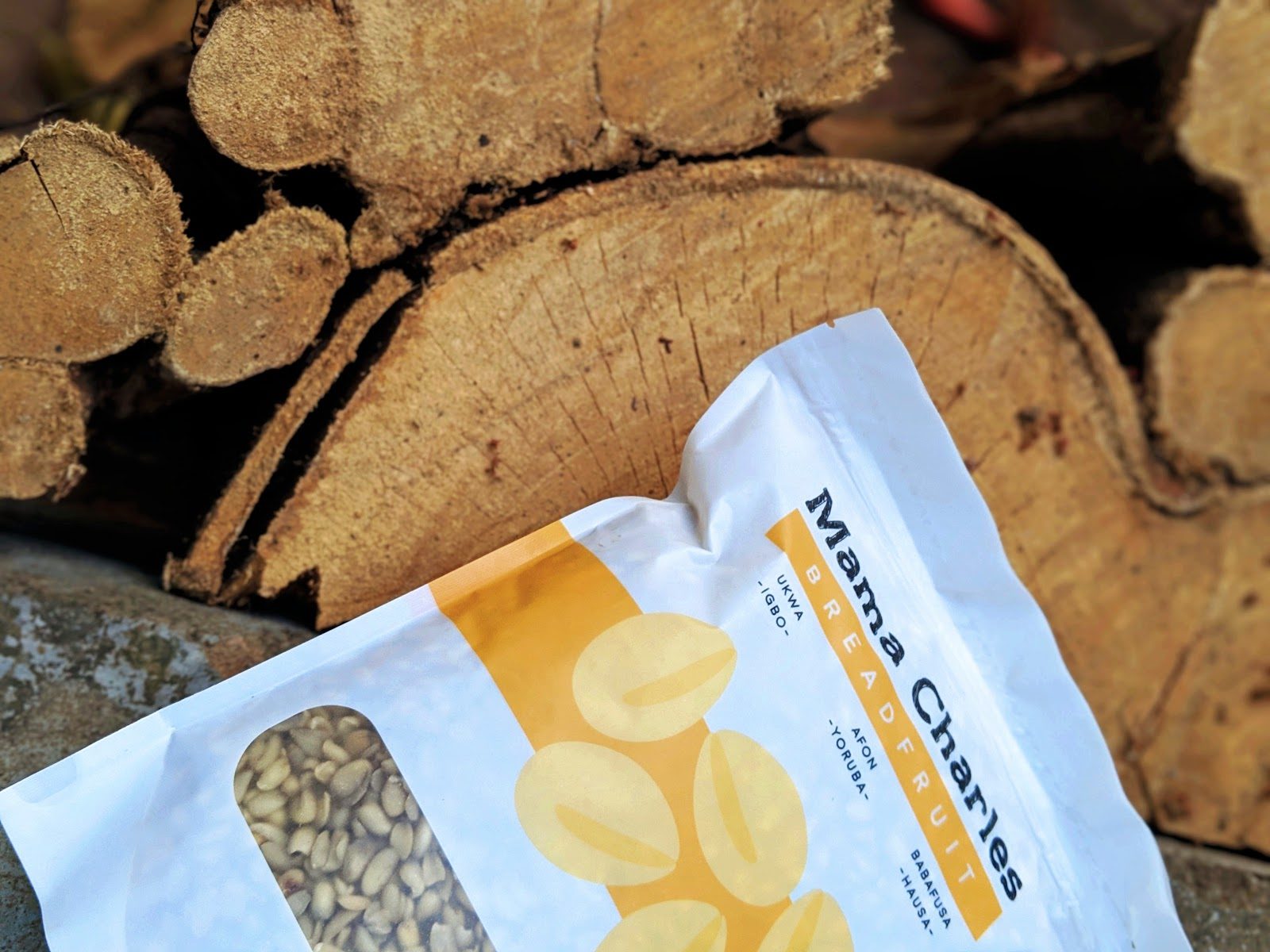
Mama Charles
We were commissioned by Mama Charles, a food production company founded in 2015, to create a packaging design for breadfruit seeds—a product that, until now, has never been adequately or thoughtfully packaged. The goal was to create an appealing, accessible design that beautifully combined typography and illustration to elevate this native delicacy in a way that would resonate with both loyal consumers and new audiences.
Inspiration
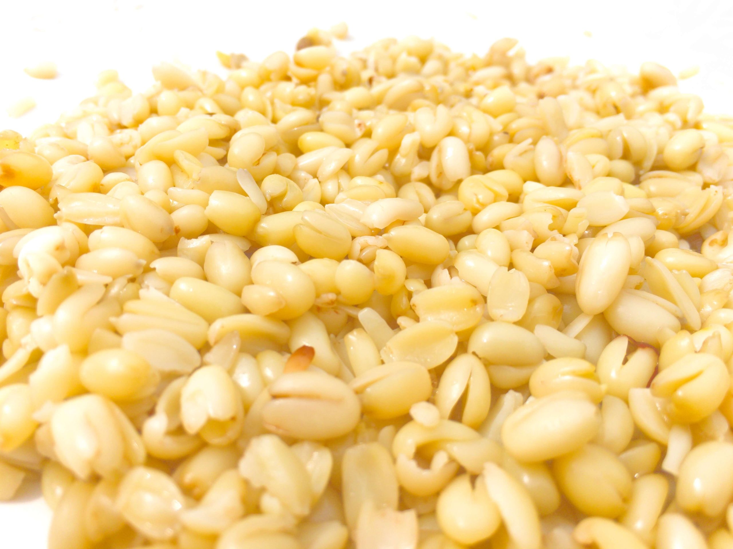
It was essential that the identity of this package draw inspiration directly from the breadfruit seeds themselves. These seeds come from the African breadfruit tree, Treculia Africana, which produces large, round fruits containing numerous highly nutritious seeds. The unique forms in which these seeds are consumed provided the creative foundation for our package design.

Typography
For the typography, we needed a typeface that offered versatility, carried a sense of simplicity, yet was bold enough to complement the white space and minimalist illustrations on the package. Gotham Rounded was the perfect fit. Its rounded terminals and geometric structure subtly reference the curves of the breadfruit seeds, while its softness conveys a sense of ease in preparation and consumption.
This choice also provided a balanced contrast to the Mama Charles logo, which is a textured slab serif with a more grounded, rustic feel.
Accessibility & Cultural Connection
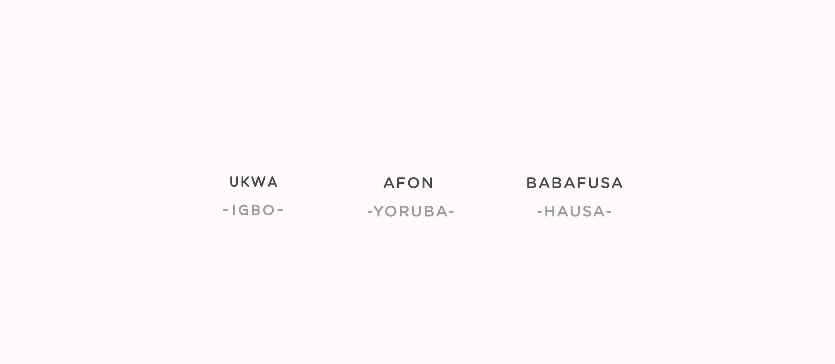
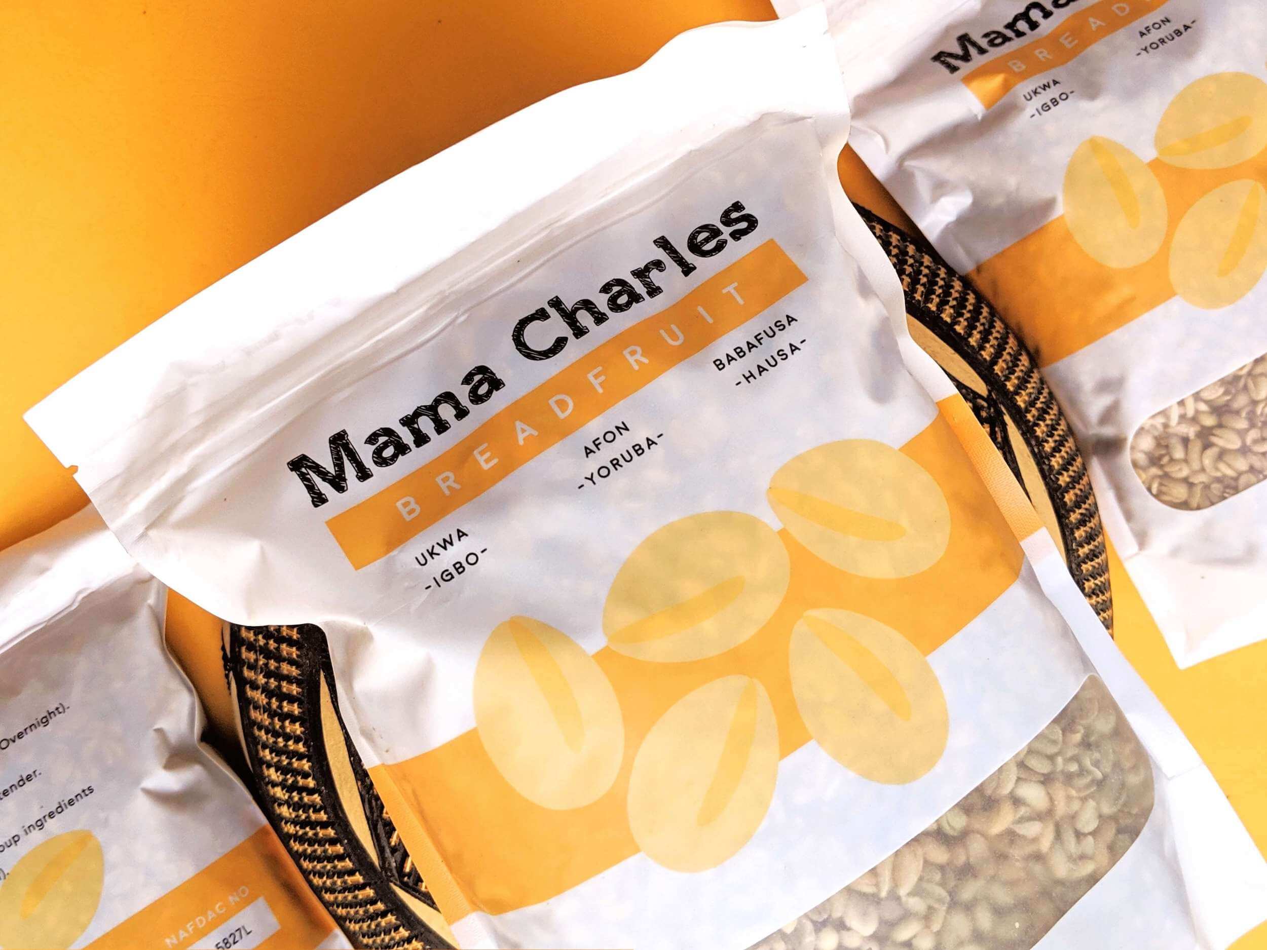
While the English name is breadfruit, it’s not commonly used among local consumers, who know the seed by its native names—many of which vary across regions. It is called Ize in Benin, Sobo and Ediang in Ijaw, Babafusa in Hausa, Afon in Yoruba, and most famously Ukwa among the Igbo.
To honor this cultural diversity and ensure market accessibility, we prominently featured the three most recognized native names on the packaging. This choice helps local consumers easily identify the product while celebrating its cultural heritage.


Illustration & Design Approach
The centerpiece of the design is a clean, vector-style illustration of the breadfruit seeds, supported by a colored bar that anchors the visual composition. We intentionally stripped the illustration of excessive detail, using just three tones of orange. This approach not only allows the colors to work harmoniously but also reduces printing costs and minimizes the risk of print errors.
Surrounded by generous white space, the illustration stands out vividly, creating visual balance and instant appeal on the shelf.
Color Psychology
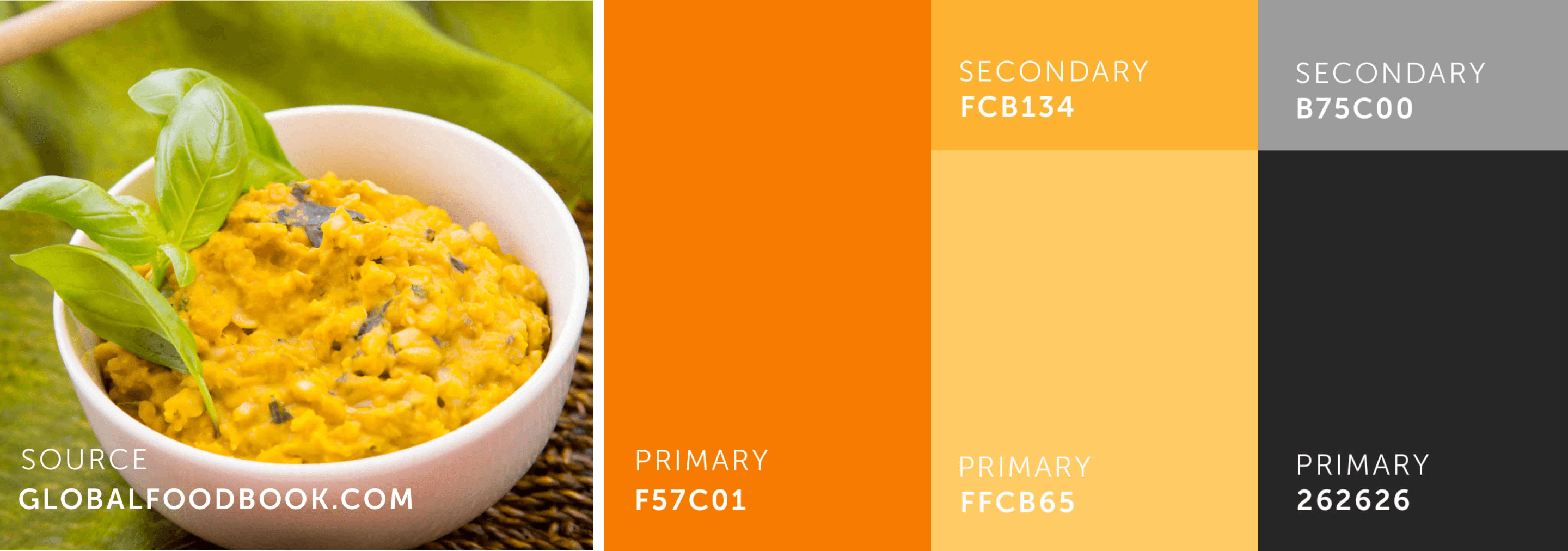
Color plays a vital role in the packaging. The primary hues were drawn from two natural references: the color of raw breadfruit seeds and the rich orange hue they take on when prepared with palm oil—a common cooking method.
We chose a vibrant, warm color palette to convey energy, vitality, and the health benefits associated with breadfruit seeds. This warmth invites consumers in and instinctively signals the product’s nutritious value.
Transparency & Trust
We included a clear aperture on the packaging, allowing buyers to see the actual product inside. This transparency builds trust, enabling customers to assess the quality of the seeds at a glance and feel more confident in their purchase.
Final Thoughts
The thoughtful combination of typography, illustration, color, and accessibility resulted in a packaging solution that successfully met the brief: to present a native delicacy—one previously overlooked in product design—in a visually beautiful and compelling way. The design appeals to loyal consumers and also invites new audiences to discover the rich heritage and nutritional value of breadfruit seeds 😊