Brighton Property Development
Brighton Property Development (BPD) is a property development company that builds, masterplans, and develops high-quality properties in Nigeria. They are equipped to handle developments that include residential, commercial, retail, and industrial properties.
The goal of the identity design was to create a minimalist system that effectively captures BPD’s mission and can be applied consistently across all brand communications.
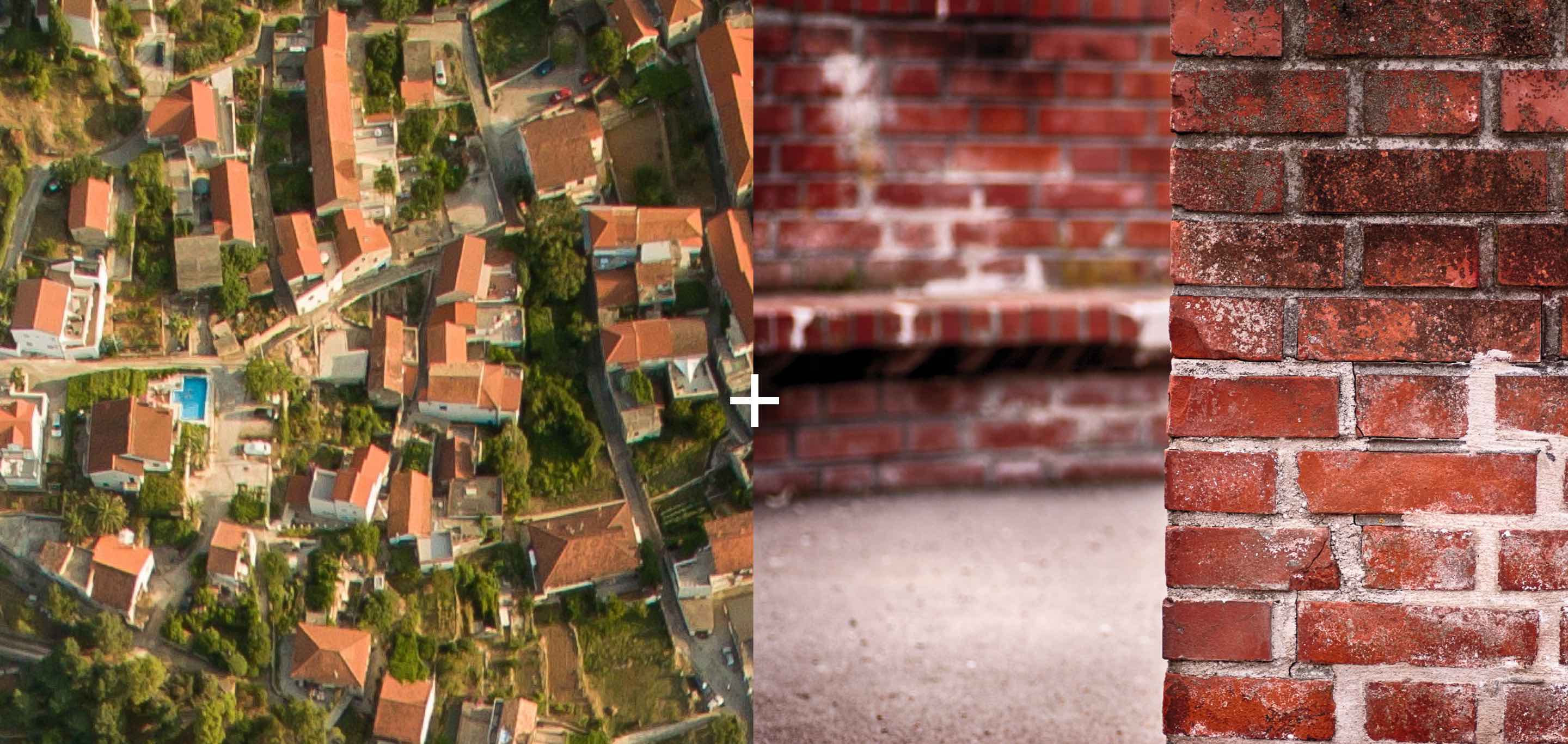
Inspiration
To develop the logo mark, we drew inspiration from two key visual elements: the aerial view of buildings arranged in a grid and the pattern of interlocking bricks in a wall. Both references directly relate to construction, but from distinct perspectives. The aerial view provides a holistic, technical overview, while the brick wall offers a close, personal, and tactile reference. This balance between macro and micro perspectives is essential in property development, where both the big picture and the fine details must seamlessly work together.
Secondary inspiration for Mark & Animation
The mark also subtly incorporates the letters B, P, and D in various orientations, symbolizing adaptability and versatility—qualities that reflect the company’s ability to thrive in diverse development contexts.
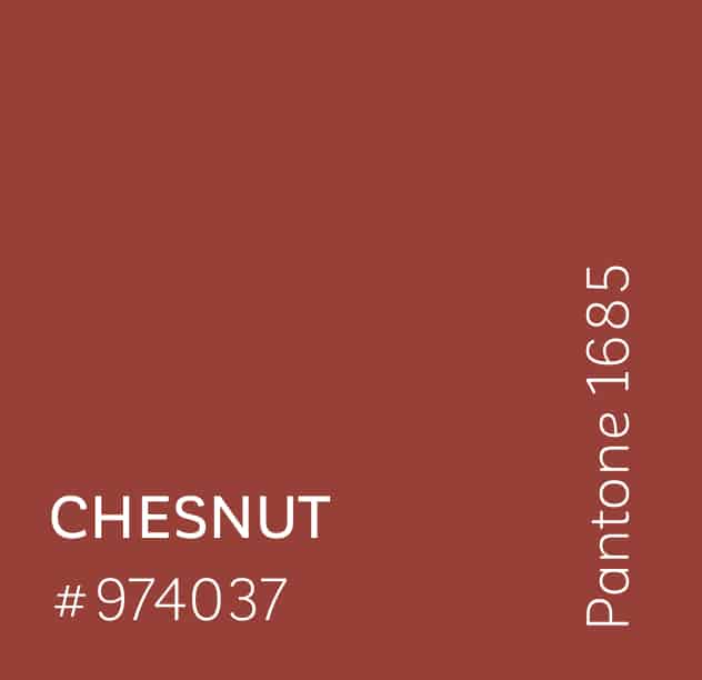
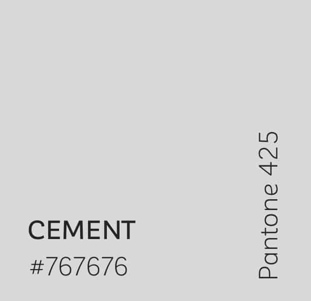
Color
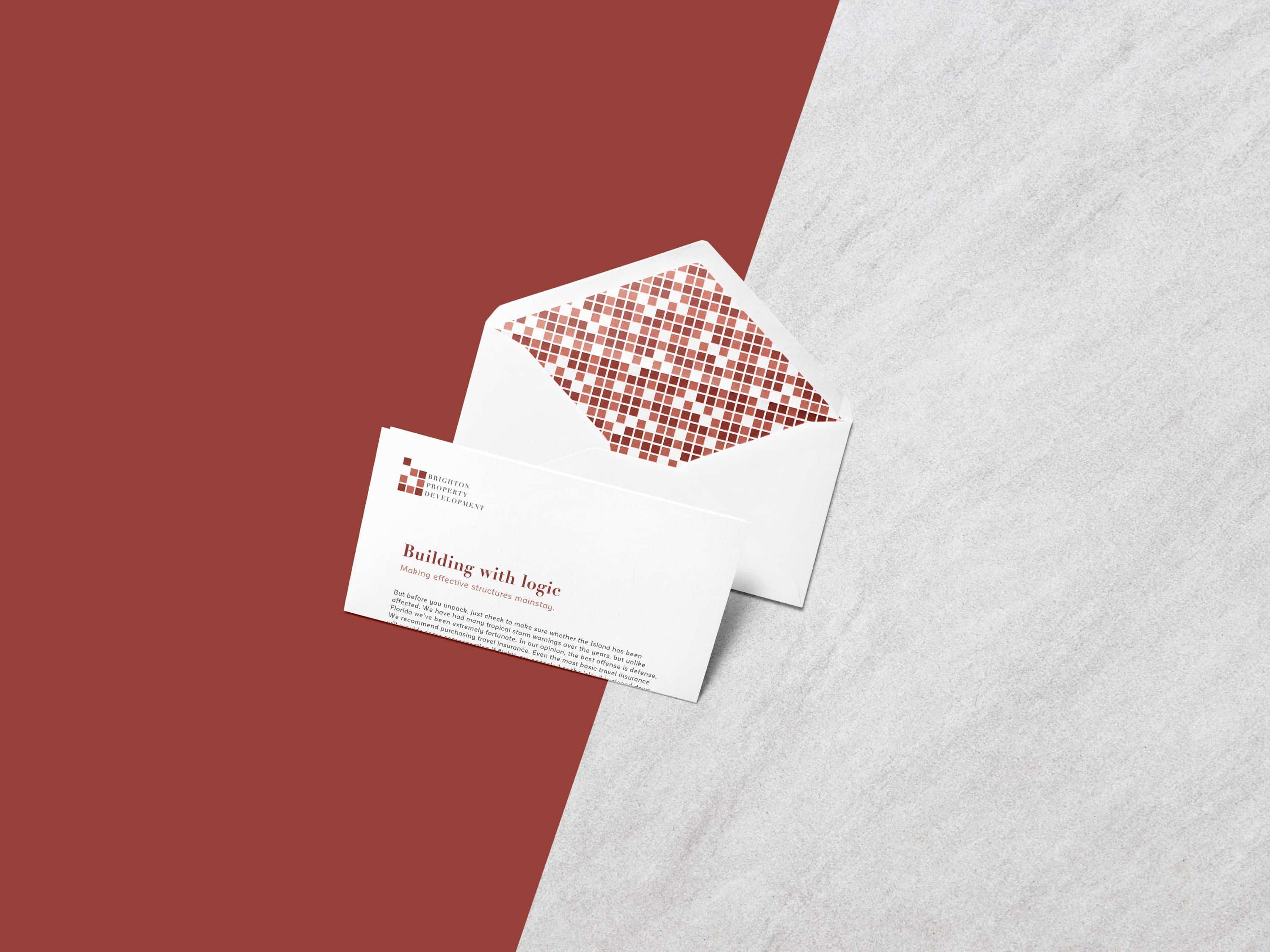
For the color palette, we selected muted tones inspired by the earthy reds of brick walls, the rich hues of chestnut seeds, and the soft greys of cement. These colors were carefully refined to complement each other, allowing flexibility in switching between foreground and background elements. When paired with white, the palette achieves a crisp contrast that strengthens the visual identity across a wide range of applications.
Logotype – Typography
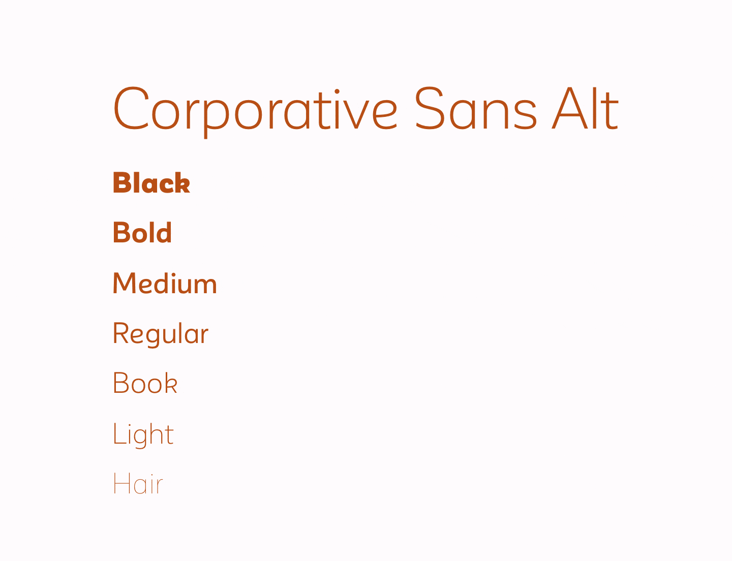
For typography, we chose a combination of Didot, a modern serif typeface known for its elegance and strong vertical strokes reminiscent of architectural pillars, and Corporative Sans, a geometric sans-serif that we used in its lighter weights to introduce a subtle, minimalist contrast. The interplay between Didot’s bold structure and Corporative Sans’s delicate lines creates a visually striking and balanced typographic system.
Logotype
The vertical stacking of the logotype was a deliberate choice, visually representing the concept of ‘building up’ inherent in property development. Each word is left-aligned with carefully considered spacing, conveying both structural stability and thoughtful precision—qualities that underpin BPD’s approach.
Typography
Both the primary and secondary typefaces offer a wide range of weights, making them highly versatile for diverse applications across various brand touchpoints.

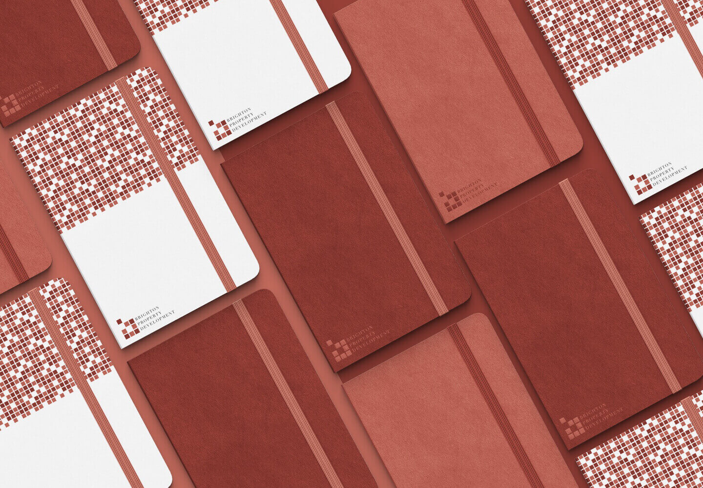
Pattern
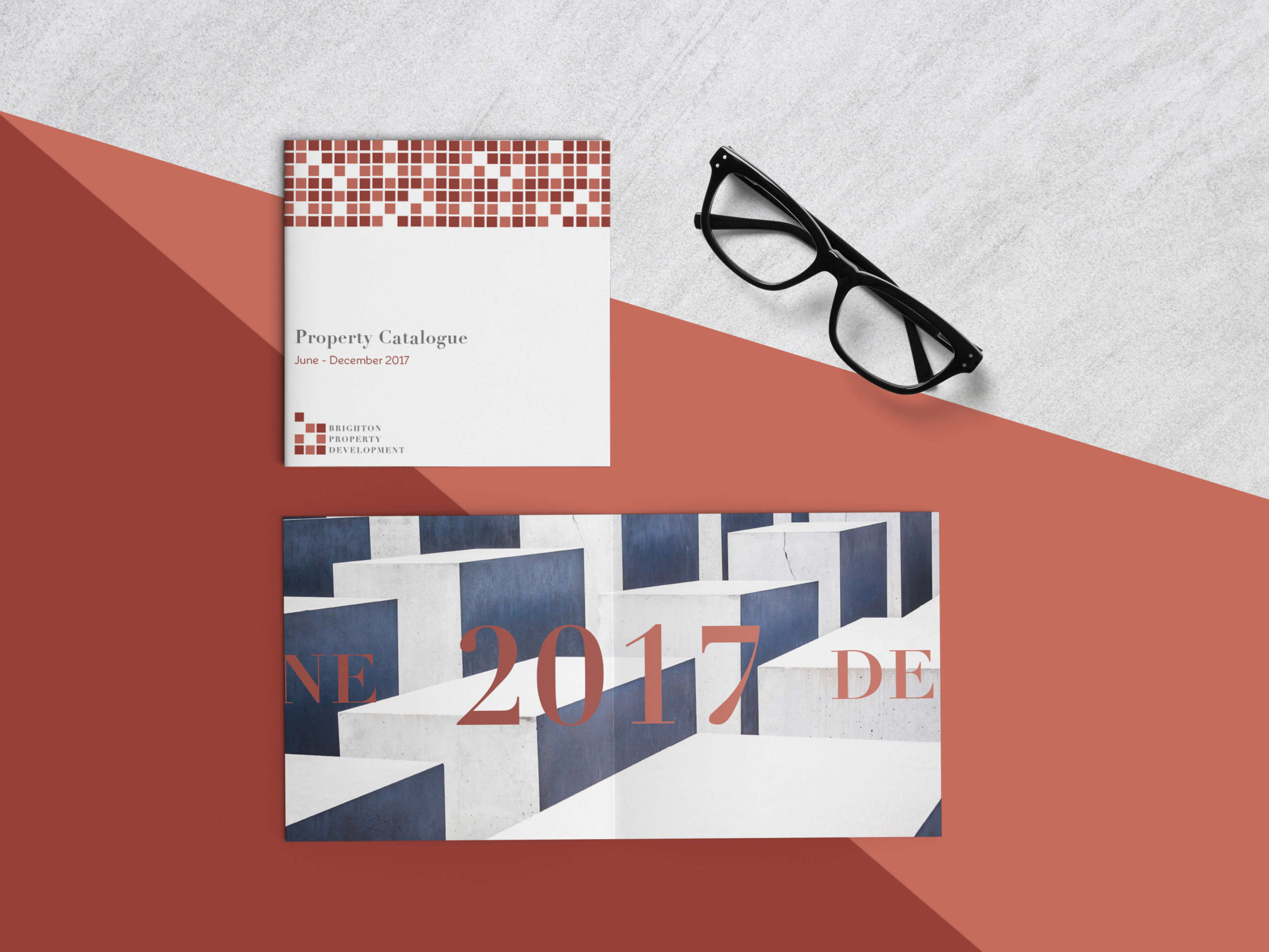
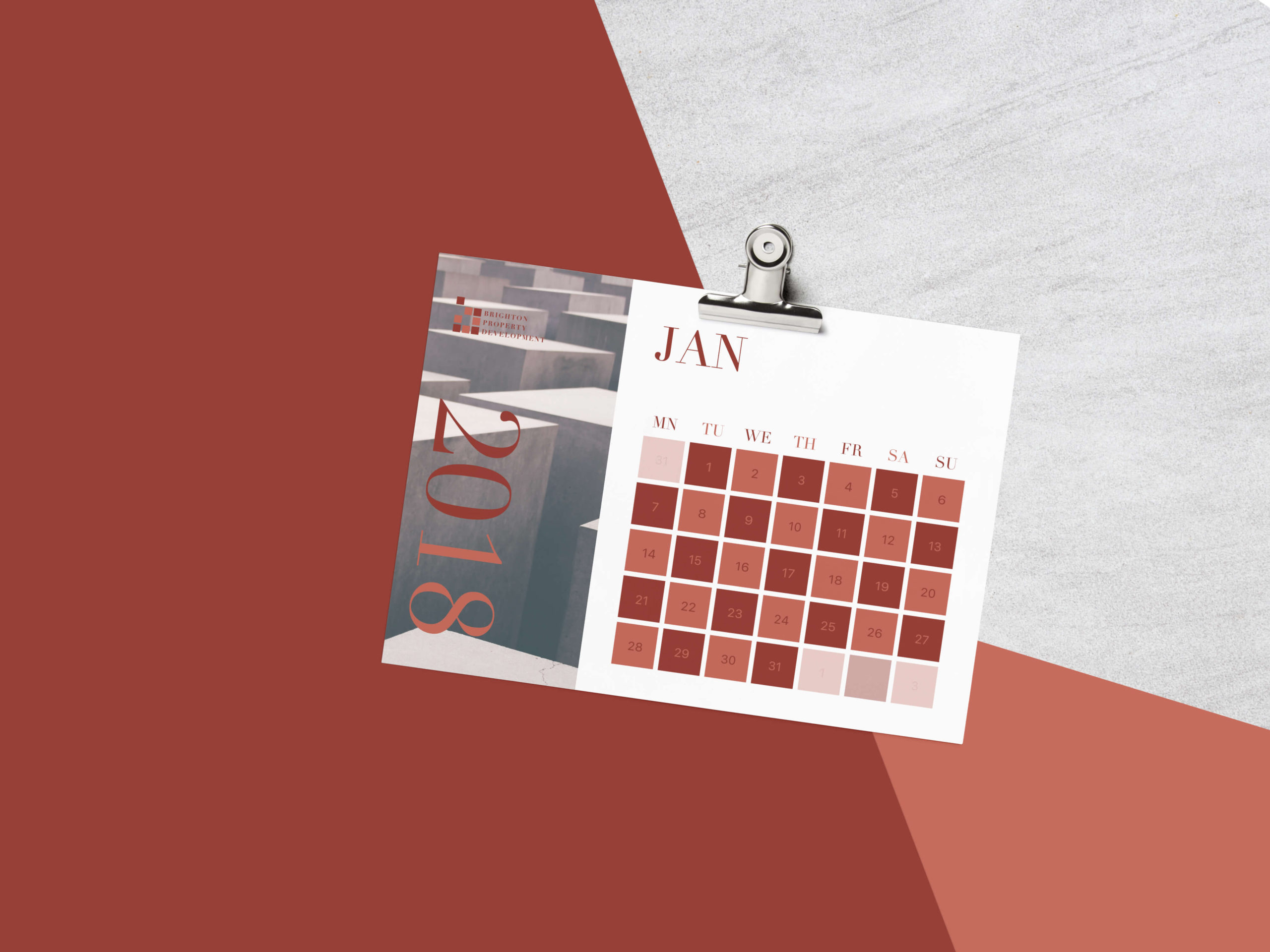
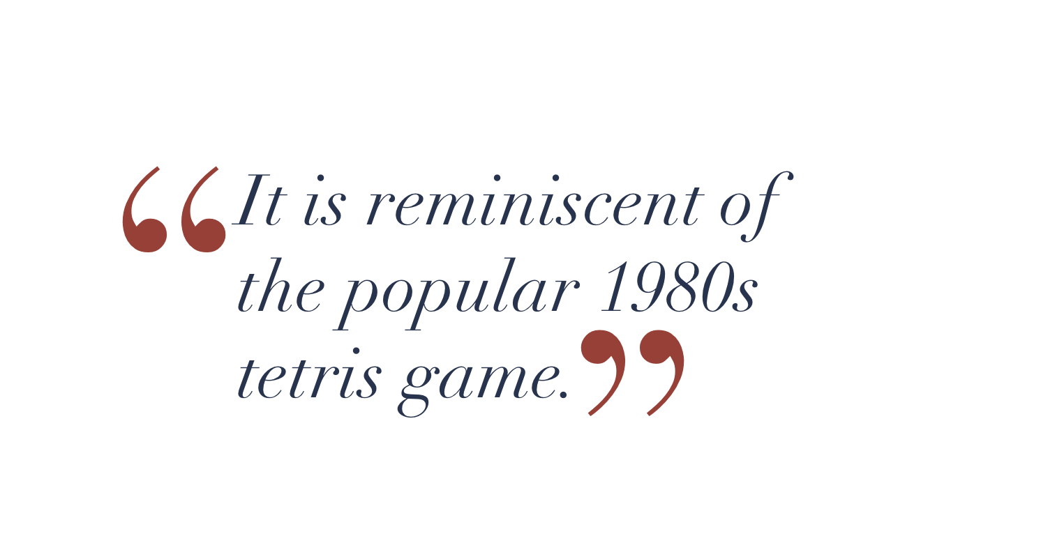
A critical aspect of identity design is creating a system that extends well beyond the logo. It must translate seamlessly into supporting materials in a way that is appropriate, recognizable, and visually engaging. We achieved this through custom patterns that give the identity a distinctive allure. The patterns are reminiscent of the classic 1980s Tetris game, symbolizing BPD’s ambition to become a leading property developer—filling spaces and building expansively across the landscape.
Tone of Voice
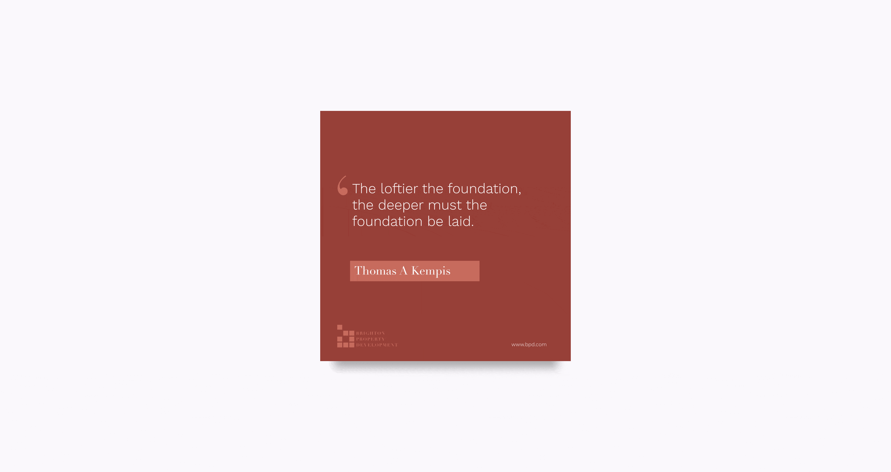
We defined a tone of voice for the brand that is factual and concise. What sets it apart is its subtle playfulness—a matter-of-fact delivery often infused with clever wordplay that softens the tone and makes it feel more approachable. This balance allows the brand’s messaging to maintain consistency while being adaptable to various contexts.
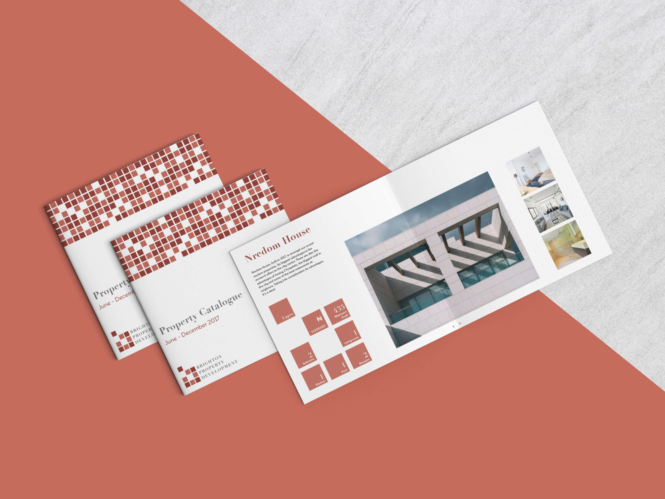
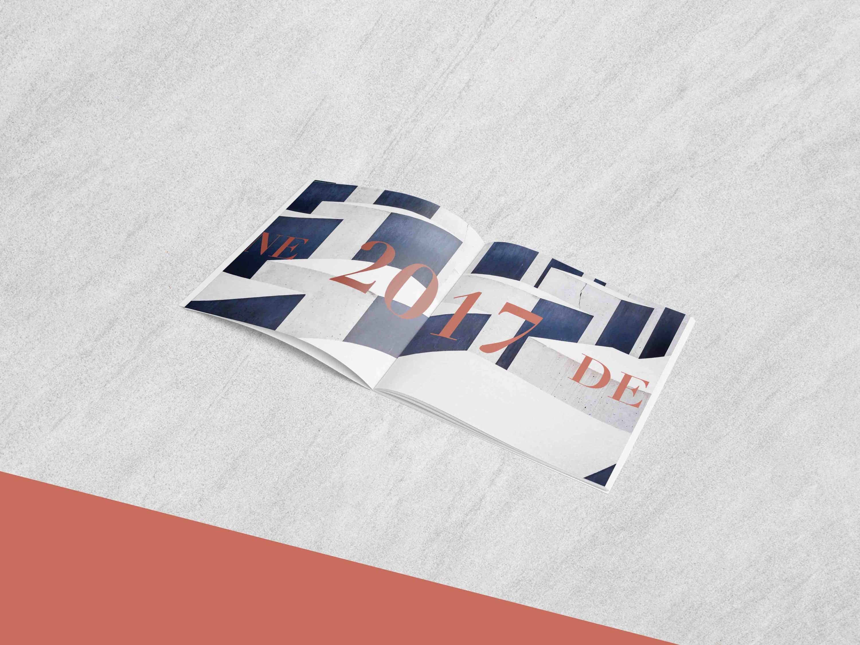
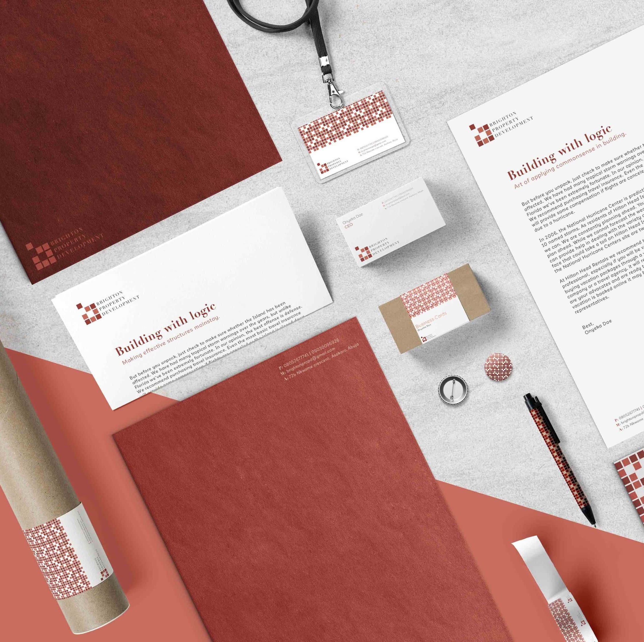
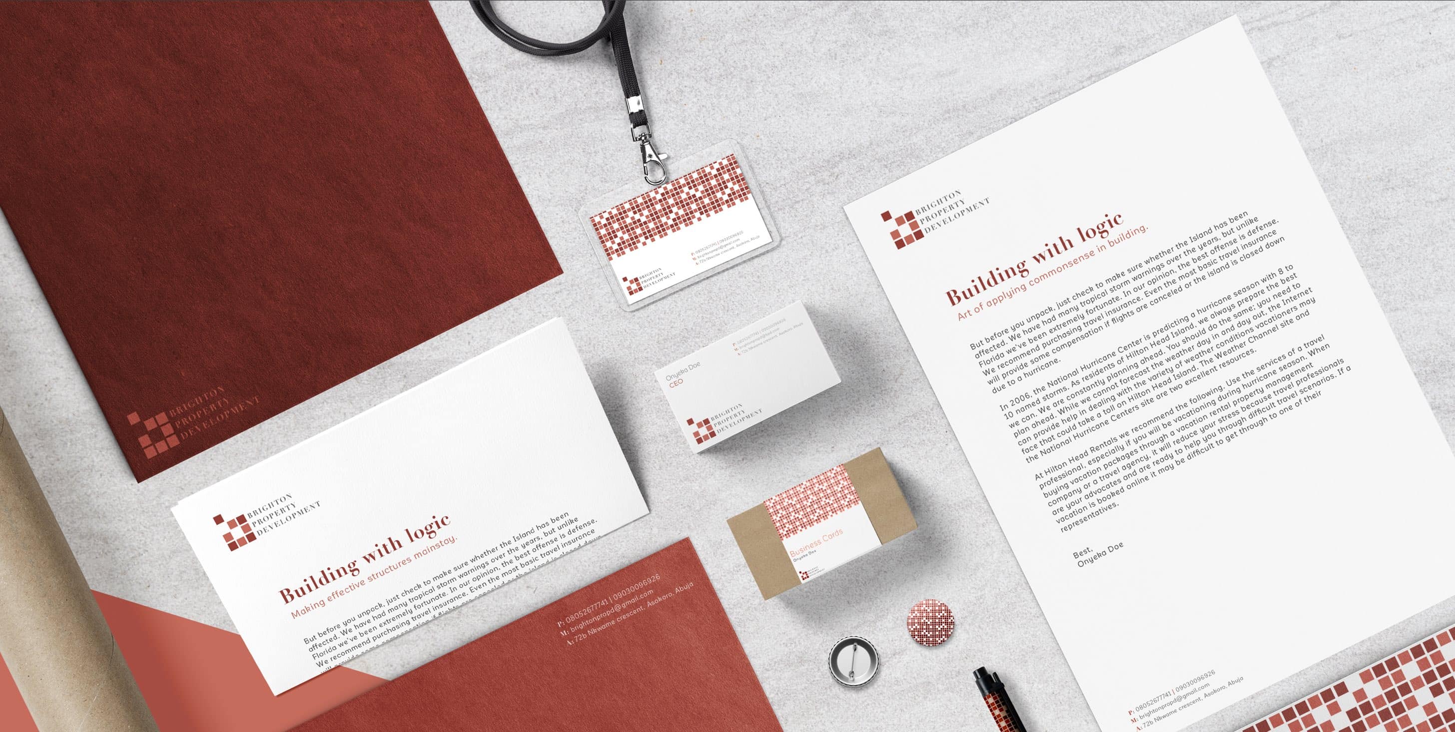
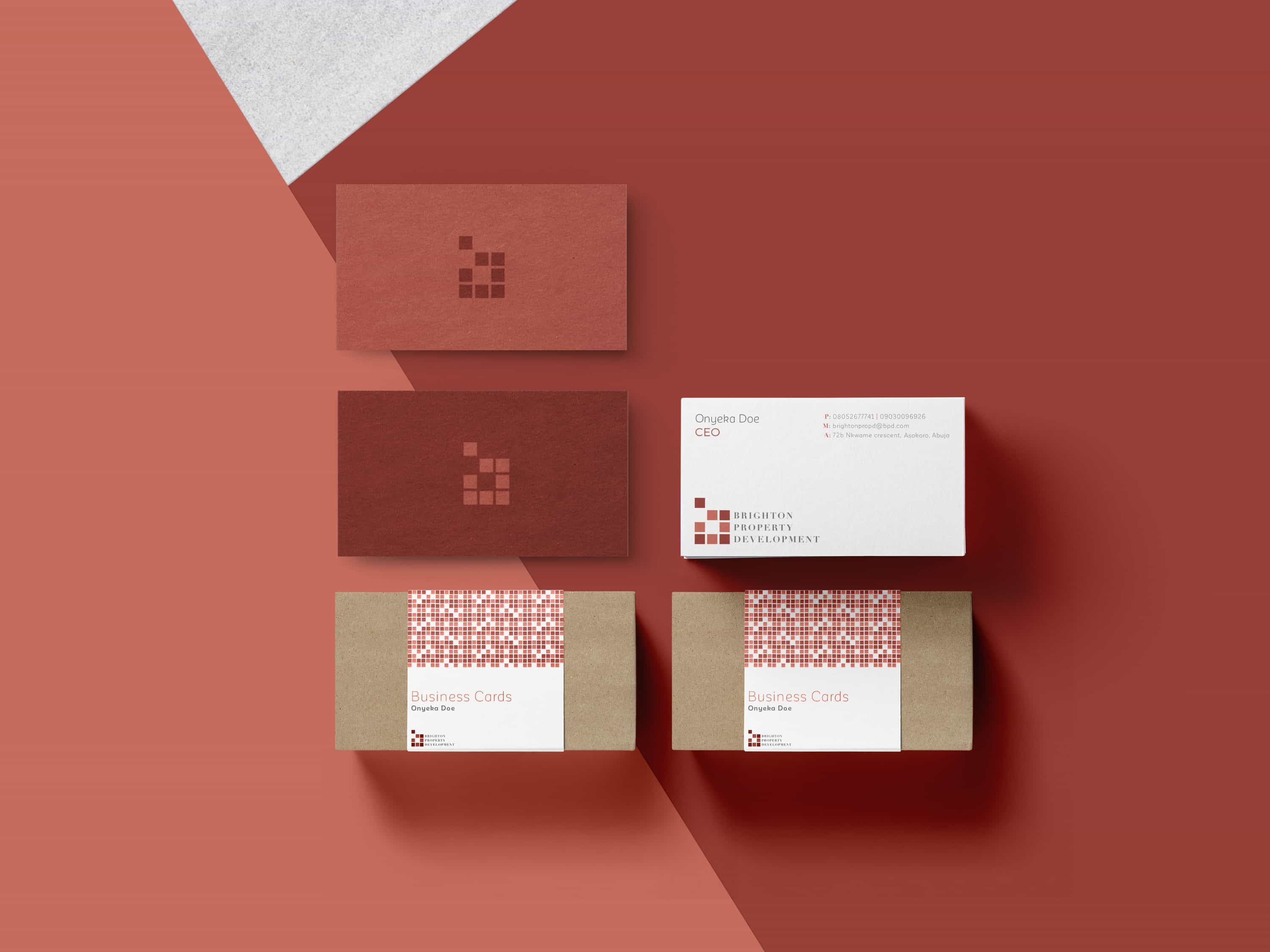
Catalog
The catalog serves as a holistic expression of the brand, combining color, typography, patterns, and tone of voice—all directly derived from the logo and visual system. Every detail was intentionally considered, from the square format of the booklet to the imagery and copy style, ensuring cohesion throughout.
Style Guide
To ensure the correct and consistent application of the identity, we developed a comprehensive style guide. This provides clear guidelines for using the brand’s assets across all marketing and communication materials.
Iconography
The modular nature of the logo elements allowed us to create a custom family of icons for BPD. These icons were built exclusively from the block shapes in the logomark, using alternating colors to maintain visual consistency and reinforce brand recognition.

Assets & Applications
By creating a minimalist identity with a well-curated complementary color palette and versatile typography, we’ve developed a system that is not only cohesive but also easily scalable across all company assets.