
Stand To End Rape
We worked with our long-time Impact partners Stand to End Rape (STER) to redesign their brand identity and website so they better reflect the organization’s vision; which is to create an equitable, safe, and resilient society where all persons are free from sexual violence.
Following their 2020-2025 strategy to position their organization as a social enterprise, we made some updates to their previous logo (which was designed by us) to reflect their love and support for their clients and also demonstrate their stand to end rape.
To ensure the brand is still recognized, we retained important elements from the previous logo such as the human figure, the love shape, the teal, and coral colours. Most importantly, we also strengthened the significance of these colors so they convey a clearer message of consent.
We’re delighted about their new logo as we believe it allows them to reflect the modern, gender-neutral, and impactful brand that they are.


To tone down the loud vibe of the former brand identity’s logo font, which was in ALL CAPS, we capitalized the new font so the vibe felt softer and more welcoming.
We’ve also updated STER’s logo font to match the softer style of their updated logo icon. The new font features curved and pointed edges, which are reminiscent of the human figure’s hands in the logo icon. As with the logo icon, these qualities make the font feel more welcoming while also protective.
Finally, we reduced the size of the ‘INITIATIVE’ font and made it ALL CAPS in order to create contrast between it the ‘Stand To End Rape’ font. This allows for visual balance between both elements.
Teaching through metaphors
Teaching consent is an important step towards the future of ending rape. If more people understood consent and respected it, fewer incidents of sexual abuse and rape would take place. To explain this better, we used the concept of contrast – one of our biophilic design principles. The two main colors (coral and teal) are complementary colors. This means they create a strong sense of contrast when placed next to each other. The contrast of these two colors made it possible for us to illustrate consent using the metaphor of a traffic sign.
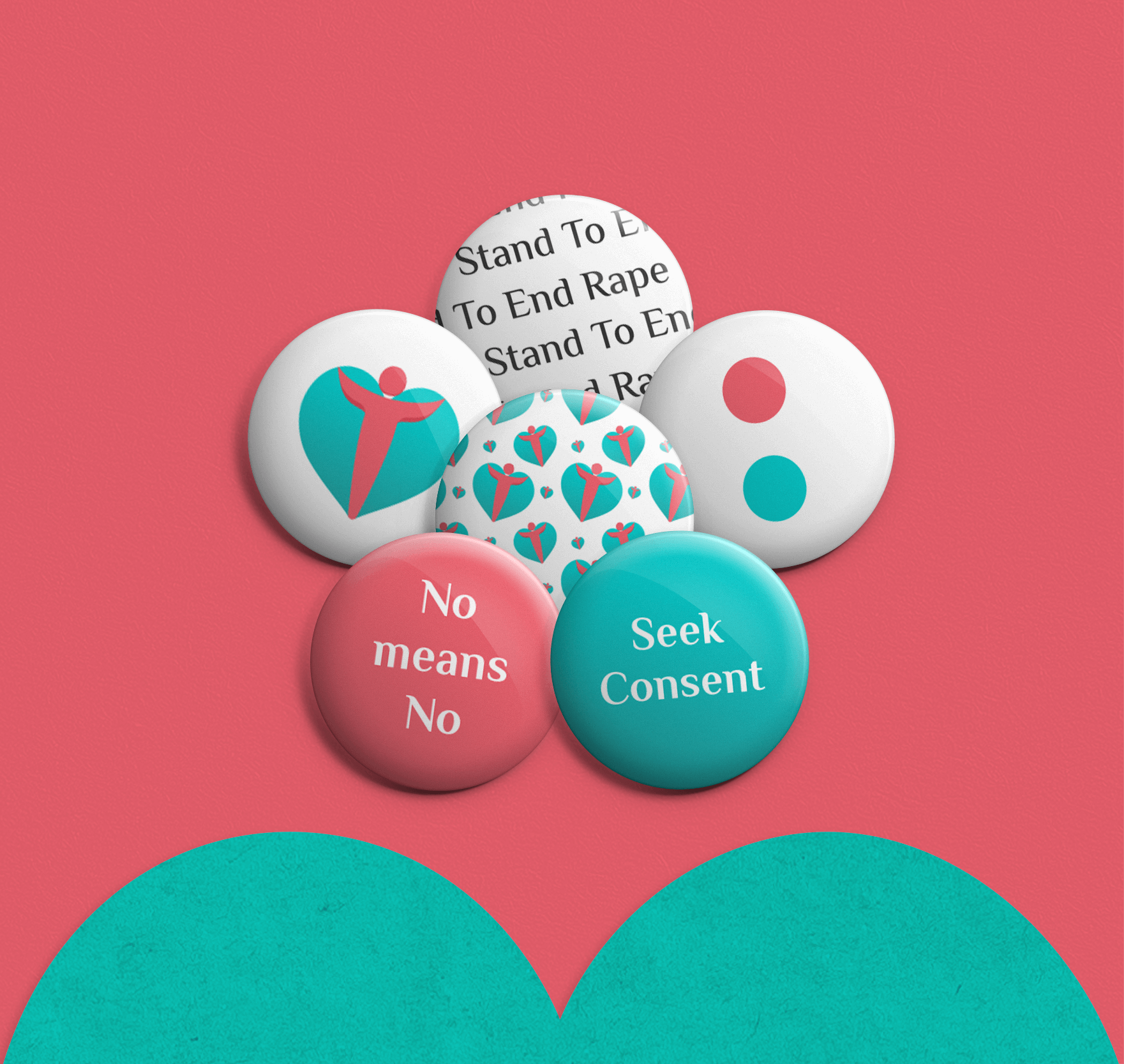
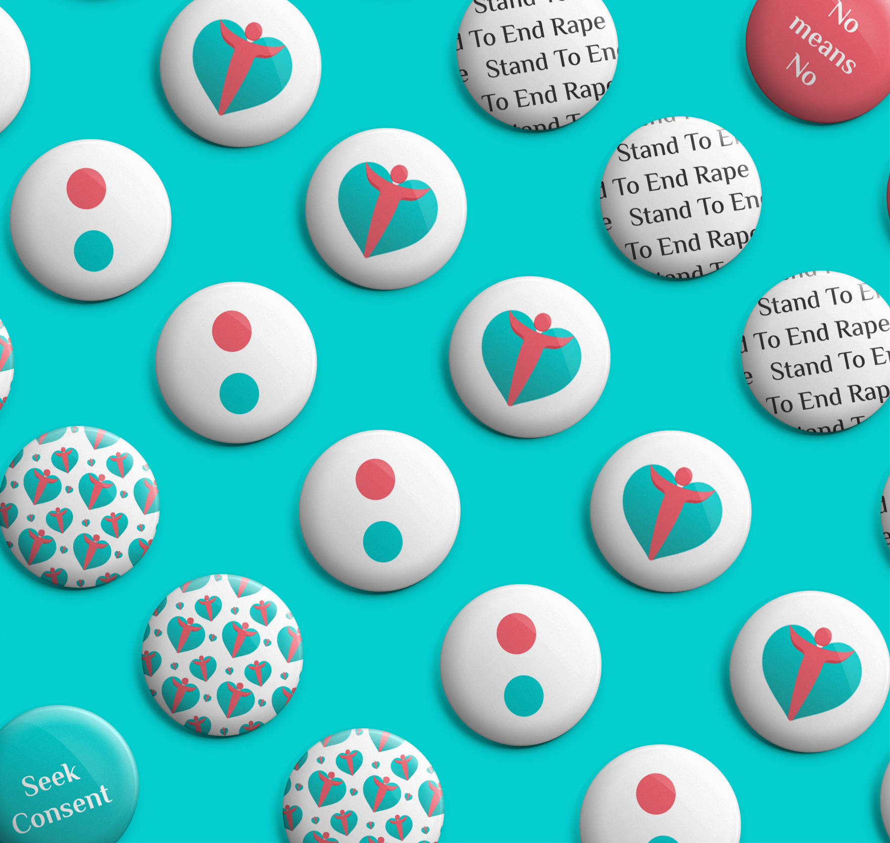
The traffic light sign is a great way of explaining consent because traffic lights are clear and unambiguous to those who understand and obey the lights. There is a clear signal to move and a clear signal to stop. The red traffic light stands for STOP, so we substituted in the coral color to signify NO. The green traffic light stands for GO, so we substituted in the teal color to signify YES.
This traffic light metaphor scales to how people should think of consent. Just like a traffic light can change from green to red, so can consent become no consent. That consent was given in the past does not mean that it cannot be rescinded in the present or future.
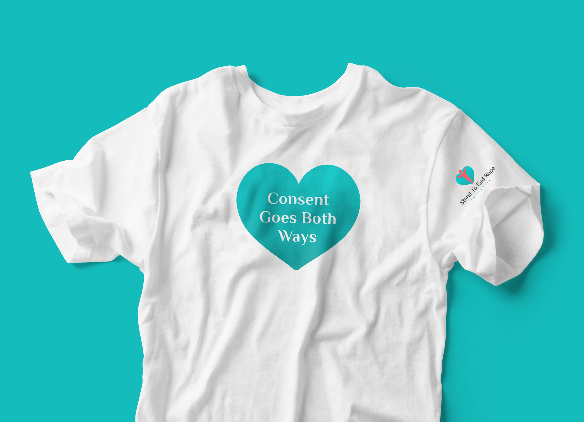
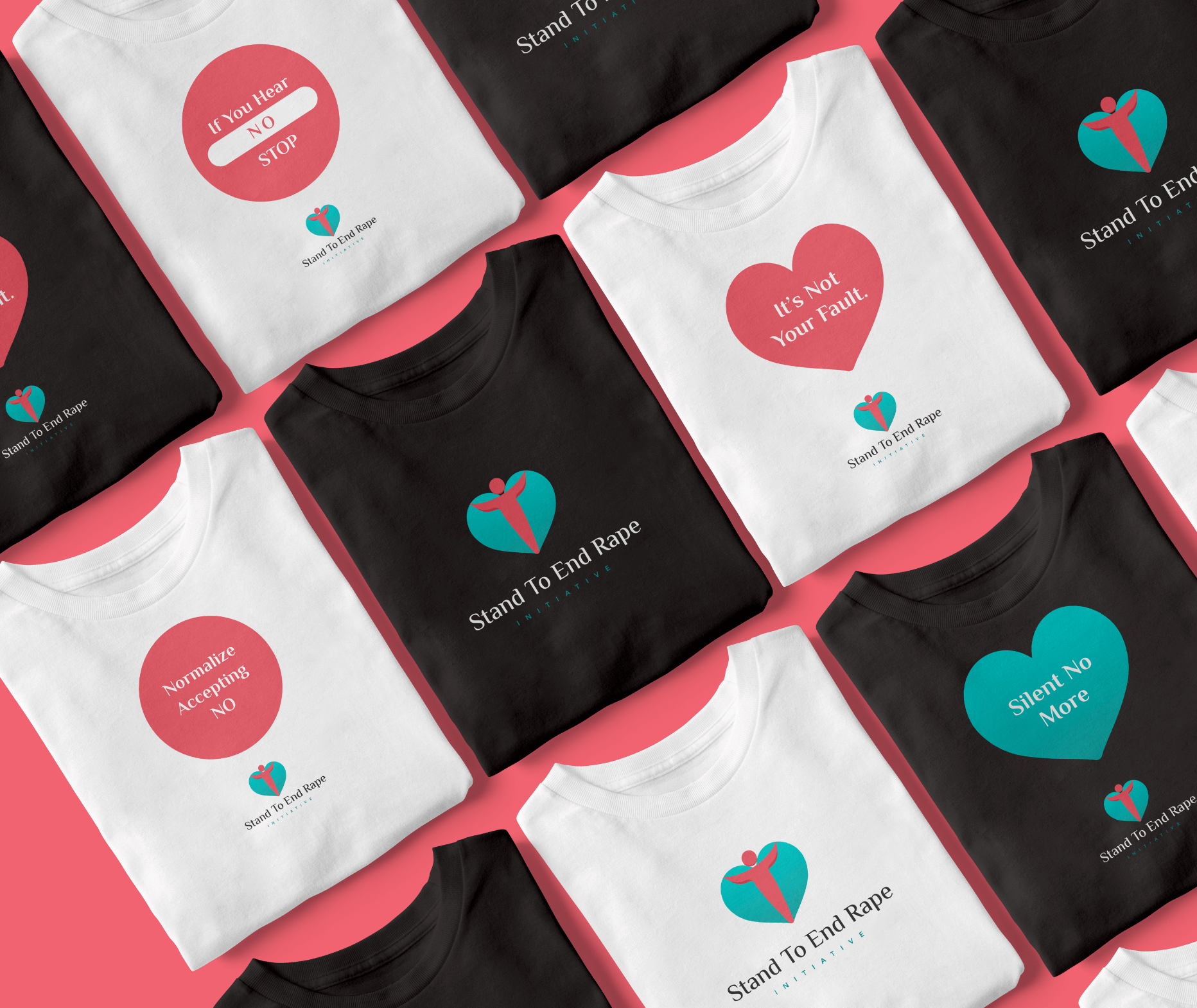

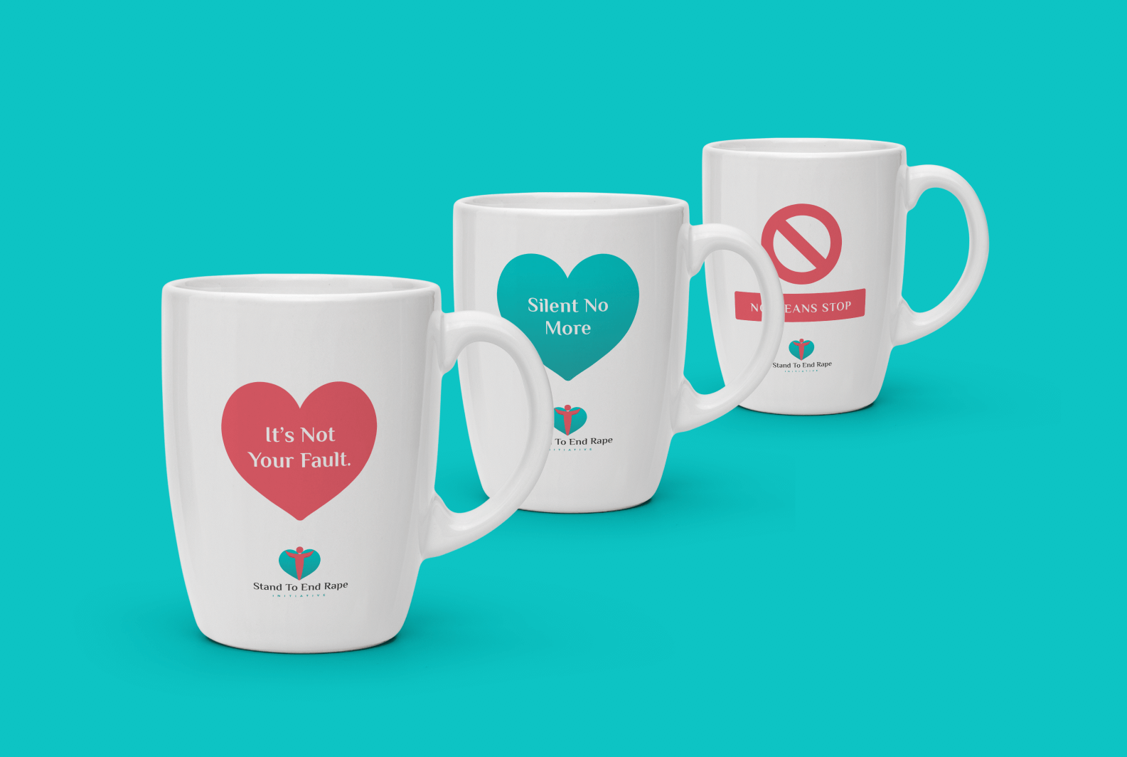
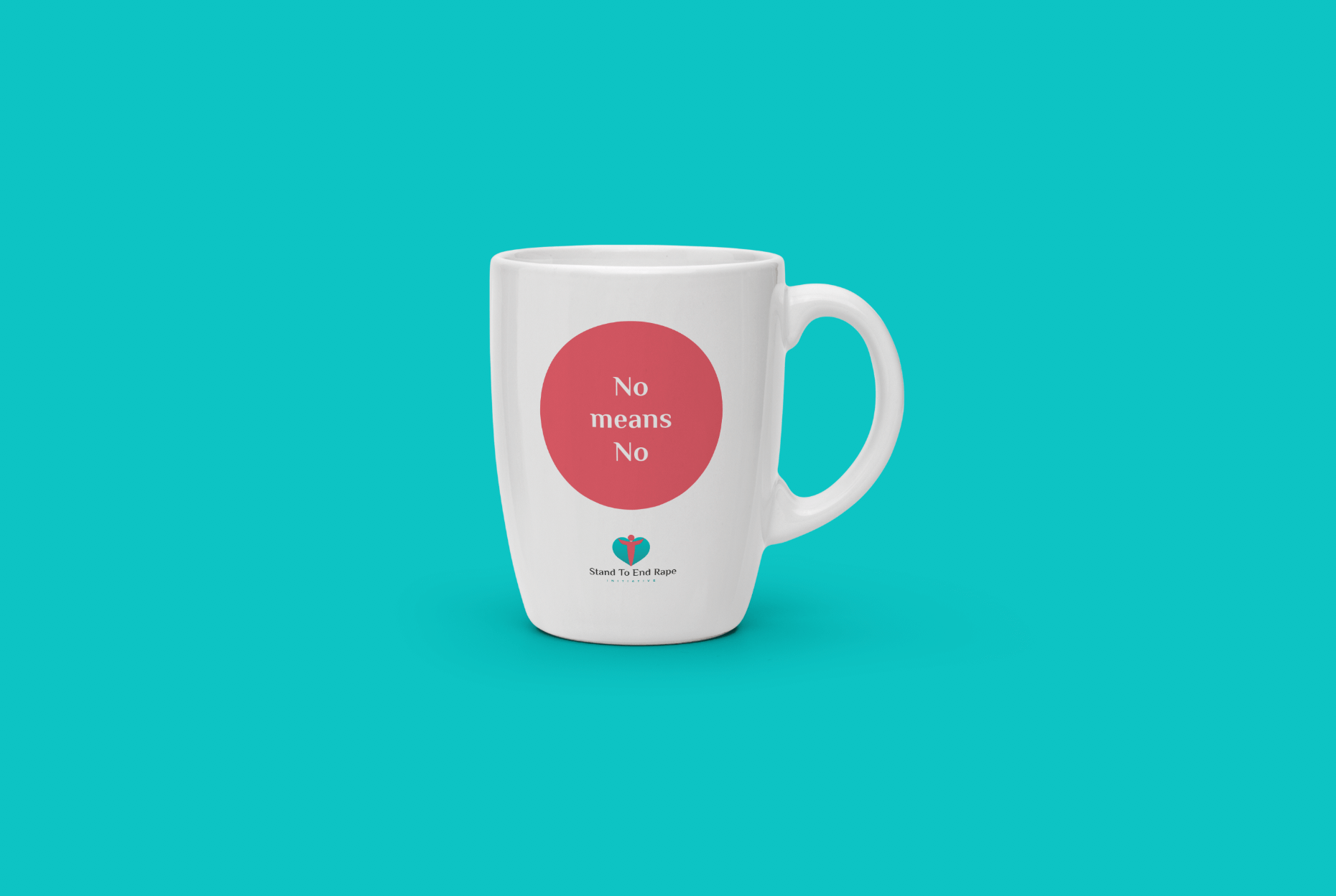
By applying the principle of contrast and adopting the metaphor of a traffic light, we’ve been able to graphically scale the message of consent to the design of the STER merchandise and other assets.
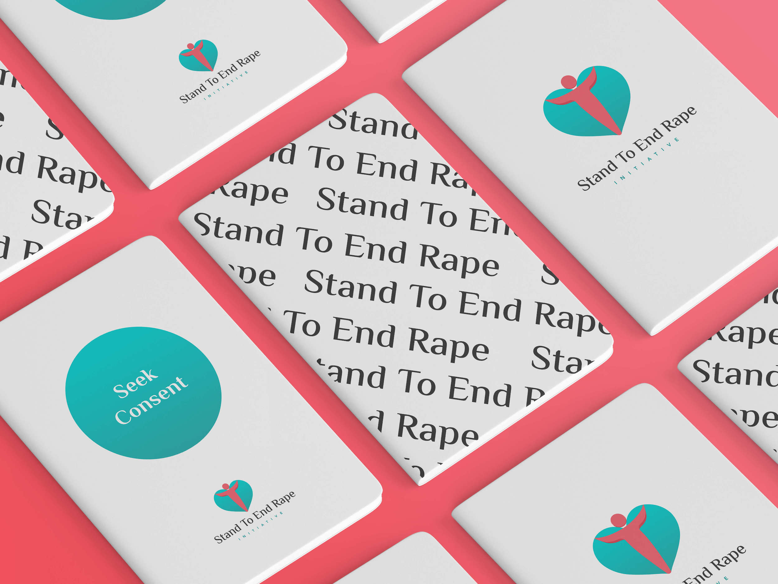
Simplicity is key to driving impactful messages, so we kept the merchandise designs simple and in line with the traffic light metaphor. The messages are written for both survivors of sexual violence and the general public. The messages for the survivors help assuage any feeling of guilt, while the messages for the general audience help educate them on the concept of consent.
Note: The purchase of these items is an important means of support for STER that also helps spread the message of consent. You can signify your commitment to a future without rape by purchasing them when they are available. To support STER right now, you can donate through their website.

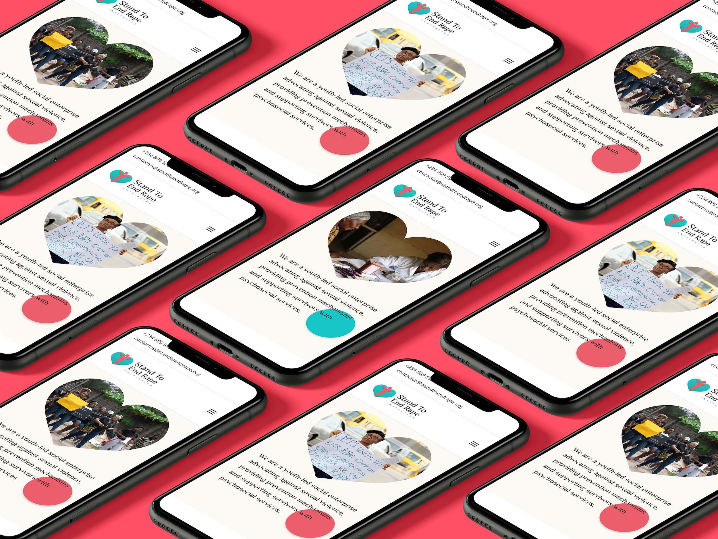
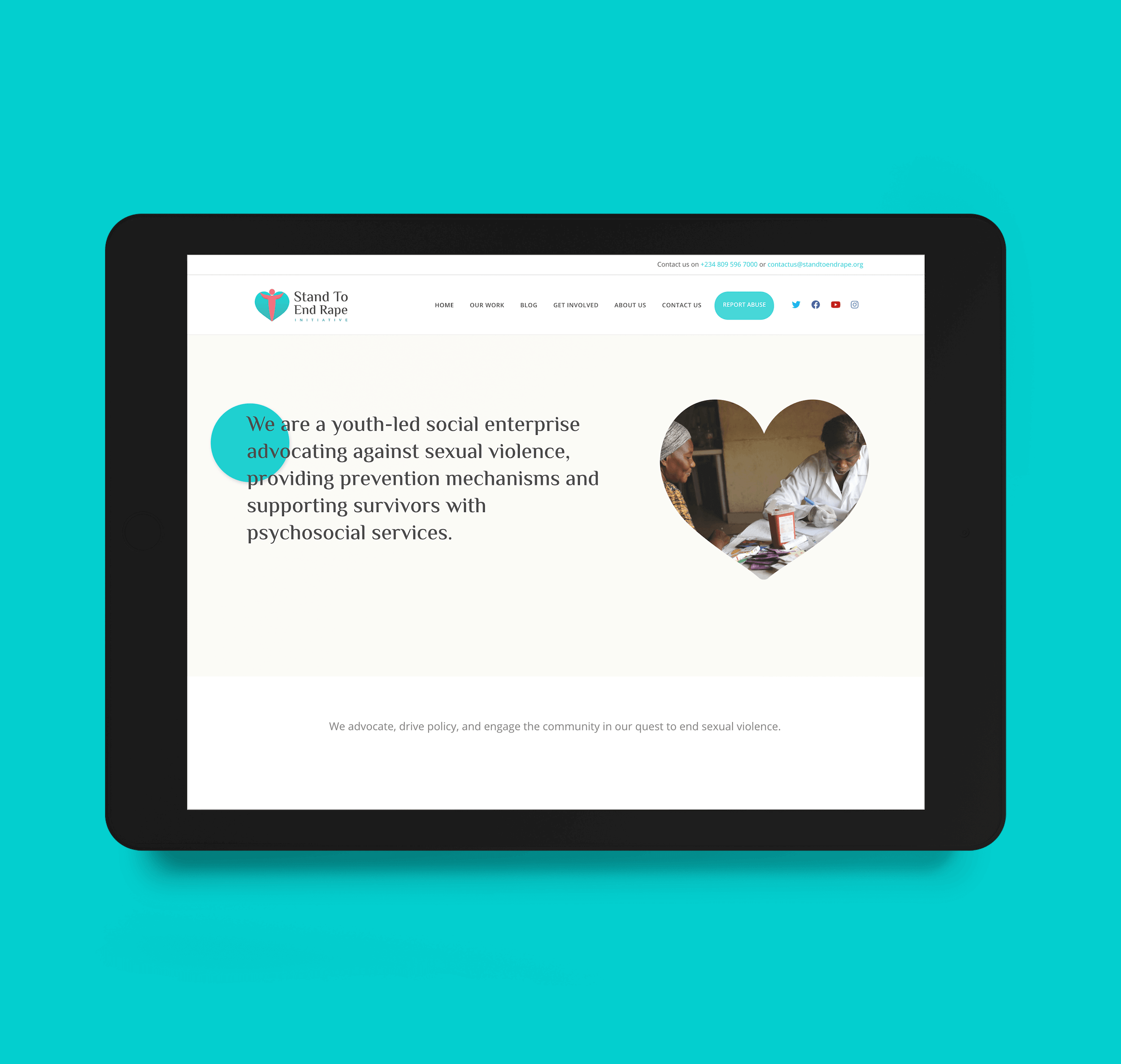
The updated website introduces a new look, better categorisation, and more functionality that help visitors find the necessary information. The cleaner and minimalist look makes it easier for visitors to navigate through the content on the website.
We’ve also told the STER story better by including more case studies of projects they’ve implemented over the years. In terms of functional updates, the new site now includes a comprehensive database where visitors can find the hospitals, health centers, and police stations closest to them!
To conclude, redesigning brand identities does not have to be a radical departure from their previous versions. First, one must slow down to understand the intention behind the redesign, and one must begin with a clear understanding of the organization’s purpose and mission. Second, one must start with gratitude for the visual elements in the previous identity that help bolster this mission and sustain them in the new version. This ensures the maintenance of brand equity and history. Third, one must take on the responsibility of improving the brand identity so it carries the message of the organization’s mission. This message then makes its way to the rest of the organization’s brand assets like its merch and website.
In redesigning STER’s brand identity, we’ve made sure to take these steps and this has led to a better more iconic brand that makes it easier to walk towards a future where everyone feels safer. 💛


